
I definitely learned so much from this class. I had a little bit of experience with photoshop, but I never had touched indesign or illustrator in my life. The class could get a bit frustrating at times because it seemed like my classmates knew so much more about the programs than I did so it felt hard to catch up. All in all though I’m very glad I had the opportunity to take this class to gain skills that I will need later in life.
Author Archives: Rosalind Cardone
iPad Design
Headline&Deck
From TIME Magazine 10/28/13
Headline: The United States of Texas
Deck: The Lone Star State is America’s future
I think the headline and the deck do their job very well. In combination with the artwork on the cover I am very interested as to why Texas is apparently America’s future.
Website

Logo
In my first draft of my resume, I used this as my watermark, but it was considered too logo-like. So I would possibly use this for my logo. I really like monograms and this is a good representation of myself because its bright and its my handwriting.

Resume Final

Website Photography
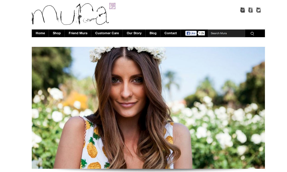
I chose the website for Mura Boutique for this weeks post. The photo here is used to show a model wearing the clothes the website is trying to sell. The photo is lovely and its goal is to make the consumer want to feel that way wearing their clothes. The target audience is girls in their mid teens to early 20’s. The designer probably chose this image because of the setting that it portrays. I think it’s awesome for the homepage of the website.
Poster Project

Gestalt Principle: KitKat 4.4
http://www.kitkat.com/#/home
The website I chose to use was the website for the new KitKat 4.4. The website is designed almost more like an info-graph because instead of navigating you scroll down the page to get the information about the new product. It’s a very creative website because it compares the new candy to technology, for example its “mobility” is represented with the sticks acting as descending bars that resemble cell phone service.
To apply the Gestalt Principle to this website we can look it its figure and ground. For example on the below “page” of the website the red words and piece of chocolate, as well as the navigation scroll bar all stand out against the white background.

As you can see in the below picture stitch of the website, the website is uniform with a common font and color scheme throughout. The proximity and alignment is on point.
The websites entire design is based on continuation considering it is one page and flows down to show all the specs of the new candy.
The visual hierarchy can be represented by the following page. The header of this “page” is written in a larger font and in red to signify that it’s important. There is then color variation when the information about the header is written in black.

Website Design


http://obo.co.nz
The website I chose to comment on its impressive design is OBO. OBO is a brand of field hockey goalie equipment that makes everything from sticks to goalie pads. I included three screen shots to show the navigation tools and the full images of the home page. To start with the basics, the website is extremely easy to navigate. It’s organized into sections telling you about sizing, where to buy, and shows all of the products. What really makes this website incredible, however, is its awesome graphics. They’re humorous and still relate to the product. The colors are bright and it is all very attractive. Although I have no need for a goalie stick, the website does a great job of advertising them to make me want one.