
Author Archives: Mengyu Chen
Webdesign Photo
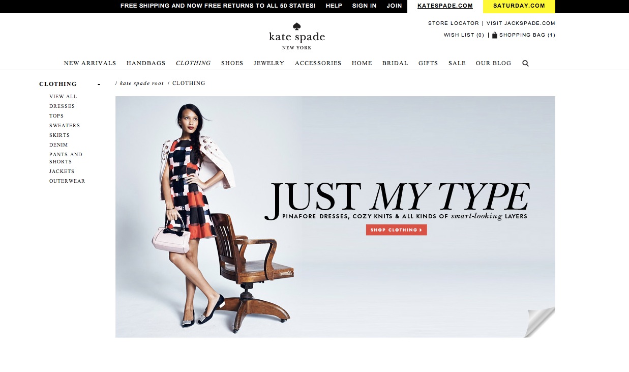
I like this photo in Kate Spade website. The background of this website is very clean. I think the color of the photo matches the whole website.
This photo is shown in the clothing section. The photo is very simple, but the clothes which the model wears is really standout because the model wears a very colorful clothes. The model’s arm and the chair all pointing to “Just My Type”. This is a very good way to lead our visual. The words “shop clothing” using red background really come into viewer’s eyes. In addition, because the whole page is very simple, when I first look at this page I will only noticed by the clothes and the call to the action. There is another thing I really like about the photo is that the right corner at the bottom. Views could click the right corner to explore about more different clothing. It just like open a new page.
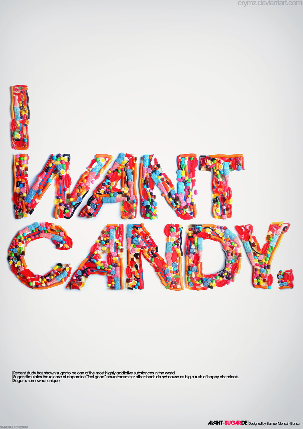
I really like this poster. The designer uses candy to show the words. The candy is very colorful and really attractive. It make me think that “I want candy”. The typeface of the words is very cute. I like the way the “W” and “C” looks.
Resume
Week 3: Poster
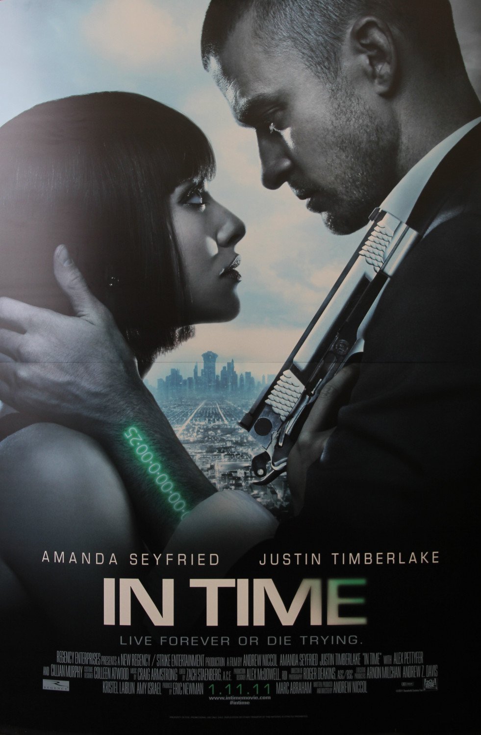
“In time” is a science fiction movie. The whole color in this poster it kinds of dark. The watch in green words is very attractive and it matches with the name of the movie. The special gun and the unique watch could let me easily to tell that this is a science fiction movie. From the poster, I could easily tell that the story is also a love story.
Even though the poster is 2D, it seems that the actor is in the very front and the city is at very far away. I think this is a very good design. It could let me imagine the relationship between the actors and the city and motivate my imagination of the story of the movie.The wordmark of the movie title is very cool and matches the style of the movie.
W O R D M A R K S
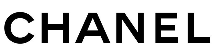
I really like this wordmark. All the letters are upper case letter. I feel it shows that the company is very confident with their products. The space between letter let me feel comfortable. The wordmark use black and white color. These are very classical colors. The brand do have some classical designs. I think this wordmark prefectly matches their brand image. All the letter are in the same size and the typeface looks very formal. It seems that the company really cares about their design and they will provide a very strict quality standard.
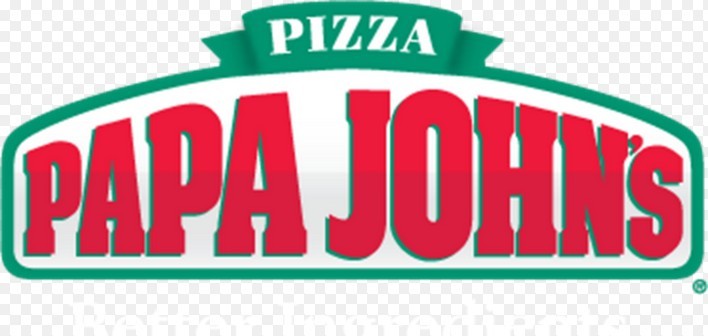
I love this logo. First, it’s red. Warm color draws my attention. It delivers a friendly image. The size of the wordmark varies. I think it help people read from left to right. Also, because of the size varies, the whole wordmark is really eyecatching. The first word “papa” from small to big. It just like somebody start reading it and the sounds from their mouth. Also, the typeface makes me feel relax.