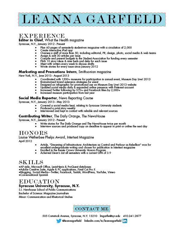
I feel like your resume is a bit too cluttered. I like the idea of using the turquoise in your name, and the “contact me,” but I feel like if you’re going to keep this theme, then you should use it more than twice. I love your word mark, and I really like the typeface you used for it. I can also appreciate the contrast between the typefaces of your headers and your body text. I would probably capitalize the word “magazine” in “Smithsonian magazine” and “What the Health magazine.” As for the layout, I think it is clear, and relatively interesting to look it!


I feel like your resume is a bit too cluttered. I like the idea of using the turquoise in your name, and the “contact me,” but I feel like if you’re going to keep this theme, then you should use it more than twice. I love your word mark, and I really like the typeface you used for it. I can also appreciate the contrast between the typefaces of your headers and your body text. I would probably capitalize the word “magazine” in “Smithsonian magazine” and “What the Health magazine.” As for the layout, I think it is clear, and relatively interesting to look it!