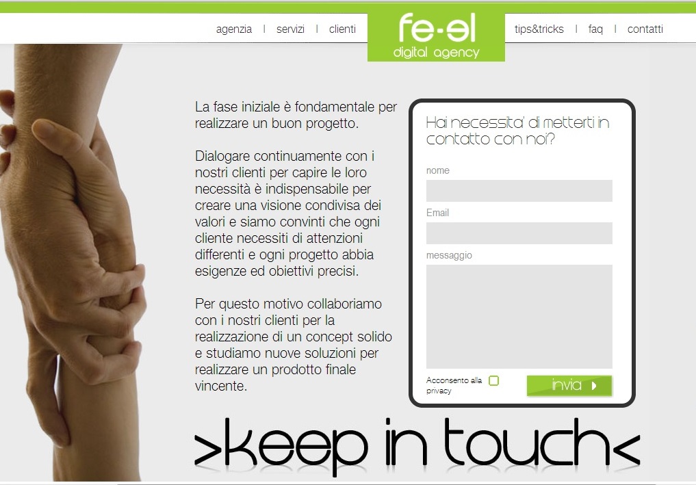
fe-el.com is a web design agency that focuses mostly on highly interactive webpages that focuses strongly on interaction and communication with customers. Their website does not focus much on photography, but it is relying very heavily on elements of graphic design to bring their website together. It’s a very deep website with the user having to continue to scroll which might be a turn off to some viewers. The one photo that they do have on their website is under the “Keep in Touch” option, which shows an image of two people literally “keeping in touch”. I think it works well because it conveys the message fe-el thinks that their partnership with customers is important in order to achieve success.
GRA 217 Section 5 Group 1
The official blog for GRA 217 with Sherri Taylor


The strongest element of this webpage is its simplicity. It is very easy for a viewer to navigate wit the menu above the page and the context in the center. While this simplicity is strong, the page needs some vibrant and warm colors to attract the eye of the viewer. With this addition, it would make the page stick in the minds of its viewers.
I really love the way the designer used the photo of the two hands reaching for each other to emphasize the “keep in touch” ordeal of the digital agency. It is very clever. The hands are the center of interest for the page and serve their purpose for the viewers. Although I cannot read this language, the photo would make me want to read the page to see what it is all about.