
This class felt like a giant semester-long workshop. Since I had no prior experience with InDesign, Photoshop, or Illustrator, I had to learn how to use the programs just from making mistakes. This was frustrating at times, but I think it ultimately benefited me because it really helped me learn. If I messed up and spent and hour more trying to learn how to fix it, chances are I wasn’t going to make that same technical mistake again. It also helped me learn how to think more creatively through the conceptualization process. The projects were very relevant to the current job market, so I only hope that I can take the skills I learned and apply them to more professional design work in the future.
Author Archives: Leanna Garfield
Retro magazine
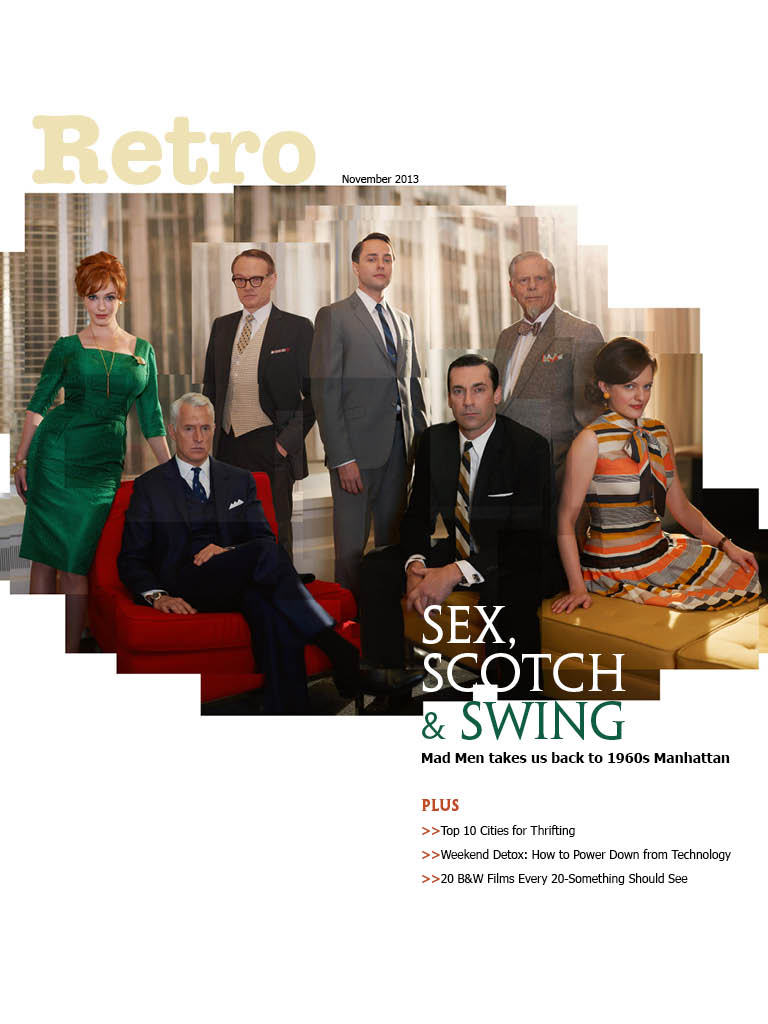


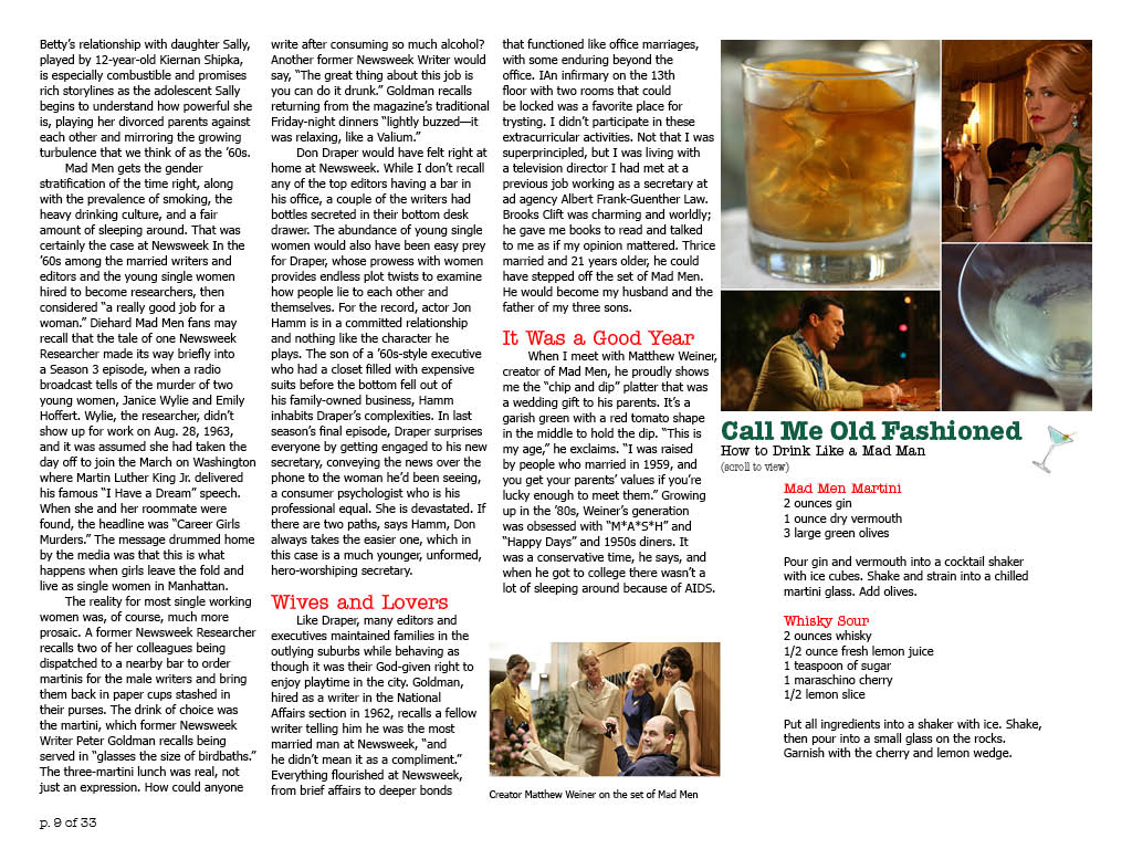

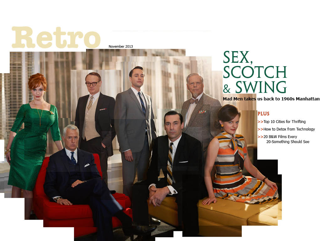
 I learned how to art direct according to a magazine feature, as well as how to incorporate different interactive elements.
Print Making Revolution–Extra Credit
In the SU Art Gallery’s current exhibition, “Print Making Revolution,” Mexican art throughout the early 20th century is described as a form of rebellion against the corrupt central government. Print makers intertwine their art with political and social commentary.
The earliest black and white lithograph prints in the collection are small in scale, using negative space to portray ominous illustrations or iconography of skeletons. The prints later progressed into more intricate and more developed scenes. For example, Leopoldo Méndez’s “Tengo Sed” (I Am Thirsty) shows a narrative of a man in a drought, the sky directing the eye toward his face and torso.
Poster prints were later employed by the Mexican government to sway public opinion. The color red was frequently inherent in the propaganda, portraying strength, power, and war–which works well with the government’s intended message.
However, most of the Mexican prints throughout the 20th century remain black and gray, expressing sadness. “Print Making Revolution” displays the sentiments and hardship as many struggled to find work and education. Across many artists’ prints, grief seems to be a consistent sentiment for life in Mexico.
Wired iPad Design

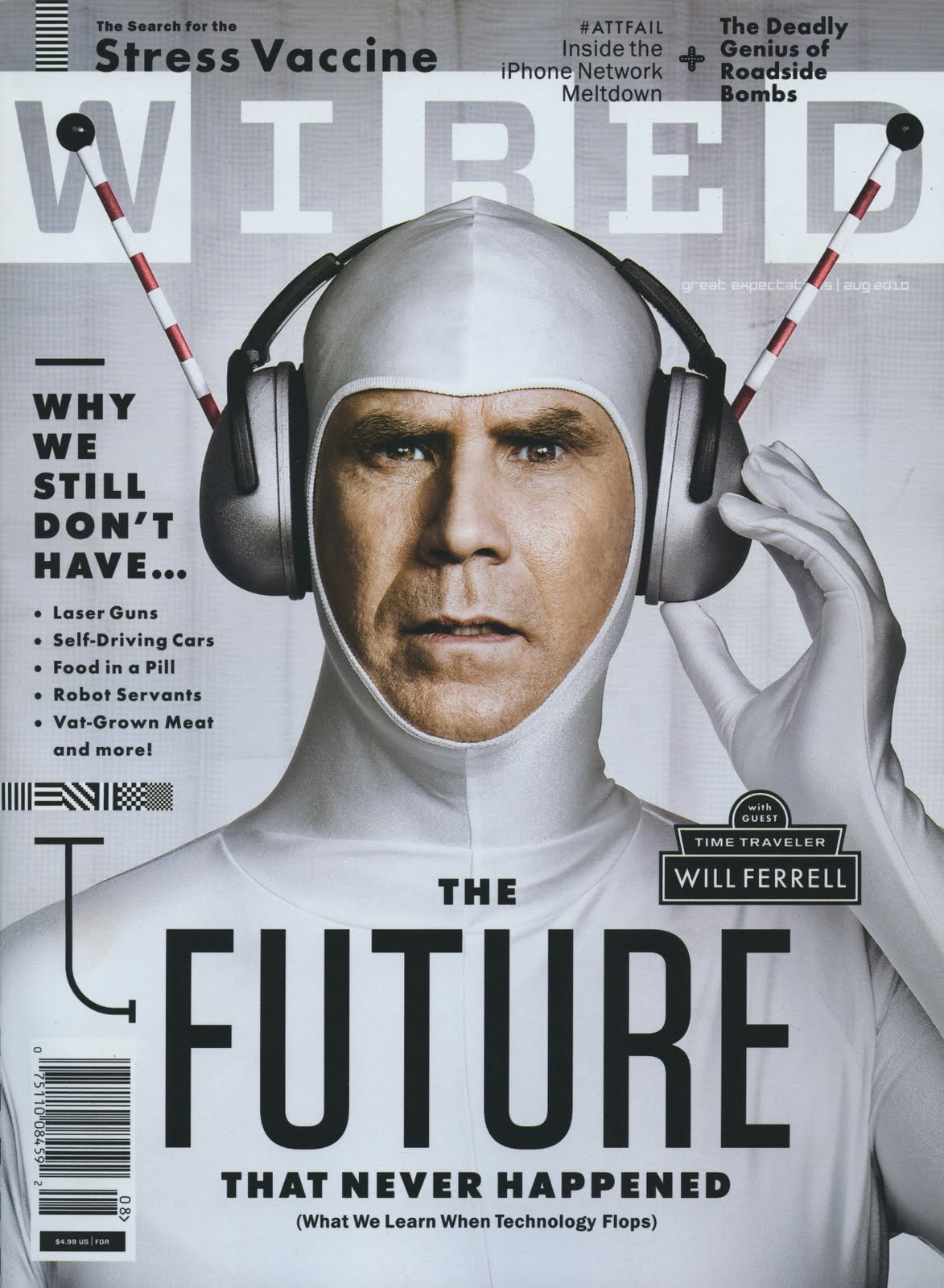
I couldn’t find the horizontal layout for this Wired cover that features Will Ferrell. But I did find the print version, which, as you can see, is identical except for the newsstand barcode. The consistent white-silver color scheme is very effective in this photo illustration since silver represents technology and the future. Ferrell’s headphones point upwards, directing the eye to the WIRED nameplate. Since sans serif is considered more modern than serif typefaces, the elongated font also fits well with the cover story. This issue has more cover lines than you would normally see on an iPad issue, so it surprises me that they kept all of them between the print and digital versions.
Hed and Dek
No Alpha Males Allowed
Peace-loving South American monkeys and the U.S. scientist who champions their future encourage us to rethink our aggressive nature.
(From Smithsonian Magazine, September 2013)
Web Interface


Magazine Spread Design
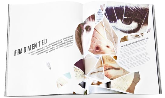
- Principle 2 (Continuation): The hed and dek leads the eye upward toward the visual, then to the text.
- Principle 3 (Closure): I think this spread most heavily uses the Gestalt principle of closure. Although the visual is a collage of random face parts of different people, our eyes are able to close the gaps between the pieces and understand that it’s a complete face. The text container also fills the face, even though it’s completely different from the rest of the objects.
- Principle 5 (Figure/Ground Relationship): Our eyes move through the page in a left to right motion.
Logo
![]()
When thinking about my logo, I wanted to incorporate my area of study somehow: magazine journalism. My initials are “LG,” so I drew a fountain pen with a line drawn to appear as the “L.” I connected the line to the bottom of the “G,” so it looks like it was just drawn as well. I would obviously place this near my wordmark on my resume or a business card, so readers would understand it’s my initials. As for my identity, I wanted to portray that I think of writing stories as a craft. I hoped that choosing a fountain pen instead of a modern one will show this.
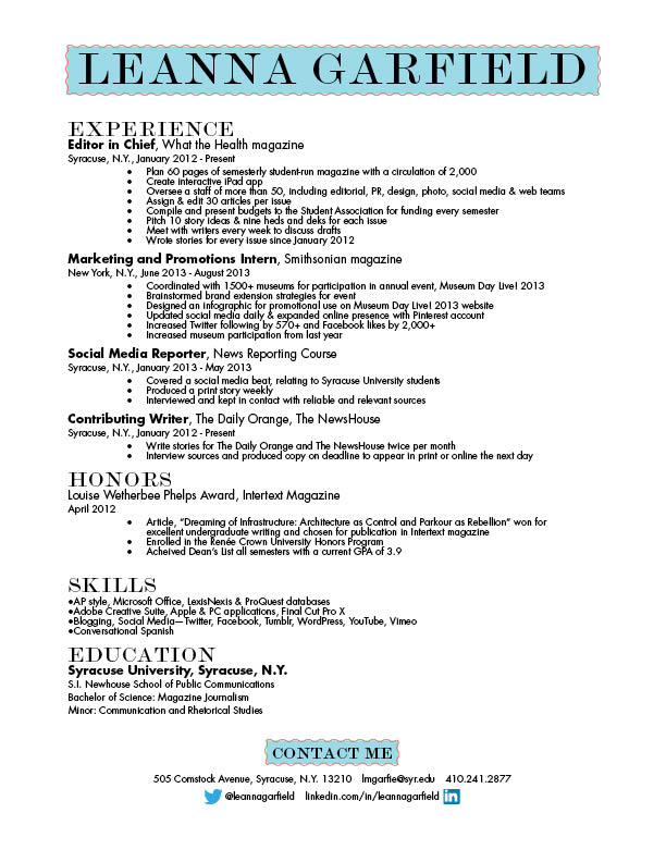
Resume 1B
Web Design/Photography

This is the home page for Pure Fix Cycles, a company that sells bicycles. The photo changes every time you refresh the page, but each is cut across the middle by the navigation bar. Because you can’t fully see the cycler’s face in this one, it focuses more on the bike. Since it’s a photo of a person, it’s also great that it makes use of a warm color palette. It employs the rule of thirds as well, positioning the cycler in the right part of the photo.