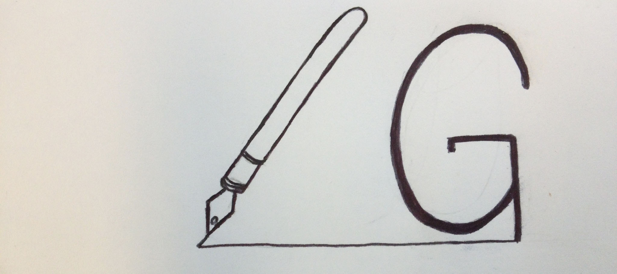
When thinking about my logo, I wanted to incorporate my area of study somehow: magazine journalism. My initials are “LG,” so I drew a fountain pen with a line drawn to appear as the “L.” I connected the line to the bottom of the “G,” so it looks like it was just drawn as well. I would obviously place this near my wordmark on my resume or a business card, so readers would understand it’s my initials. As for my identity, I wanted to portray that I think of writing stories as a craft. I hoped that choosing a fountain pen instead of a modern one will show this.


I really like this logo. I think that what you were trying to convey about your major and your love of writing is very apparent. I also, think it was very smart to use a fountain pen to show that you think of story writing as a craft. I would say to make the pen more vertical to make the L more apparent, but I don’t think it is necessary if it is next to your wordmark.
This logo instantly stood out to me. I looks as if that exact pen drew the logo. This is something different that will instantly grab a person’s attention. This logo is not only attention grabbing, but it depicts the type of person and your area of study. This would make a perfect business card.