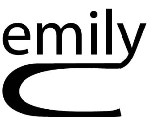
 For my logo, I wanted to make my name look cohesive, because it’s a good way to draw the reader in and get the whole picture. I liked the use of my full first name, because that is more important to me. I then connected the last letter of my first name with my single initial of my last name to have the eye read from first to last name. I like this simple font because it was easy to manipulate, however, I may explore more diverse fonts for the future.
GRA 217 Section 5 Group 1
The official blog for GRA 217 with Sherri Taylor


I love how the extension of the Y turned into a C. Its very easy to recognize, before I even looked for your last name I knew it must start with a C.
I think the fluidity of this logo works very well. It’s informal, yet professional. The way that the “C” underlines your first name is very clever. The cohesiveness works, but I’m kind of wondering what it says about your brand identity.