
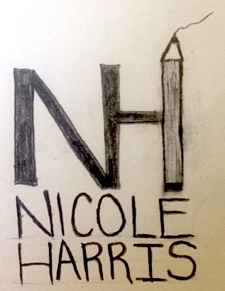
Since the my initials (N and H) both have long straight edges, I decided to combine them so one side of each letter is connected. In my logo, you can easily distinguish between the N and the H but still see them as one unit visually. I wanted to incorporate a symbol of writing in my logo, since I’m majoring in magazine journalism. I made the other edge of the H into a pencil. The squiggly line coming out of the tip makes the pencil look like it’s writing. I also wrote out my name underneath the design, aligning each letter since my first and last name form a true perfect and both have 6 letters.


I really like the whole look of this logo. I think adding your full name to the bottom really helps make the logo coherent and since it is a perfect it is also very visually coherent. I also think it was a good choice to connect the NH because it makes the visual more interesting.
I love your logo! It’s very simple and clean. I agree with Kathryn, by putting your name under the logo, it helps people recognize your name very easily. Besides, by replacing one stroke of “H” with the pencil, it helps people get the idea you can do a lot of graphic design work. It helps if you wanna find any job related, or it will simply add visual interests to your logo as well.