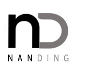
I have already designed my personal logo in the resume project. I want like to keep it very simple and recognized. The simplest design is the best design. I put the first letter of my first name and surname, “n” and “d” together. I tired different combination of these two letters like “ND”,”nd”,”nD” etc. At the end, I choose the combination of “nD”.
GRA 217 Section 5 Group 1
The official blog for GRA 217 with Sherri Taylor


This logo looks very modern and classy. I am not quite sure what type of company this logo would represent but I like how you use the downward stroke of the N to be the backbone for the D. This is a common strategy and I think it is very visually appealing and that it works very nicely.
I love this logo! Its so simple and modern. I like your use of color, it makes your logo very visually appealing. I also like how you were able to incorporate your full name into the logo so people will know what it stands for, thats something i wish i could have done for mine.