I chose to include a double page ad as well as a magazine spread. As an advertiser, its really hard to cut through the clutter. Its especially hard to make your magazine ad stand out from all the other ads in a magazine. A good way to do this is to really take advantage of the medium you’re using. In this Apple ad, they created a completely new ad from any ad they had existing in order to fully take advantage of the fold of the magazine as well as the double sidedness.
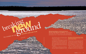
I also picked a regular magazine spread as well. Spreads that stand out to me are ones that have content streaming across the two pages. I feel like a lot of times, despite the two facing pages, content is kept pretty segregated to the left and the right side. Here, content crosses over from left to right and is also filled with a full picture. Magazines are a really good medium for pictures so I really like when magazines feature very big, high quality pictures.


