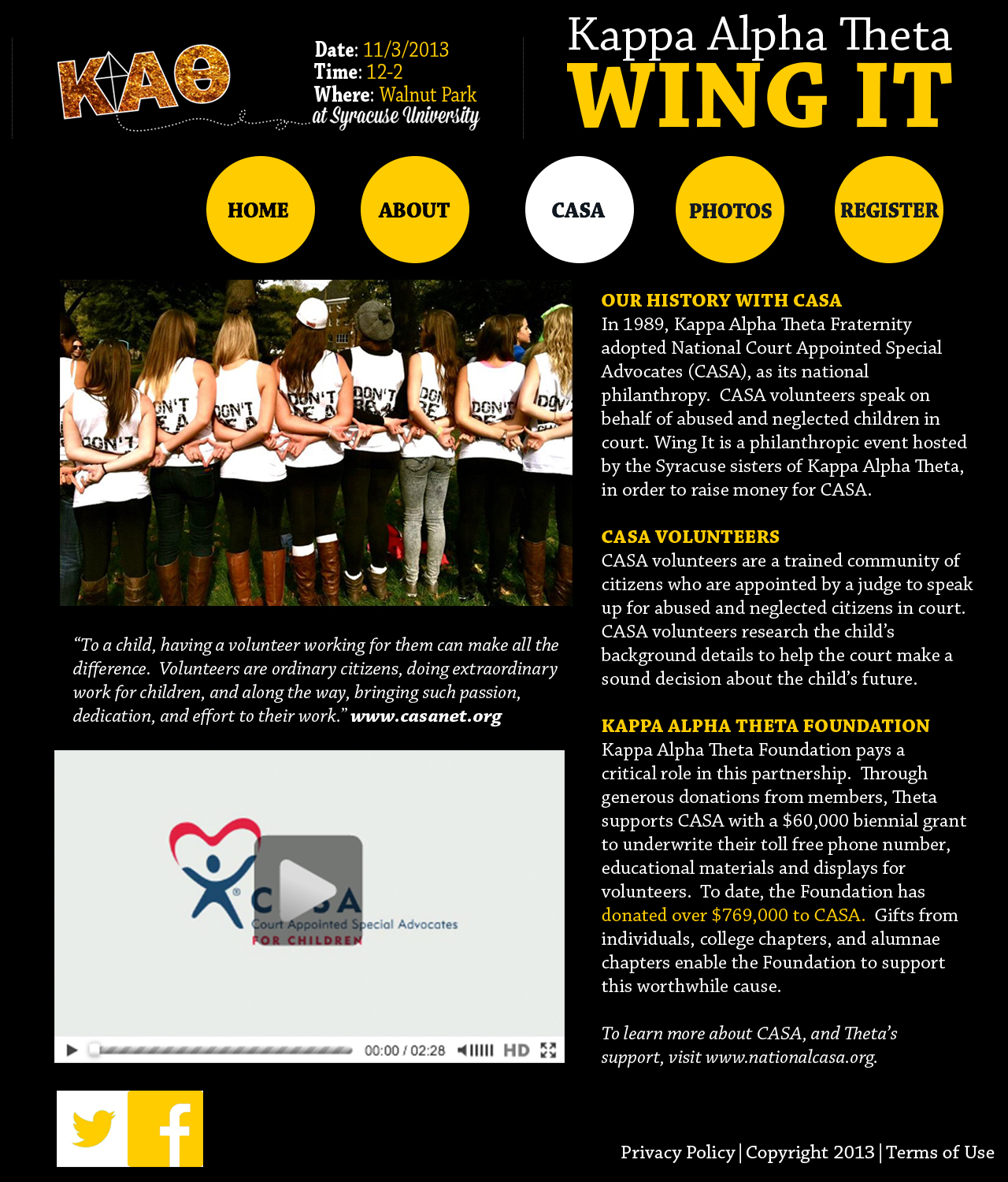
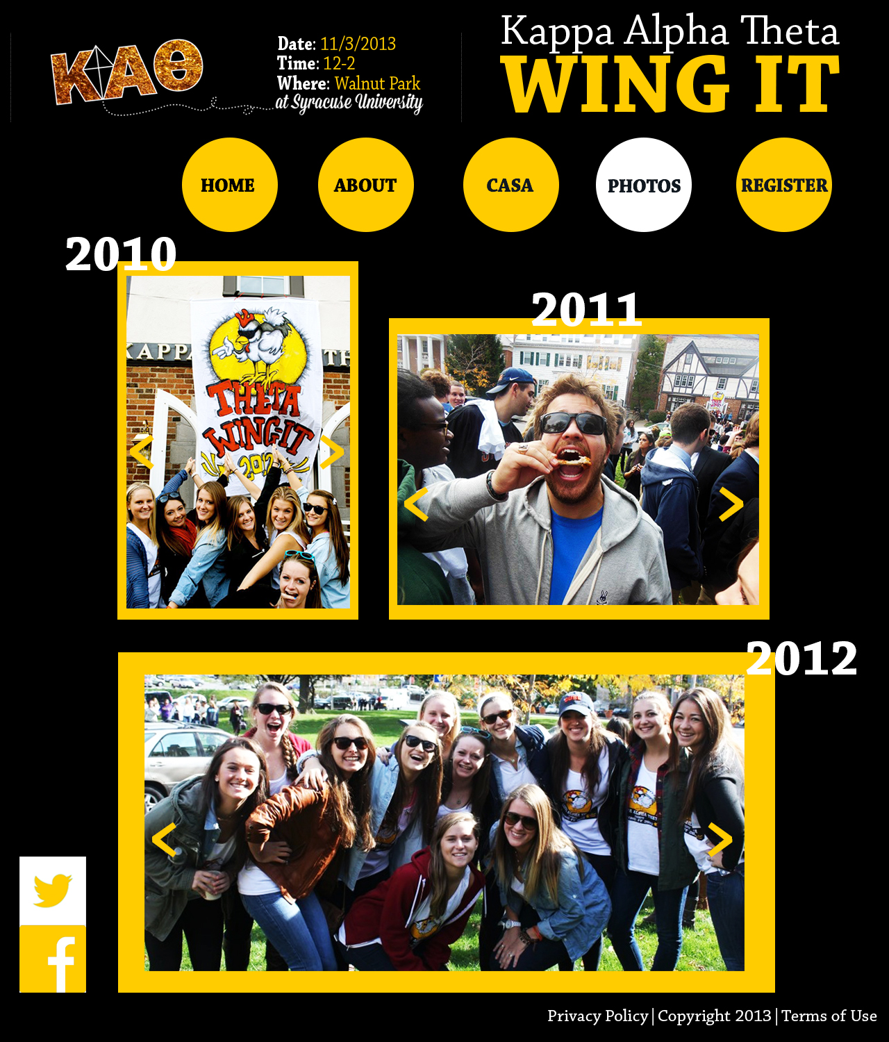
I really like how clean this layout looks. The pictures work perfectly and definitely enhance the website. I also like how the circles work in your design. They stand out and make your navigation very clear. The social media is tailored to the site, and the colors are very “wingy.”
I think your navigation bar is very unique–it’s a little quirky and youthful, which fits since the event is marketed toward college students. It was also smart to keep with the color scheme of the Greek org. Your choice of photos was effective, as well, giving the event a very fun and social feel.