GRA217 has taught me so many valuable skills. Even though I am not a graphics major, knowing how to use the Adobe programs is a skill that I think I will use in school and also in my job. In one of the classes Professor Taylor said we will never look at type the same and she was right. Whenever I see a logo, poster, anything design oriented I now actually stop and critique it in my head. I am really grateful for this class because I feel like I learned skills that will be very valuable in my career.
Author Archives: Kathryn Grant
iPad Magazine jpegs
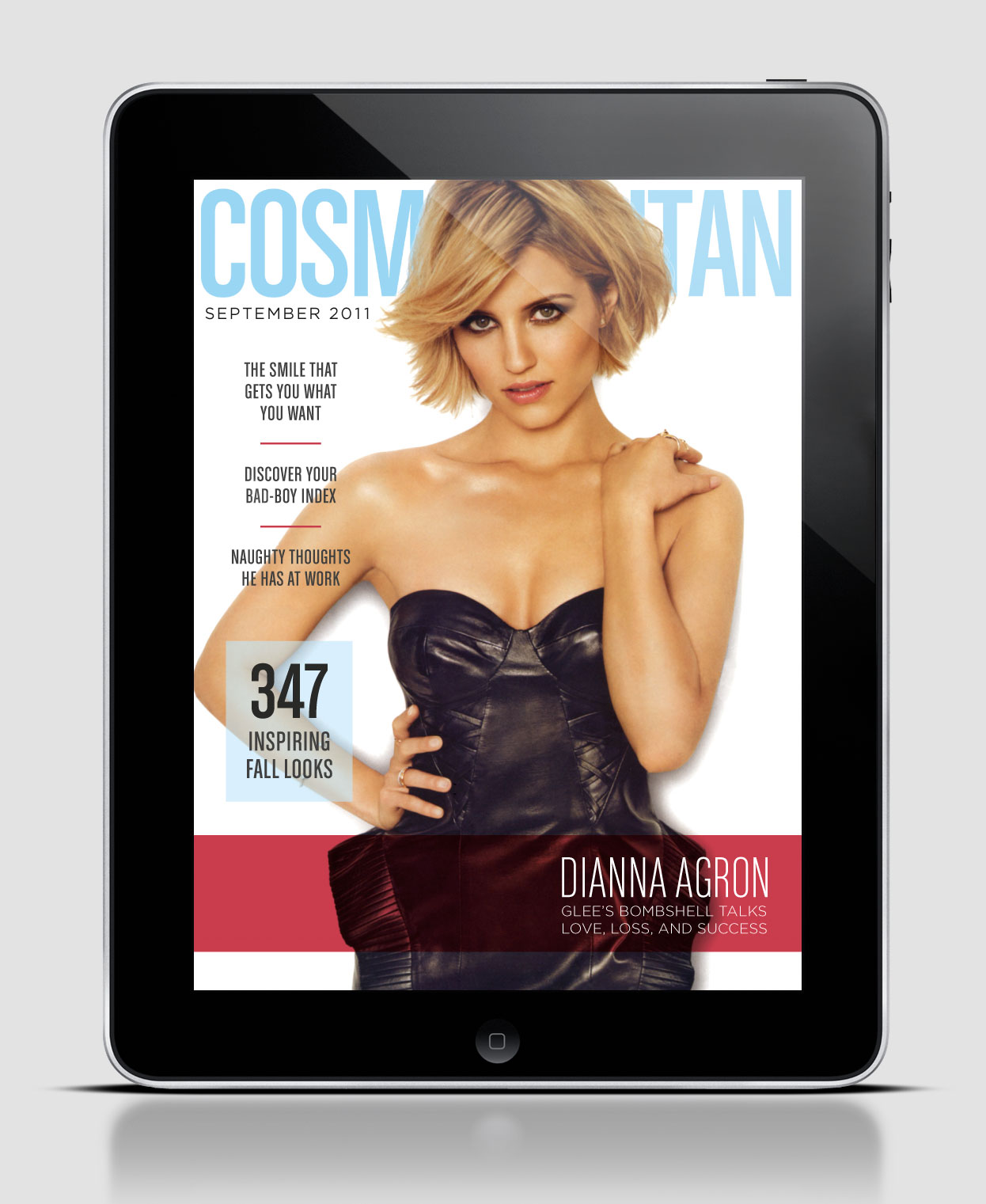
iPad Magazine Cover
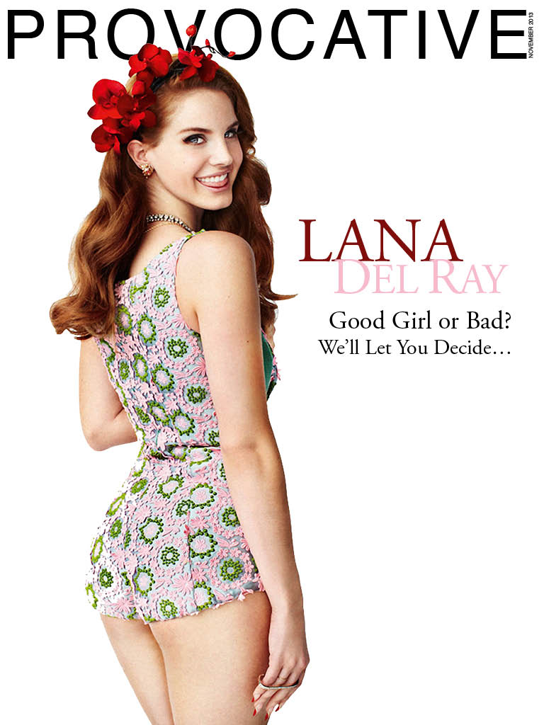
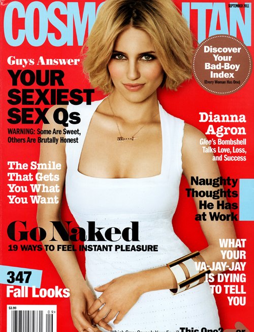
As you can see the digital and print cover for this particular issue are completely different. Although the color scheme stays consistent, where the color is placed is different as well as the picture itself. Another difference is the amount of white space from cover to cover. For the digital design 6 stories were picked to spotlight, whereas the print version has 8. On the digital version the only type that is in bold is the title of the magazine, but on the print version the majority of type is bold. I also thought it was interesting to see the difference in where the type was placed. The print version surrounded the picture with type, whereas the digital version clustered it all to the left except for the story that goes with the cover picture, which is located at the bottom left and highlighted. Although this example is of the same issue the design is so different it almost appears to be a different magazine. Do you think this is good or bad?
HEADLINE AND DECK
Magazine Feature Layout
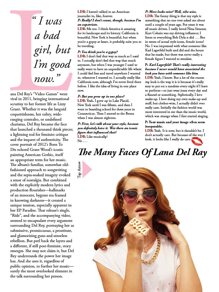
I think the design of this layout is very successful. I really like the way the photo was cropped. The fact that you can not see the women’s face makes the picture very interesting and familiar, kind of like you could know her. I also like that the image portrays movement, by doing so it draws the reader in because the page is dynamic. Another reason this layout is so good is that the picture uses the rule of thirds as well as depth of field. The positioning of the text also really adds to the success of the layout. The readers eye is drawn to the text by having it directly above the peak of the mountain. I also like that the title/text mimics the curve of the mountain. Overall what makes this layout so successful is the use of a strong image and smart placement of text.
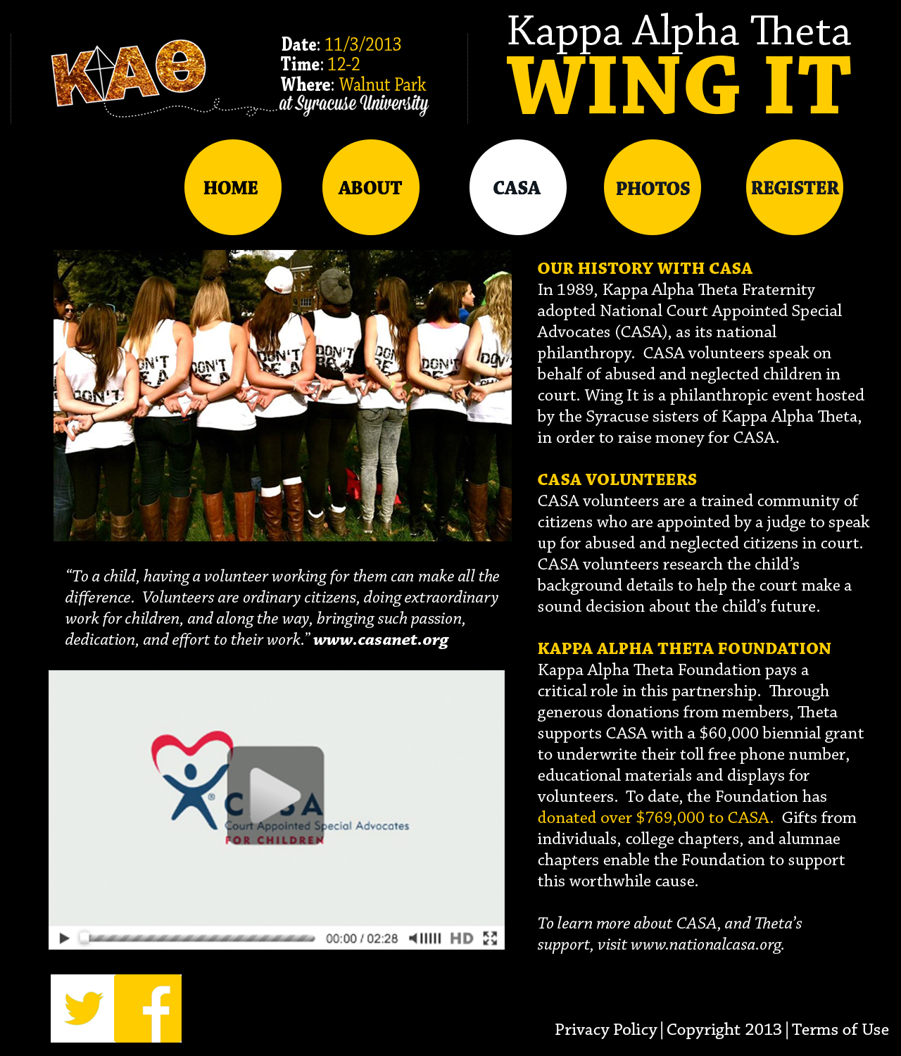
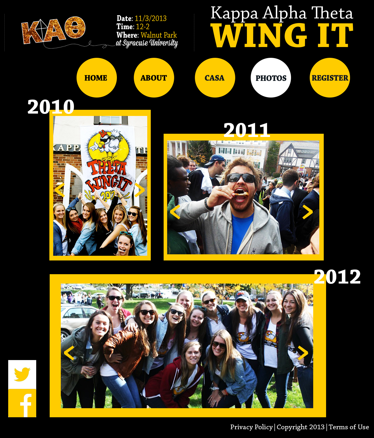
Website
LOGO
 Before sketching my logo I first thought about what I wanted it to communicate. I’ve always loved to travel and would like to do PR for company or organization that works internationally. I thought the perfect symbol to represent my love for travel and work goal would be a globe. I realized that if I made my last initial wide enough it could work as both a globe and G. I then noticed that by simply adding a line in front of the globe I would also represent my first initial.
Website Photography
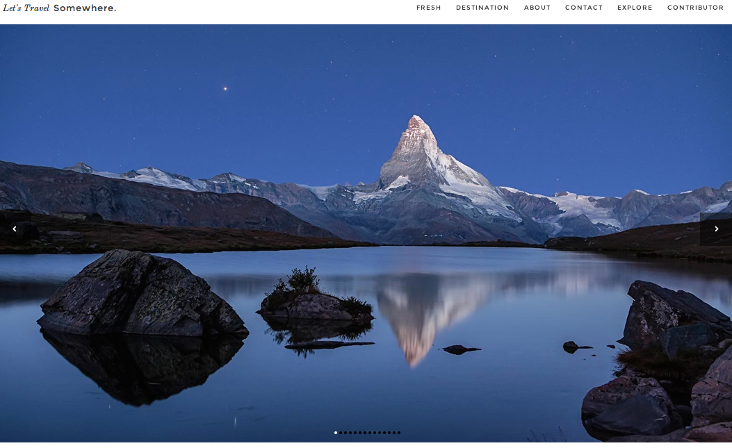
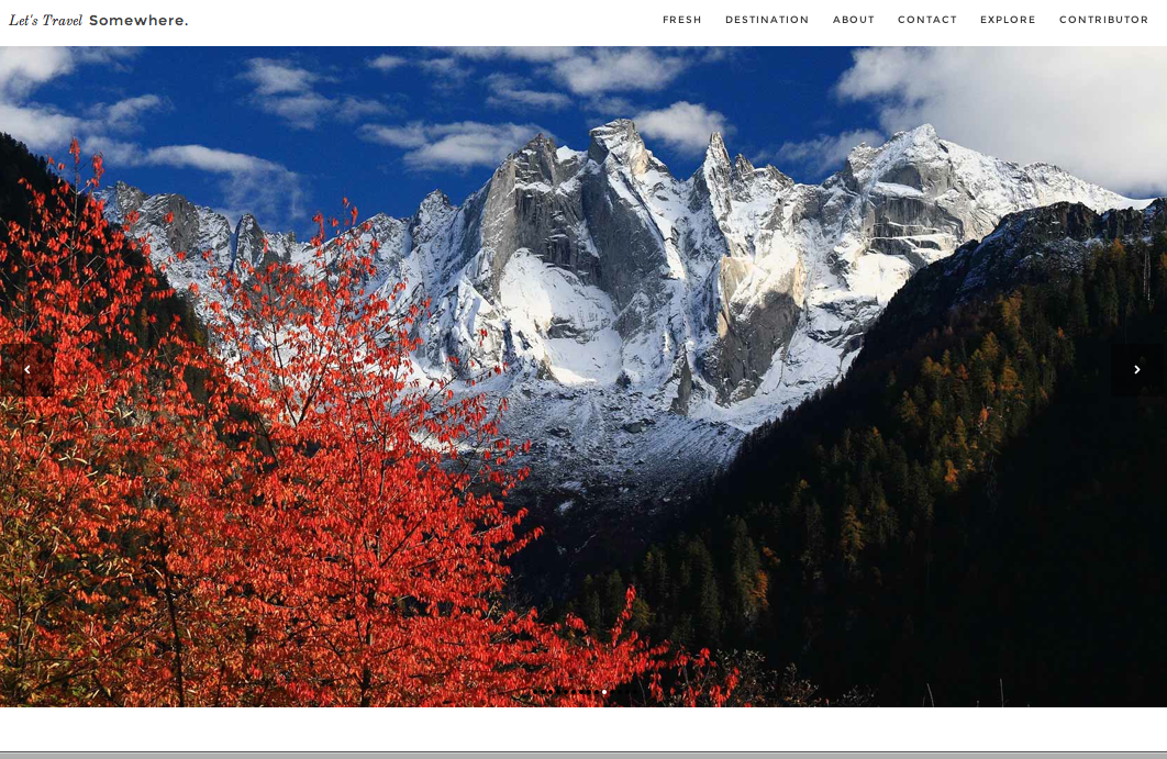
When I found this website I fell in love with its design and use of photos. Let’s Travel Somewhere is a site that features different photographers photos and articles of the places they’ve traveled. This allows the audience to see and “experience” as many places as possible. The idea is that “a single traveler can’t live to see it all” so people can show different parts of the world on this forum. Each page is dominated by photographs. The site setup itself is very simple. All the font is in black and so the main attraction is the beautiful photographs that have very vivid color. The photographs on the home page show a variety of destinations, subjects, and colors. By showing such a wide range of photographs it makes the homepage very interesting and visually appealing. It also guides the audience to click on a photo to see more photos from a particular destination and photographer. 