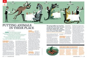
The magazine I chose was Mental Floss magazine because I believe their feature stories are always well designed. I think the use of the large image at the top of the page with interesting content catches the readers eye, and makes the large amount of text less daunting to read. Bringing out the interesting/funny quote from the article helps attract the reader to the content of the story. Additionally, the use of orange, which is a color that pops, helps bring the reader’s eye to the headings of the different parts of the story and also to the sidebar, which includes relevant interesting information.
GRA 217 Section 5 Group 1
The official blog for GRA 217 with Sherri Taylor


