
I was definitely surprised by what I learned in this class. I thought I wouldn’t really be interested in the projects since I’m not interested in design, but I thought it was really interesting to learn about how different visual patterns affect how the viewer receives the information being shared. Additionally, I think it was great that we got to learn how to use a variety of different programs and get pretty well acquainted with them. I had never used the adobe programs before this and I’m definitely going to use these skills going forward.
Author Archives: Nora Horvath
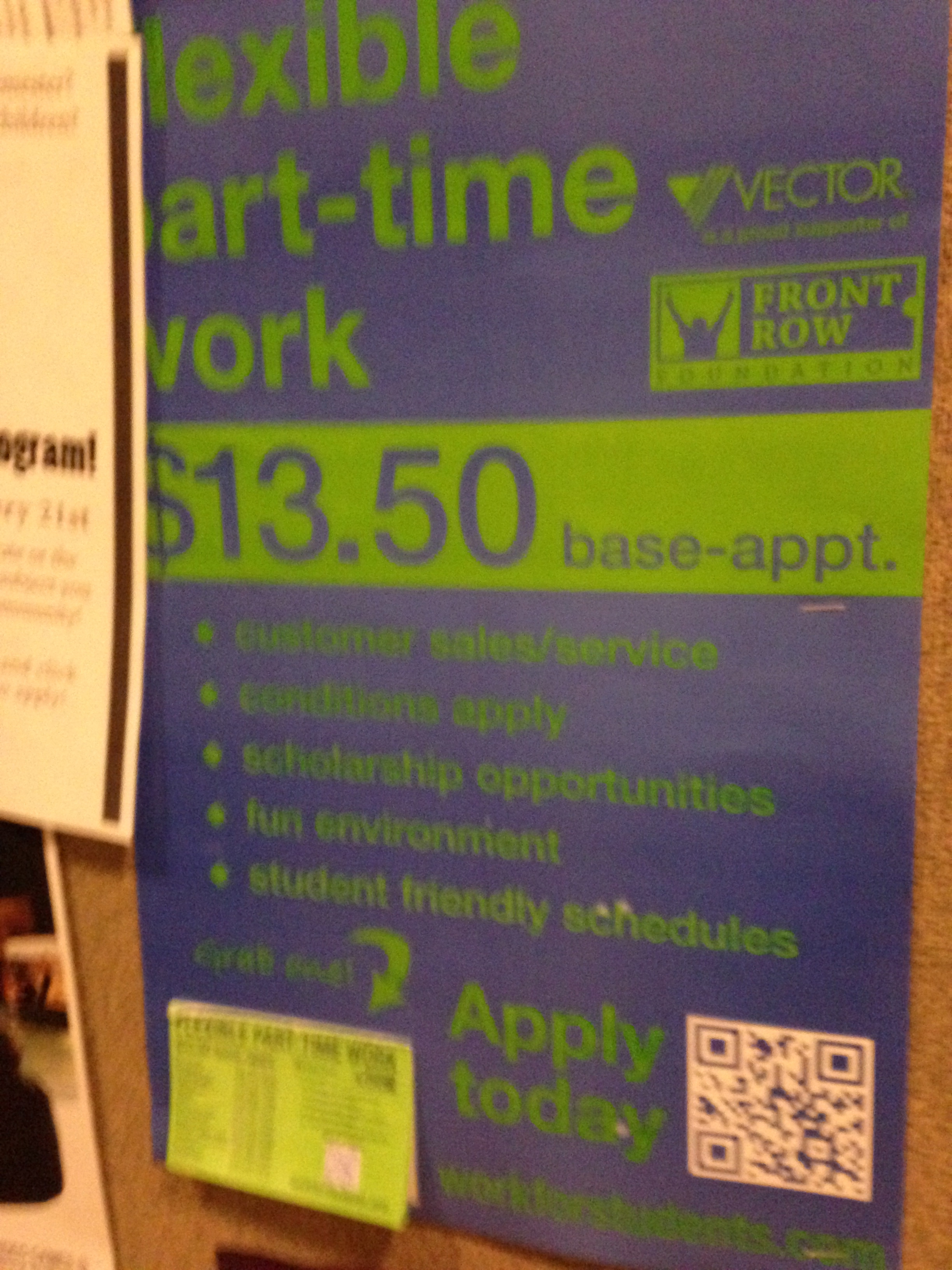
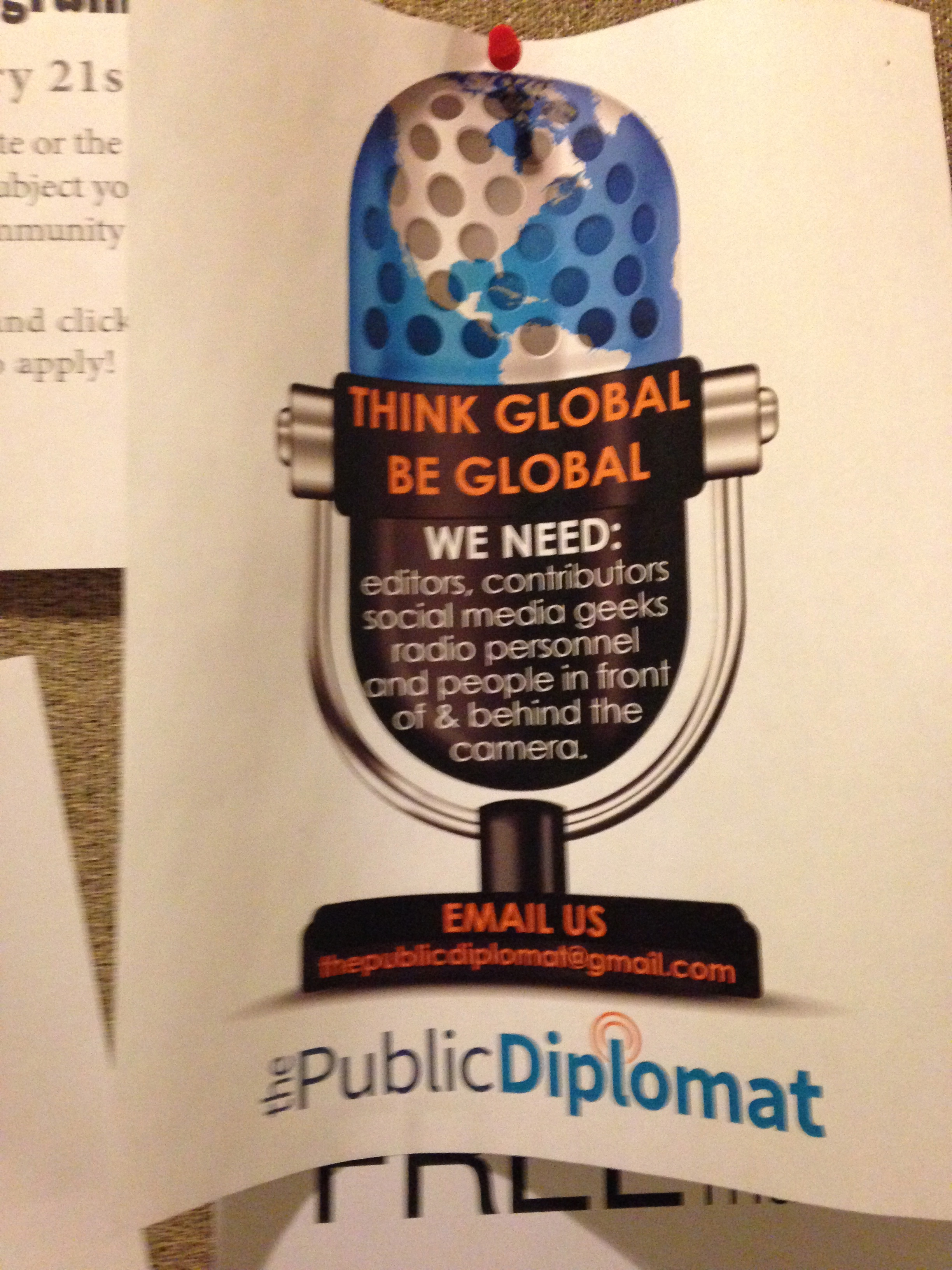
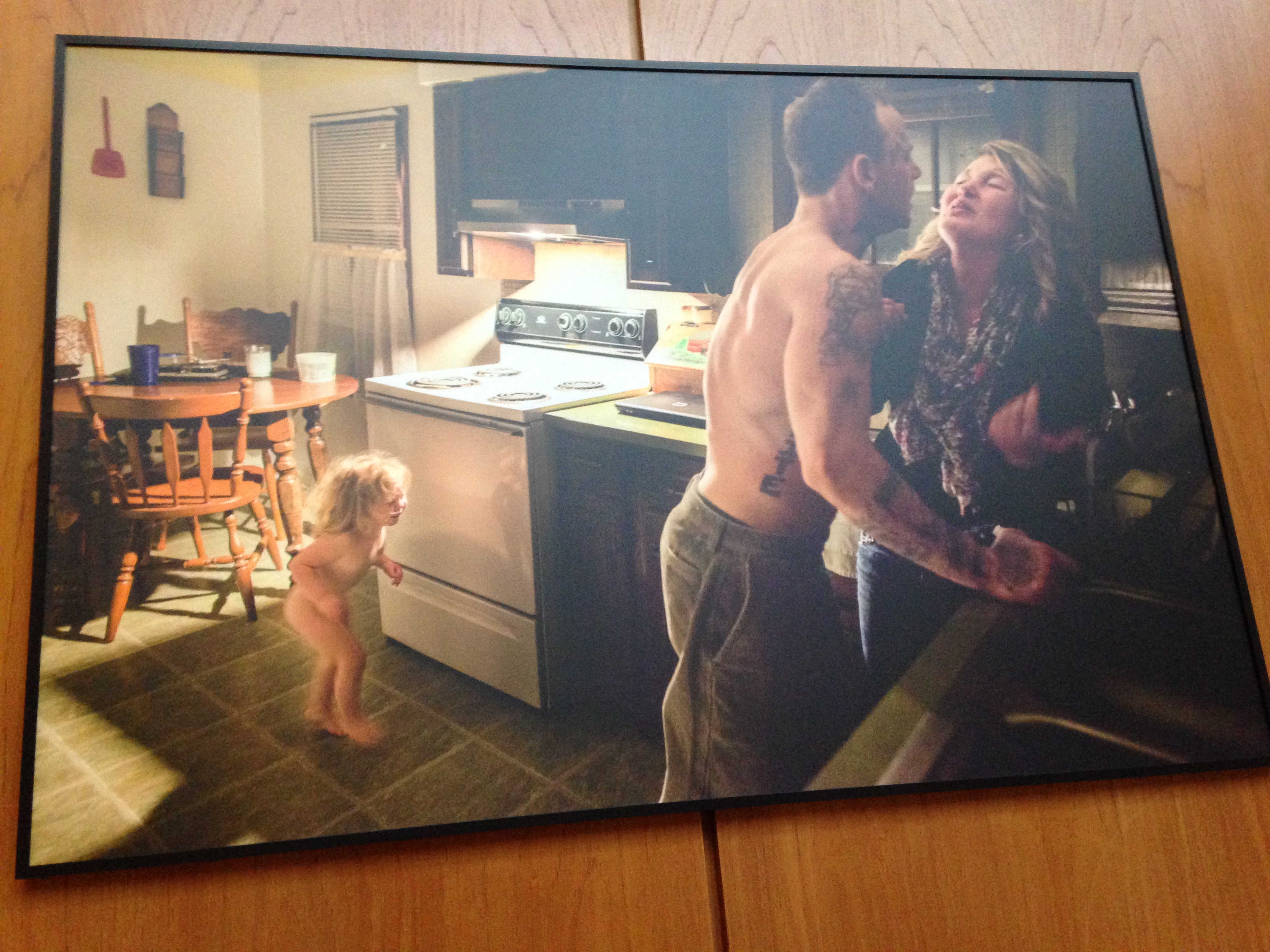
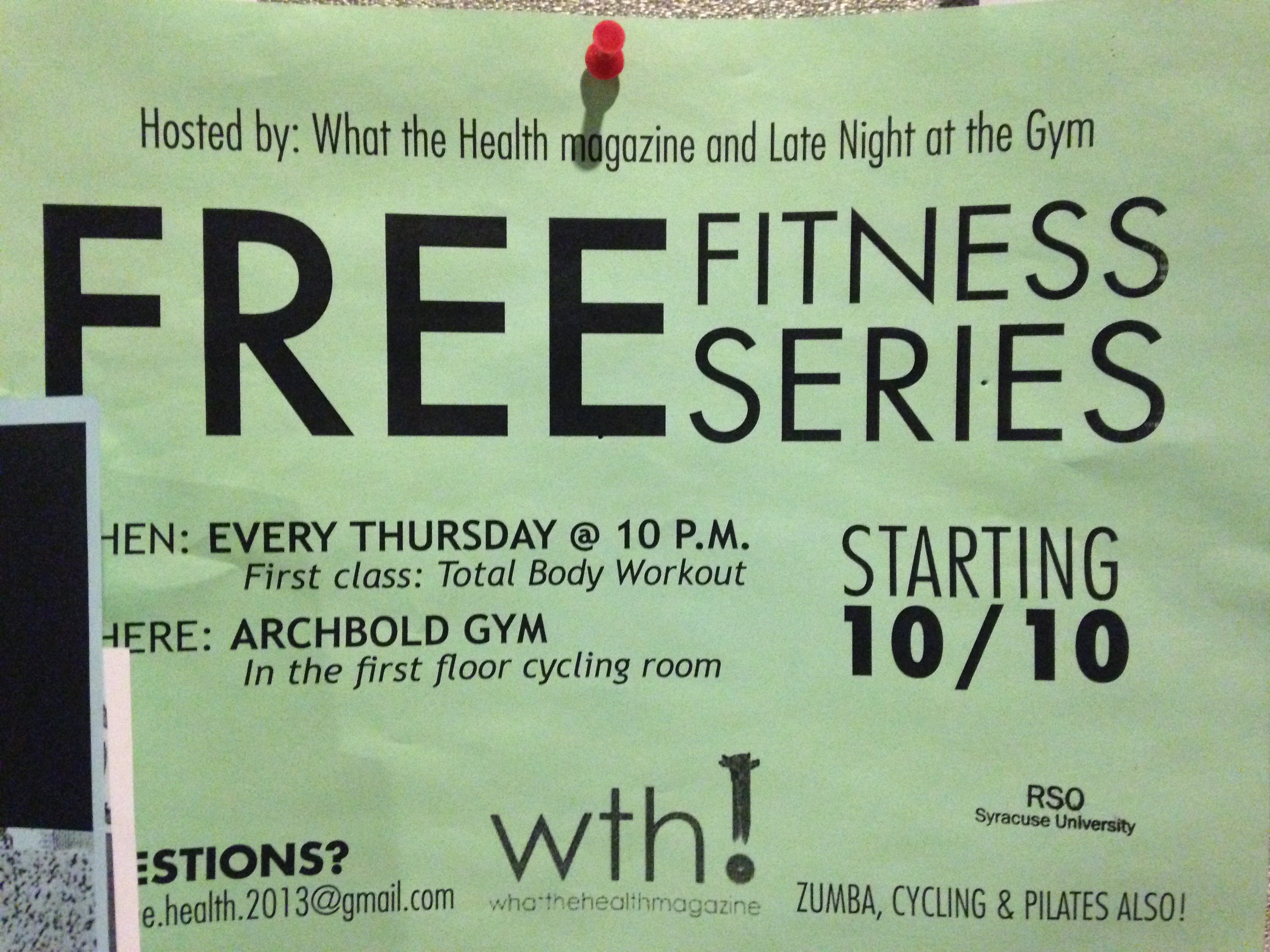
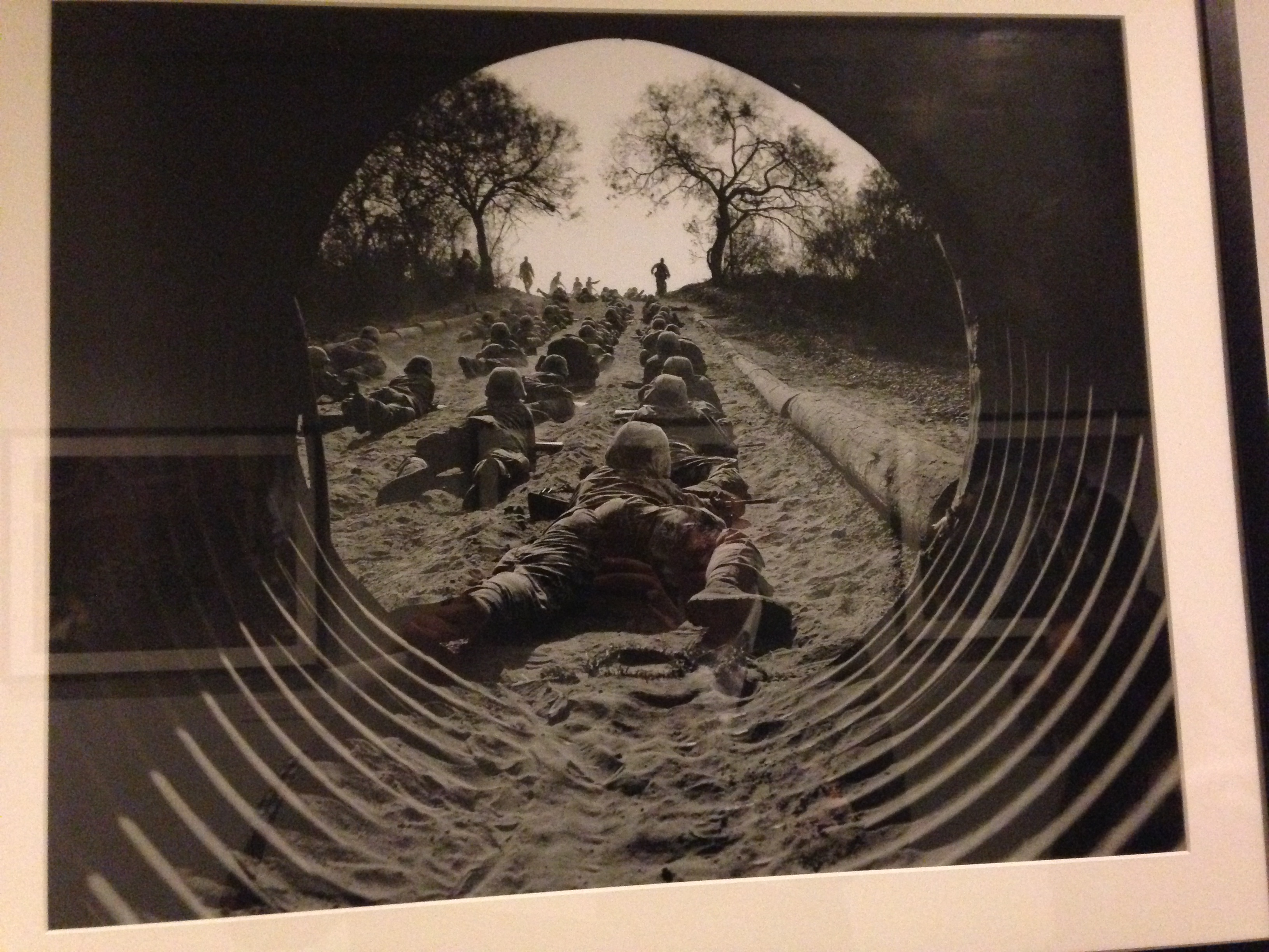
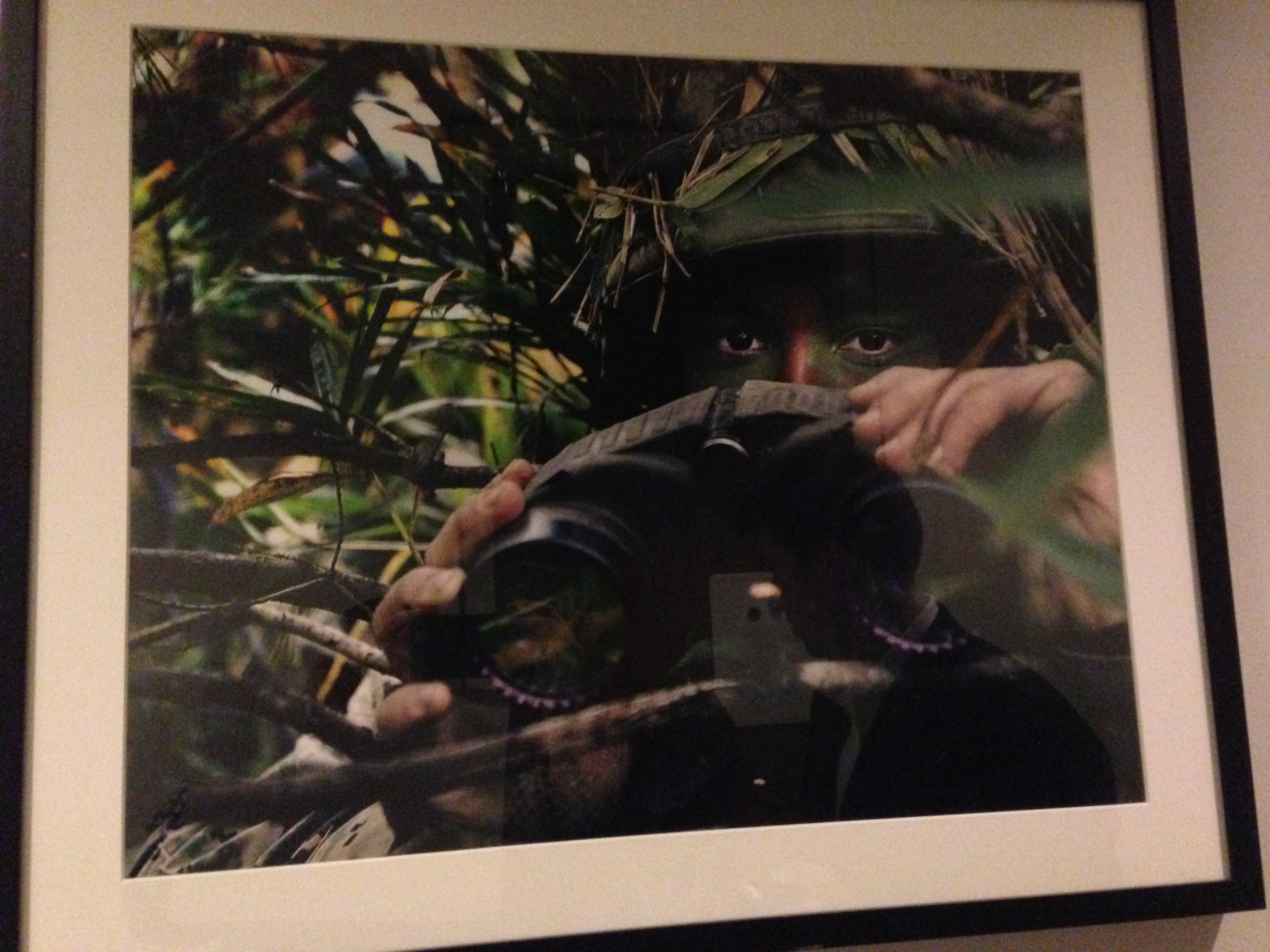
Nora Horvath, Emily Capobianco, Dean Carney scavenger hunt
The photos are in order of number.


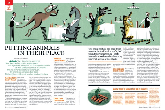
Headline/deck
From Saveur Magazine, November 2013
Headline: Miss American Pie
Deck: How one cook embraced the glory of America’s iconic dessert
I think the headline and the deck are effective because the headline clearly describes what the article is about – pie (Saveur is a food magazine) – while being witty.
The deck is effective because it is an extremely short, clear connector between the heading and the actual body text.
magazine feature layout
The magazine I chose was Mental Floss magazine because I believe their feature stories are always well designed. I think the use of the large image at the top of the page with interesting content catches the readers eye, and makes the large amount of text less daunting to read. Bringing out the interesting/funny quote from the article helps attract the reader to the content of the story. Additionally, the use of orange, which is a color that pops, helps bring the reader’s eye to the headings of the different parts of the story and also to the sidebar, which includes relevant interesting information.
logo
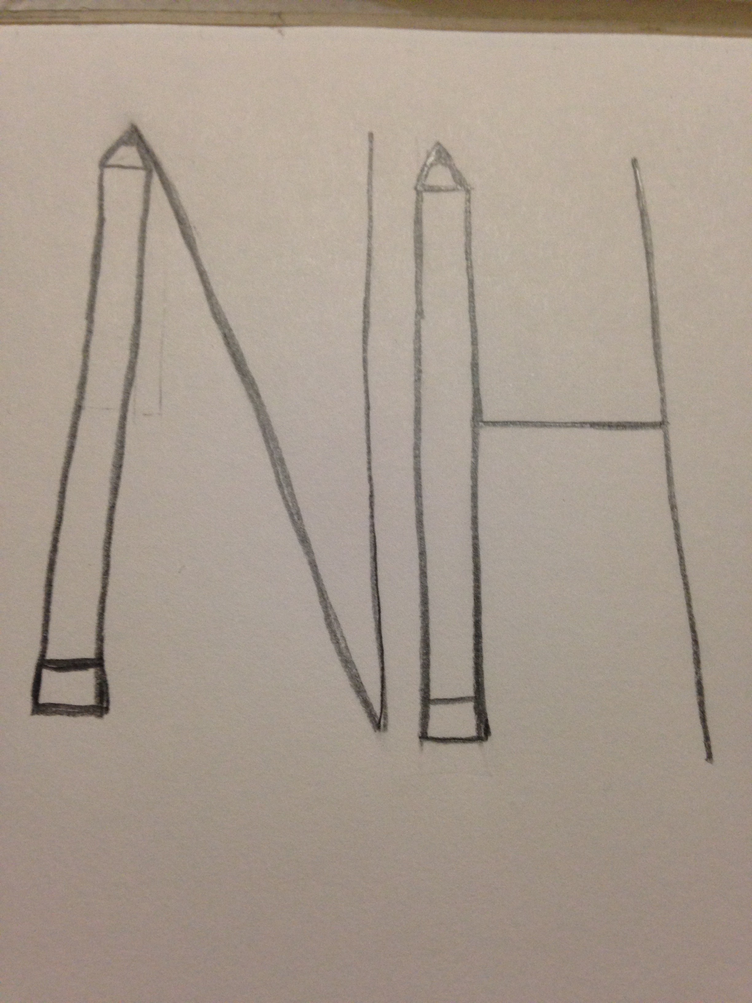
To create my logo I used my initials and the image of a pencil, because I like to write (and my major is magazine). Had I used a computer, I would have probably made the “h” out of a bullet shell instead (because I want to be a war correspondent).
images in webdesign
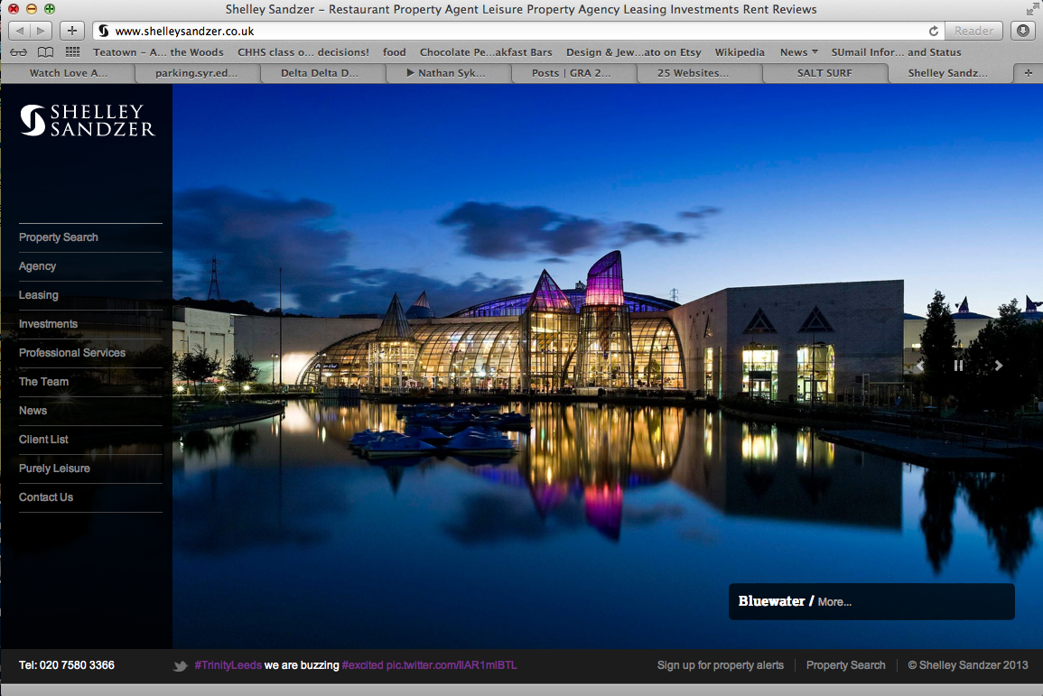
The website i chose to use as an example is Shelley Sandzer, a restaurant/leisure property agency based out of the UK. I think the image is effectively used because it captures the viewer’s eye and brings it right to the center of the page. Additionally, the image demonstrates the prestigious nature of the company and the scale and price of properties that they work on. The colors are vibrant and the image is sharp.
poster project 2
Website Design
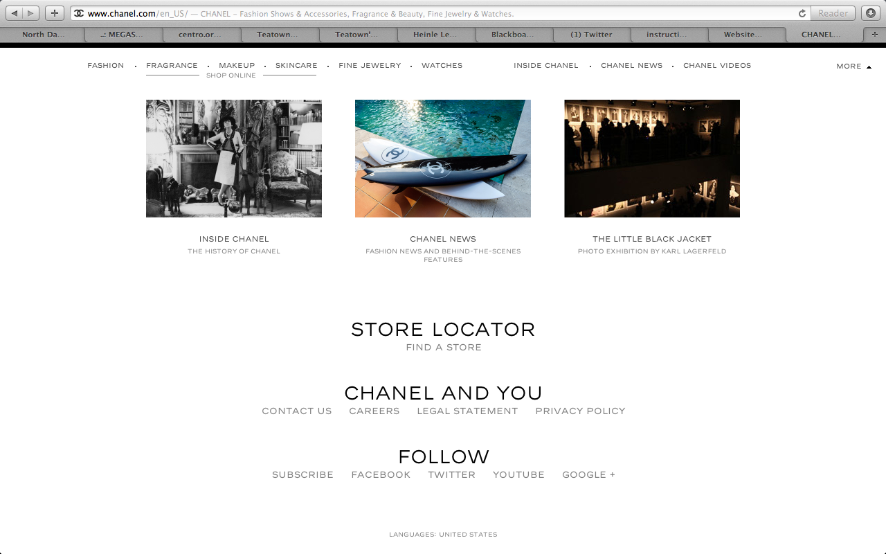
The website I chose was the homepage for the brand Chanel. When you first get to the site a video plays of women walking down the catwalk wearing the brand. When you drag your cursor to the bottom of the page, however, the page changes to a regular homepage with links to direct the user to other places. I think the design of the page is effective because the brand is simple and elegant, and so is the page. Additionally, the designer used the font that chanel always uses, so even though there is no large logo on the page, it is obvious what brand’s site they’re on.
adobe illustrator

This was created in illustrator quite simply. The designer made a number of different sized circles using the shape tool and then chose a number of different colors. They used the fill tool to change the color of the shapes. Then they changed the opacity of each circle so that some appear more transparent than others. The text colors are the same as some of the dots, so everything works together.
Typography
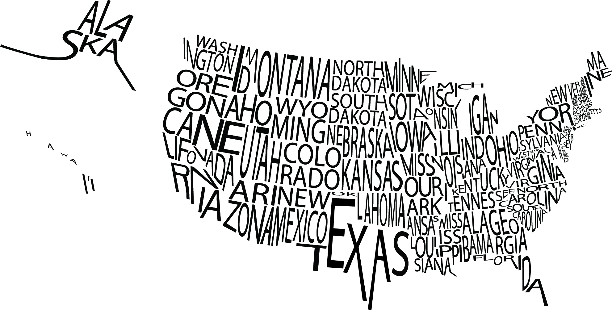
I really liked this typographic image of the United States. I thought the font the designer used works with the image because even though the words are crowded, it’s easy to see which state is which. I think the use of only black and white was also smart because had the designer used color, the entire image would have been harder to read.