
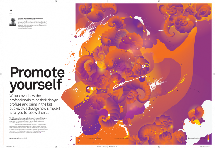
This layout stood out to me because the art direction was so on point. The headline, “Promote yourself” goes perfectly with the visual because the visual has so much life and personality to it. I also like how they didn’t conform to the gutter. They spread the illustration out over two-thirds of the spread rather than stopping at one page–it definitely works to their advantage. Their is very clear visual hierarchy and I really like how the color is integrated with the white background. Catchy and clear.


