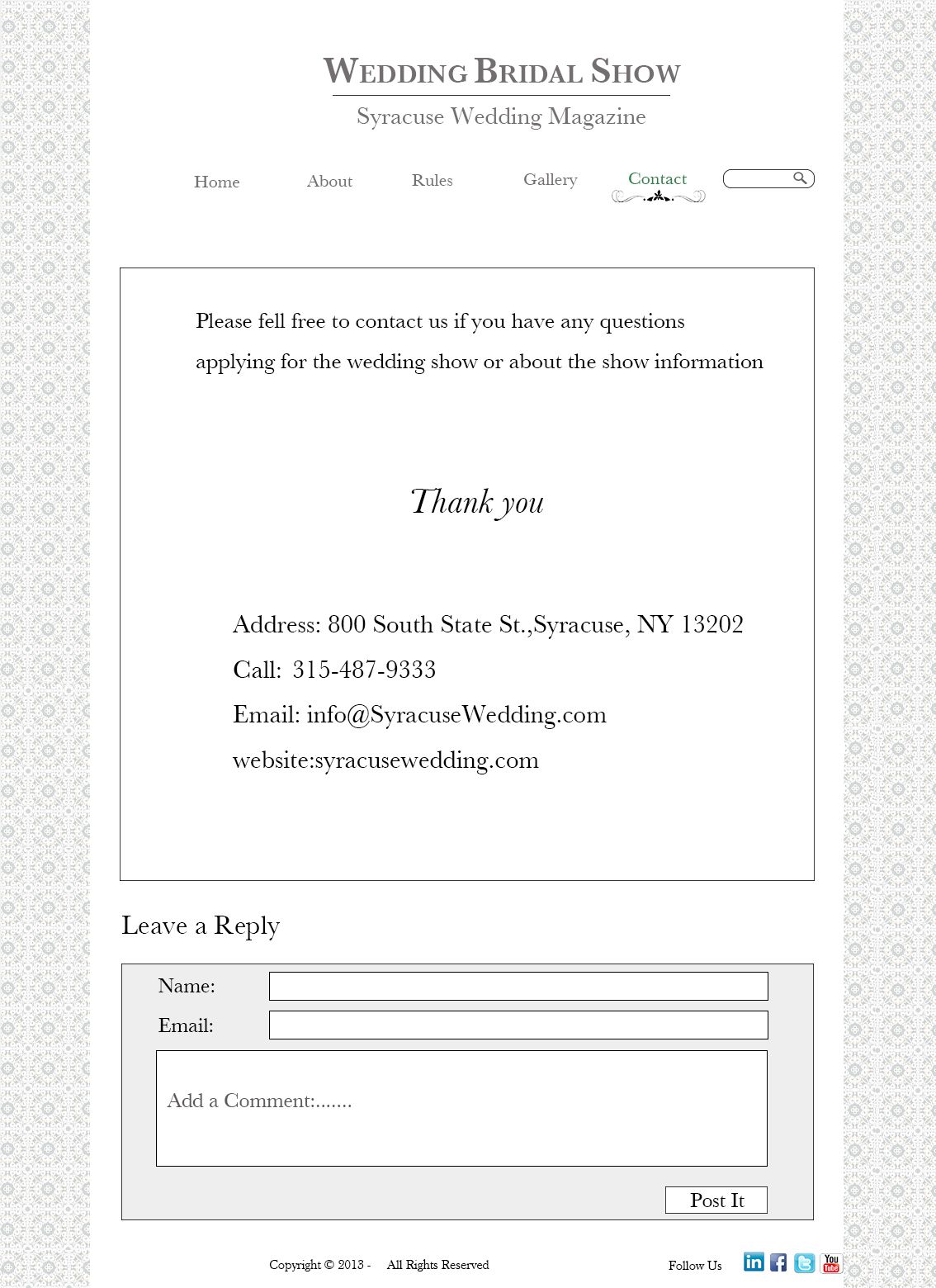
The pearl-white and eggshell color scheme definitely fit with the bridal show. The lace border was also a very nice touch. You do a very good job with keeping with the fairytale aesthetic. However, I’m a little unsure how the show is a nonprofit event–it seems more like a networking opportunity.
This is a beautiful website! The white/gray color scheme and lace borders are definitely reminiscent of a wedding. The photos are light and pretty, and I really like how many of the photos have green accents with the flowers and leaves. The typeface you chose is very appropriate- it looks formal and elegant but still easy to read and not too girly. The simply header fits well with the clean and elegant design of the website, and the navigation bar is appealing. I also like how information on your contact page looks like it’s placed on a wedding invitation. However, I agree that the bridal show seems more like a networking opportunity than a nonprofit event.
your website is beautiful! I am honestly in awe. I think you did an amazing job capturing the essence and perosnality iof the event in the website. Akso i just love the elegant and timeless feel that is has. outstanding job.