Final post

Though I did a floating redo on the ipad project, I posted my ipad design before thanksgiving break and here is the link to it: https://gra217.expressions.syr.edu/s5g1/?p=1514

Before this class, I am unfamiliar with the graphic design software such as indesign and illustrator. This class enable me to have some basic ideas about these softwares. Besides, it also help me understand some basic concept of graphic design. I really like doing the ipad design on illustrator. The interactivity is great.

Bon Appétit Ipad Cover

bonappetite

Generally,  Bon Appétit’s print cover and ipad cover are almost the same. The only difference is that the ipad cover takes away the barcode, date information and price at the bottom of the magazine. That mainly because the it would makes the ipad cover more clearly. Otherwise, for the ipad edition, people don’t need to know the price information for they have already purchased it.

Headline and Deck

屏幕快照 2013-11-08 下午04.35.10

This is a feature story on Economist magazine about Bush leaving the White House. The magazine teased the lack of popularity of Bush’s presidency in the United States. Economist also teased Bush’s poor policy-makings.

Bon Appétit feature layout


bon1 bon2


Bon Appétit is one of my favorite magazines. It’s a food magazine and publish stories including food recipes, restaurant recommendations etc. Almost all the photos in the magazine is beautiful and attractive. People will always be attrated by these pictures. For the feature layout, the magazine also relies heavily on photos. The food always look fresh in the pictures. The picture also applies wonderful colors.

Logo

I have already designed my personal logo in the resume project. I want like to keep it very simple and recognized. The simplest design is the best design. I put the first letter of my first name and surname, “n” and “d” together. I tired different combination of these two letters like “ND”,”nd”,”nD” etc. At the end, I choose the combination of “nD”.

logo

Website photography

For the fashion website, it’s extremely important for them to use the photos to show the beauty of the products and attract customer’s attention. Particularly for the wedding dress, the website have to show the elegance and the beauty of the products and unconsciously connect the product to the happiness of love and marriage.

For the famous Vera Wang wedding dress, the website highly rely on the photography. On the front page, they only apply one big photo, applying beautiful photography. The bride will easily attract customers for she is the only one person in the photo and she is very bright. The photo also clearly shows the look of the wedding dress especially the unique design on collar and layered cuts of the leg opening. The customers can see the good quality of the products as well. All the background image make the bride and the wedding dress stand out easily. Customers interested in wedding photo will addict to nothing but just the wedding dress for its beauty and elegance.


屏幕快照 2013-10-18 下午11.05.09

Apple – Web Design

屏幕快照 2013-10-11 下午11.06.43

Apple’s website is one of the best websites.

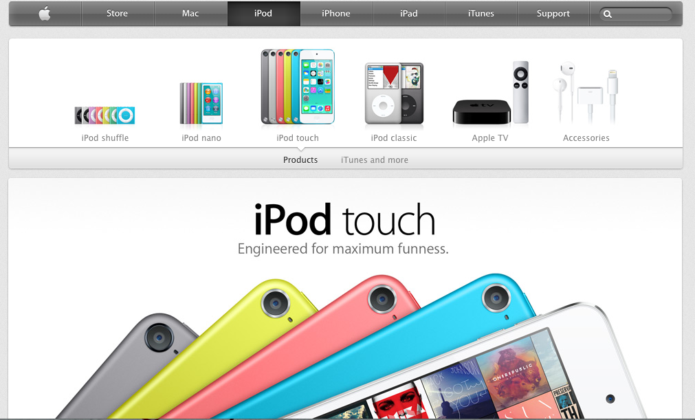
First of all, apple use the color dark grey and silver as its main color in the web design. The color looks similar to black and white, which is the best contract color. However, grey and silver comforts people’s eyes. And also, when introducing products, Apple always uses big and high-definition pictures that usually occupy the whole page. It makes the object stands out easily. Besides, apple products are usually in black, white or silver. These three color are easily stand out on a white web page.

Secondly, all the pages are applied the same font- myriad, the similar color – grey, white and silver and the same alignment. Apple website makes a good example of consistency and proximity.

Besides, apple also gives good example of visual hierarchy. The toolbar on the top is in grey. It’s not annoying or attract too much information while still gives its own function – navigate the users to different pages they want. They always put the big pictures of the latest product the company wants to advertise or promote on the particular pages. No other pictures will be bigger. It clearly attracts customer’s attention and would be distracted.