
Bon Appétit is one of my favorite magazines. It’s a food magazine and publish stories including food recipes, restaurant recommendations etc. Almost all the photos in the magazine is beautiful and attractive. People will always be attrated by these pictures. For the feature layout, the magazine also relies heavily on photos. The food always look fresh in the pictures. The picture also applies wonderful colors.


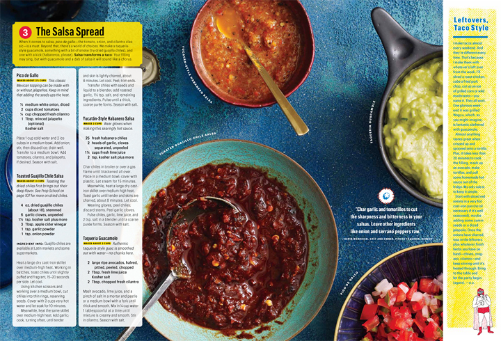
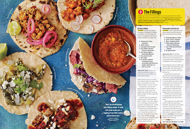
I really like this magazine layout. I think that the colors used are very vibrant and eye catching, for both the text background and the food. I also really like that in each photo the end of a spoon is pointing to the text, this leads the readers eye from the picture to the story. Another great aspect of this layout is that the columns the text are in are translucent which makes the whole page flow.