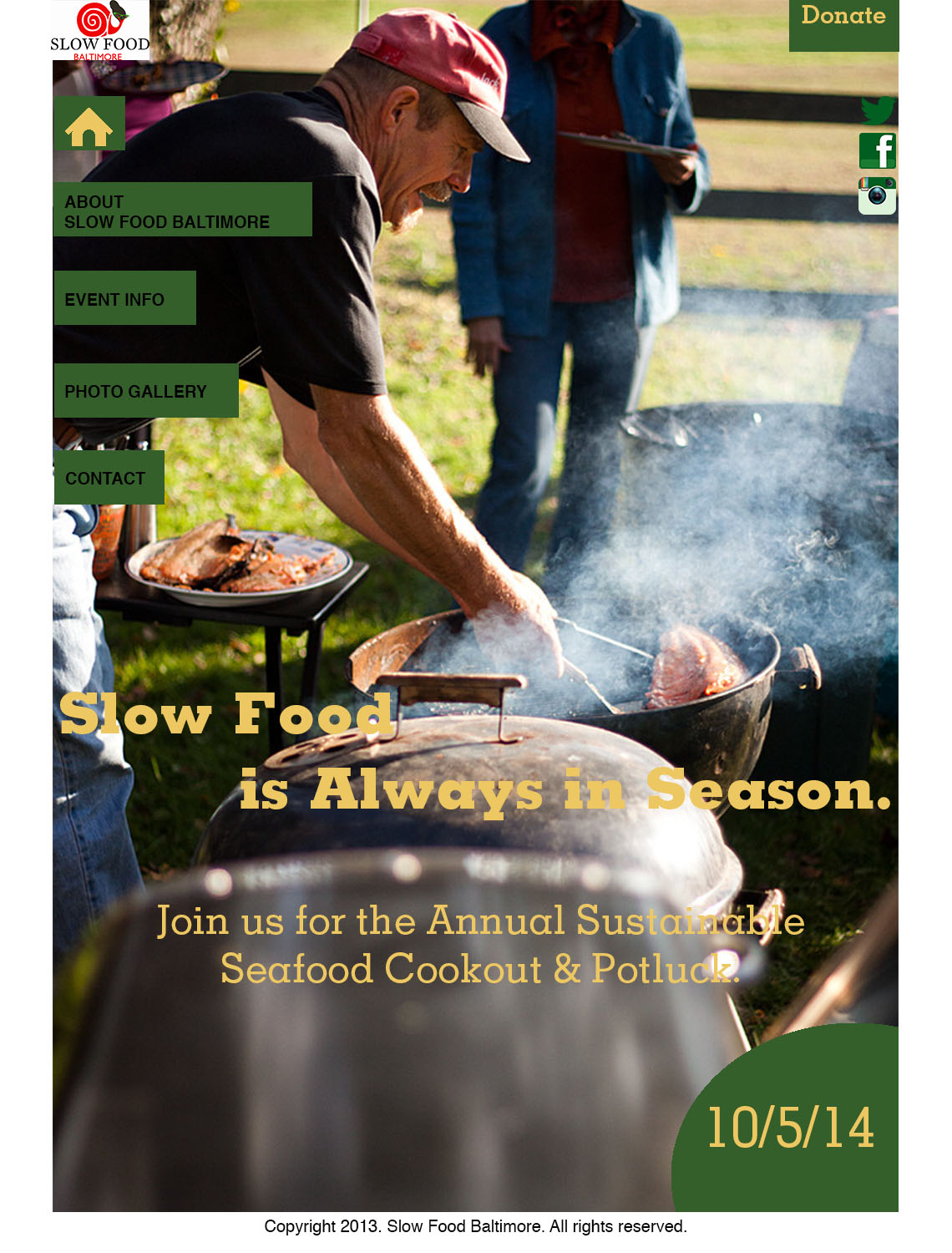
I really like this website design! Using photos as the dominant element on the site really attracts attention and prevents the pages from being overwhelming. I especially like how the “home” and “contact” pages are simply text placed against a photo that fills the screen. The photos you chose nicely represent the organization, too. The color scheme ties everything together well- the yellow and green navigation bar, text and background colors match dominant colors in most of your photos. The navigation bar is easy to access and is creatively placed, and I really like how you include social media on every page.
I think your home page actually looks more like a magazine cover than a website and I really like this! It’s very clean and sophisticated and completely stays away from the typical, boring website layout. I think a lot of this has to do with your use of a picture as the entire background, and your choice to differentiate from the usual horizontal navigation bar. The picture you use on the front page has a very obvious point of focus and gives you a general idea about what the event is about. It must’ve been hard to find a picture that would look clear when blown up that large and that cropped well enough to use.
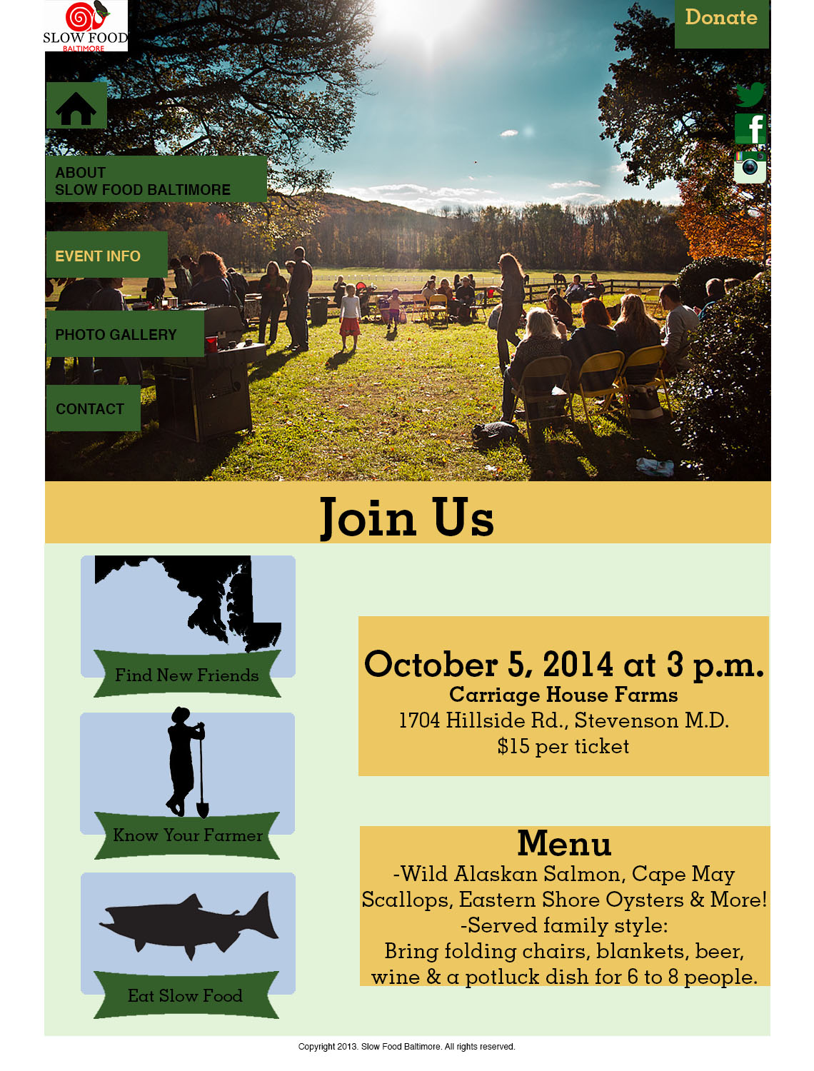
As far as the other pages go, I think there is a strong sense of continuity among then. You do a good job of leading your viewer through the site with your strong use of the green and yellow color. The yellow bar across the center of the about, event info and photo gallery page breaks the page up nicely between the picture and the content but also gives something for a reader’s eye to continually look for throughout the website. It grounds the pages and minimizes any confusion.
You went with a very nontraditional design here and I think it is extremely effective. I especially like the way the navigation bar is laid out across the side of the page. Also you utilize exceptional visual hierarchy with the big picture at the top of the page and all of the info at the bottom. When people think outside the box for this project in terms of design it tends to end up looking more like a poster than a website. But this is a great example of how it can be done without conforming to website standard. Really cool.
I really like your choice of photos in your website project. The pictures are professional looking and they are so beautiful. They could be used in a travel magazine very well. However, I agree with Julia’s opinion that the home page look like a magazine cover and I believe it’s a very good design. However, I think you should do a little bit change to your navigation bar because the black letters in the green box is not very read-friendly. You might want to change it to yellow, the same color as the headline’s. Overall, it’s a very nice website.
I love this web design! your images are amazing and make me want to actually stay on the website. I love how you were able to keep the whole design very simple but foundways to change the layout for each page. Every aspect of this website is amazing and it looks very interactive! great job!


I really like this website design! Using photos as the dominant element on the site really attracts attention and prevents the pages from being overwhelming. I especially like how the “home” and “contact” pages are simply text placed against a photo that fills the screen. The photos you chose nicely represent the organization, too. The color scheme ties everything together well- the yellow and green navigation bar, text and background colors match dominant colors in most of your photos. The navigation bar is easy to access and is creatively placed, and I really like how you include social media on every page.
I think your home page actually looks more like a magazine cover than a website and I really like this! It’s very clean and sophisticated and completely stays away from the typical, boring website layout. I think a lot of this has to do with your use of a picture as the entire background, and your choice to differentiate from the usual horizontal navigation bar. The picture you use on the front page has a very obvious point of focus and gives you a general idea about what the event is about. It must’ve been hard to find a picture that would look clear when blown up that large and that cropped well enough to use.
As far as the other pages go, I think there is a strong sense of continuity among then. You do a good job of leading your viewer through the site with your strong use of the green and yellow color. The yellow bar across the center of the about, event info and photo gallery page breaks the page up nicely between the picture and the content but also gives something for a reader’s eye to continually look for throughout the website. It grounds the pages and minimizes any confusion.
You went with a very nontraditional design here and I think it is extremely effective. I especially like the way the navigation bar is laid out across the side of the page. Also you utilize exceptional visual hierarchy with the big picture at the top of the page and all of the info at the bottom. When people think outside the box for this project in terms of design it tends to end up looking more like a poster than a website. But this is a great example of how it can be done without conforming to website standard. Really cool.
I really like your choice of photos in your website project. The pictures are professional looking and they are so beautiful. They could be used in a travel magazine very well. However, I agree with Julia’s opinion that the home page look like a magazine cover and I believe it’s a very good design. However, I think you should do a little bit change to your navigation bar because the black letters in the green box is not very read-friendly. You might want to change it to yellow, the same color as the headline’s. Overall, it’s a very nice website.
I love this web design! your images are amazing and make me want to actually stay on the website. I love how you were able to keep the whole design very simple but foundways to change the layout for each page. Every aspect of this website is amazing and it looks very interactive! great job!