
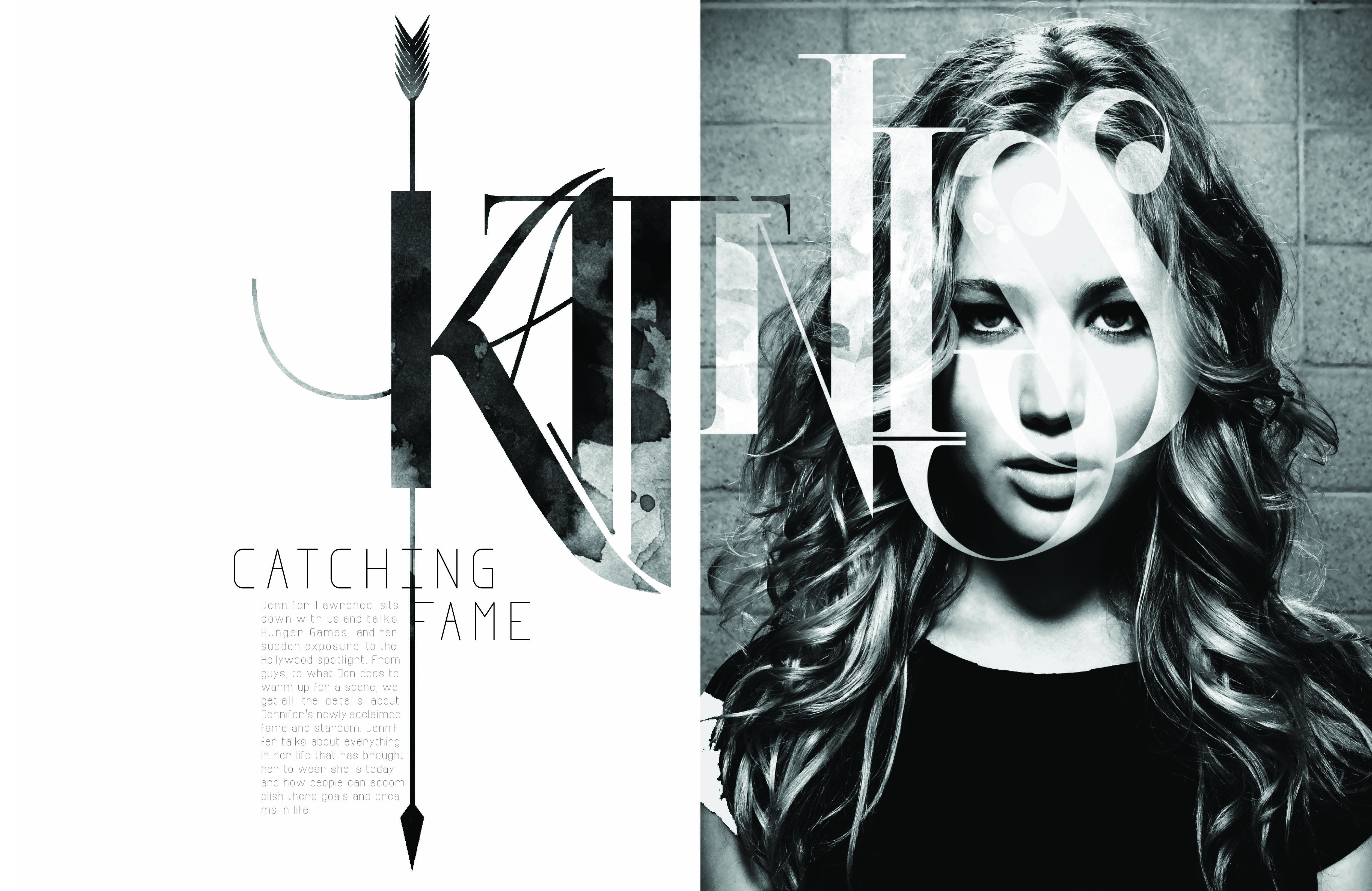
I really love this two page spread, and not just because I love the Hunger Games. Although this design shows no color, it is far from plain and simple. The typeface used for “Katniss” is extremely creative. The designer also incorporated a different picture within the typeface to contrast from the picture of Jennifer Lawrence. The texture seems to be either dirt or blood stained, sticking to the theme of the movie. The arrow going through the K also fits perfectly with the theme of the written piece (which is about Jennifer’s role in the movie) because it is one of the main sources of survival for Katniss. The designer further perfected this design by making the arrow go through the K in Katniss, the I in Catching and the F in Fame. Not to mention that Jennifer Lawrence looks absolutely beautiful.


The two page design is very classic in the magazine industry. I really love this magazine feature design very well. On the one hand, the photo of Jennifer Lawrence is very attractive and fits the dominant color of grey and white very well. On the other hand, it serves the content very well. Besides, the design of the headline is also very appealing. It’s very classic and gothic. The designer makes the K like an bow with arrows which fits Jennifer Lawrence in the movie.