All the pages of your website seem very connected and there is a strong sense of continuity. Also, while most people (or at least me) just stuck on the copyright and terms of use at the end as an afterthought, I like how prominent you made it by putting it in the pink box. This, along with the navigation bar, grounds all the pages and defines the space that the viewer should be looking at.
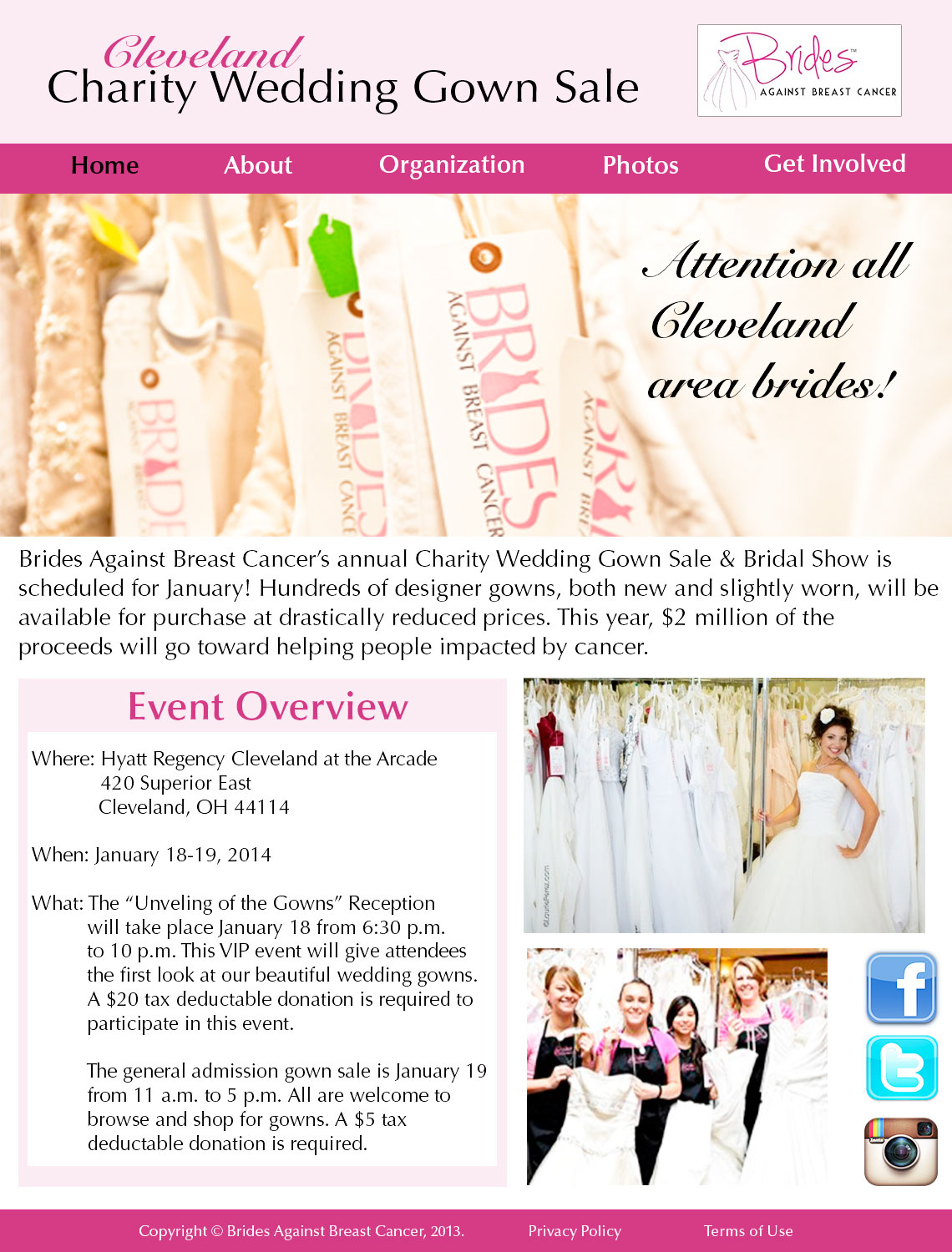
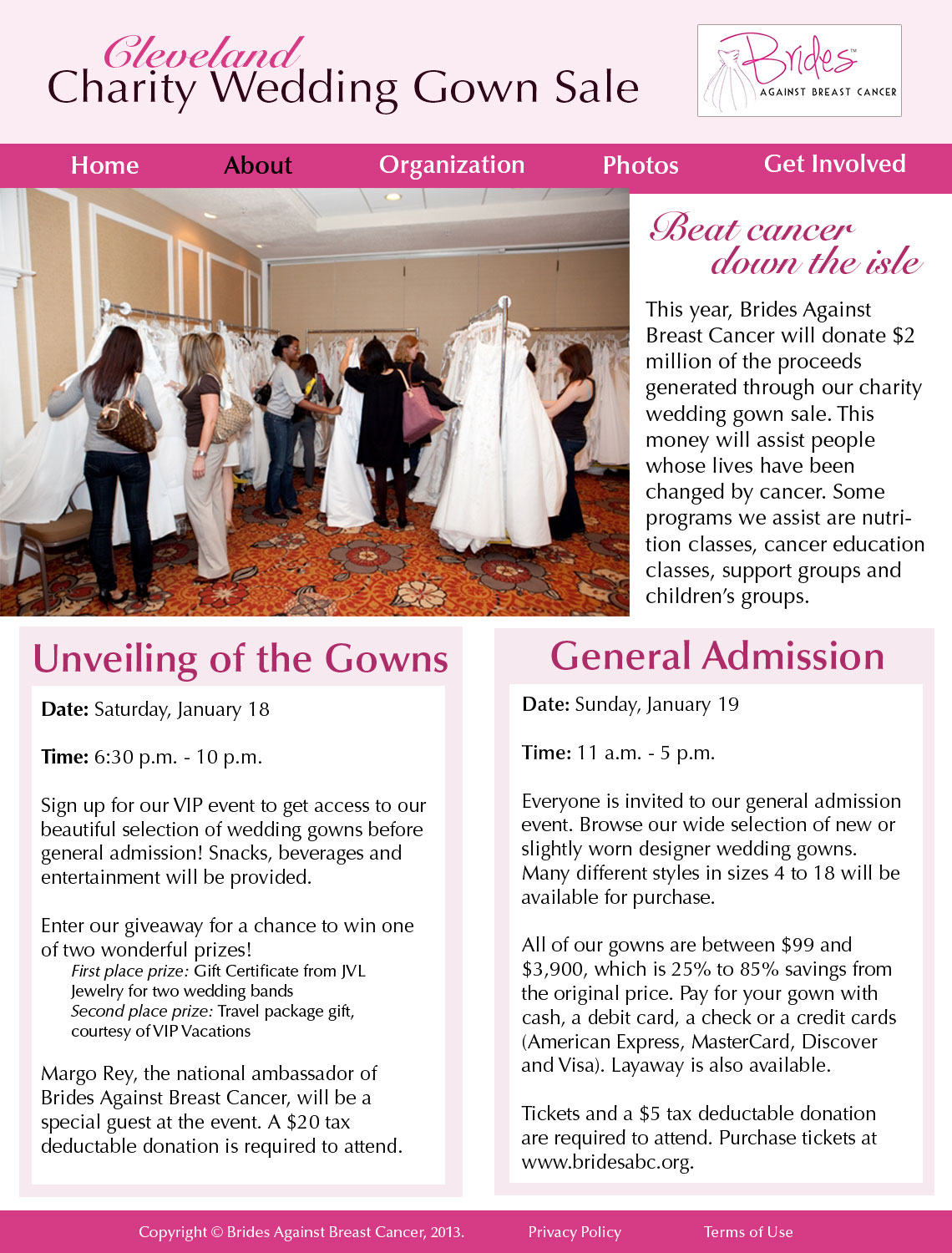
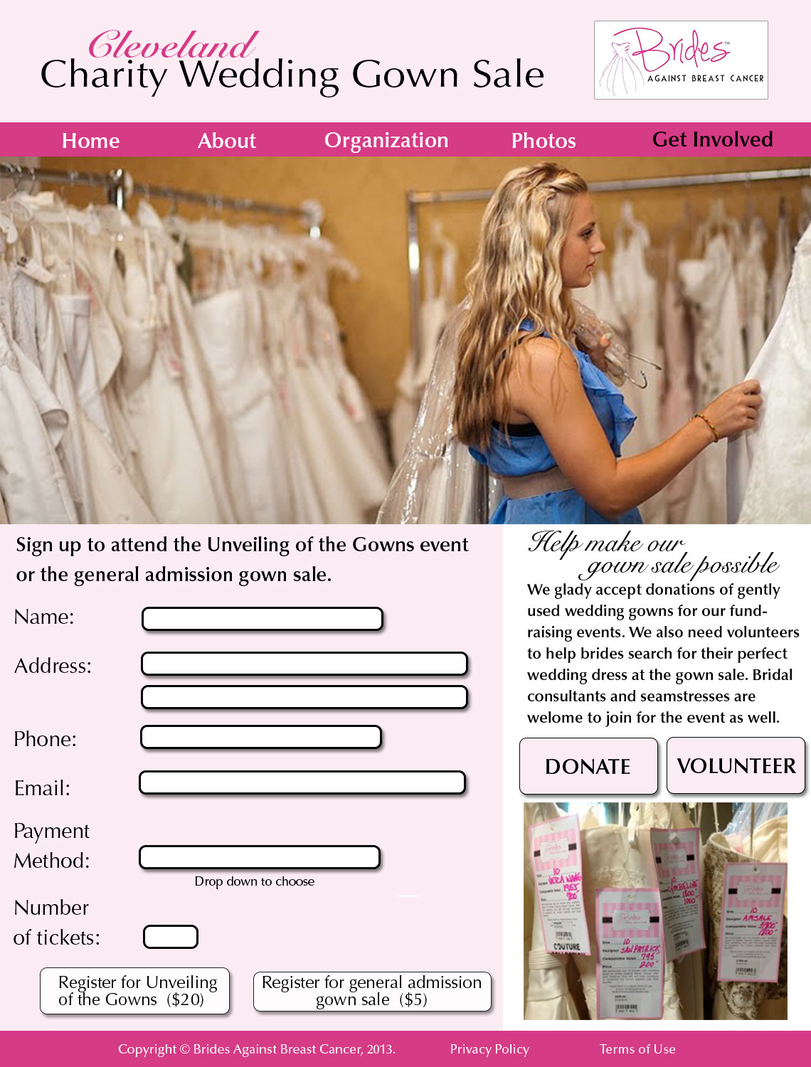
As far as pictures go, I really like them all and I like that you included a lot of them. My favorite one is the one of the girl in the blue shirt that is on the “Get Involved” page. The picture really lends itself to being cropped that wide and I like how far the girl is off the right. I feel like the pciture on the “About” page doesn’t really have a strong point of focus, there’s nothing that jumps out as the main part of the picture, but the wideness of the shot does offer variation when compared to the other pictures that are mostly close-ups or feature just one person. So while I think a lot of pictures like this one would have really hurt your website, just including this one added variety to the pictures you feature.
I really like your website. It’s very consistent and clean designed. The choice of pictures are very connected to the pages. Besides, I really like your choice of the color – the pink is not very dazzling but fits the website very well.
I also like your choice of font of the headline and the content. The headline font is very classic and novel while the content is very clean and increase great readability and legibility. The boxes are used very well to give enough information.
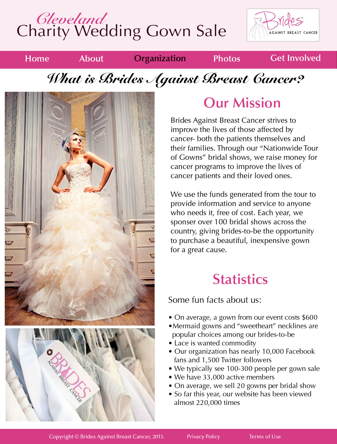
I am a big fan of the “organization ” page. The picture of the bride is very eye-catching . You used two pictures in different sizes and suits the web page very well. The layout of page also fits the rule of thirds very well. People could easily pay their focus on the contents.
Good job!


All the pages of your website seem very connected and there is a strong sense of continuity. Also, while most people (or at least me) just stuck on the copyright and terms of use at the end as an afterthought, I like how prominent you made it by putting it in the pink box. This, along with the navigation bar, grounds all the pages and defines the space that the viewer should be looking at.
As far as pictures go, I really like them all and I like that you included a lot of them. My favorite one is the one of the girl in the blue shirt that is on the “Get Involved” page. The picture really lends itself to being cropped that wide and I like how far the girl is off the right. I feel like the pciture on the “About” page doesn’t really have a strong point of focus, there’s nothing that jumps out as the main part of the picture, but the wideness of the shot does offer variation when compared to the other pictures that are mostly close-ups or feature just one person. So while I think a lot of pictures like this one would have really hurt your website, just including this one added variety to the pictures you feature.
I really like your website. It’s very consistent and clean designed. The choice of pictures are very connected to the pages. Besides, I really like your choice of the color – the pink is not very dazzling but fits the website very well.
I also like your choice of font of the headline and the content. The headline font is very classic and novel while the content is very clean and increase great readability and legibility. The boxes are used very well to give enough information.
I am a big fan of the “organization ” page. The picture of the bride is very eye-catching . You used two pictures in different sizes and suits the web page very well. The layout of page also fits the rule of thirds very well. People could easily pay their focus on the contents.
Good job!