
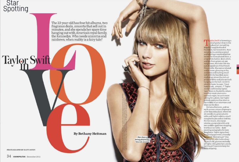
I think this magazine spread is very creative and eye-appealing. Although the feature runs on two pages, the elements work together to create a sense of unity. For example, Taylor Swift runs through the gutter of the spread, connecting both pages together. The image of Taylor also separates the elements in the page. The headline and deck are on her left, while the actual story is on her right. This method ensures that the two elements don’t mix together. The headline design itself is very creative as well. It takes up lots of space and commands reader attention, though doesn’t overpower the photo. The color scheme of the word “love” ties in with Taylor’s dress nicely, and the stacked and overlapped letters create a graphic, artsy feel. The silhouetted photo of Taylor keeps the page simply with its size and lack of background, and her draped hand leads the eye to the headline. Finally, the small elements of the page (like the author’s name placed within the “e” and the red dropcap at the start of the article) make the page look complete against the white background.


I love this feature! I’m probably a little bias since T Swift is a favorite of mine. The image and and text compliment each other very well, and it creates a very strong layout. My favorite part of this is the “LOVE” that is written in the different colors. It helps tie in all thats is going on in the story. Also, it gives yo ua since of what the featur is talking about. The visual of T swift is also very good and leads the reader to the text.
The vivid colorway of the text makes it a very appealing spread in my eyes, and easily allows me to make the transition from heading, to model, to context.Colors of the model complement the text as well, and the visual hierarchy makes me want to read the body of the text.