I really like the way this website was designed because the colors and the image make it really clear what the cause of the organization is. The use of many images, especially on the homepage, also make it convenient for the viewer to understand a lot of information about the cause without having to do a lot of reading. The only issue I see is that there is no clear event, and while there is a “donate” page the website is missing a call to action.
I agree the color scheme and pictures create a consistent theme throughout the page. In addition, the pages are well laid out and space is well managed. However, it is a little confusing as to what you want your viewer to accomplish while on this site.
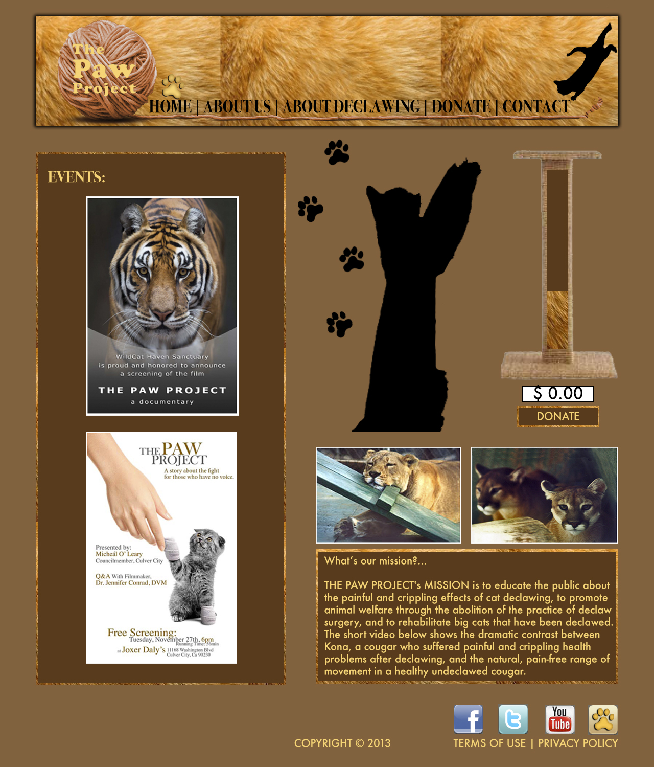
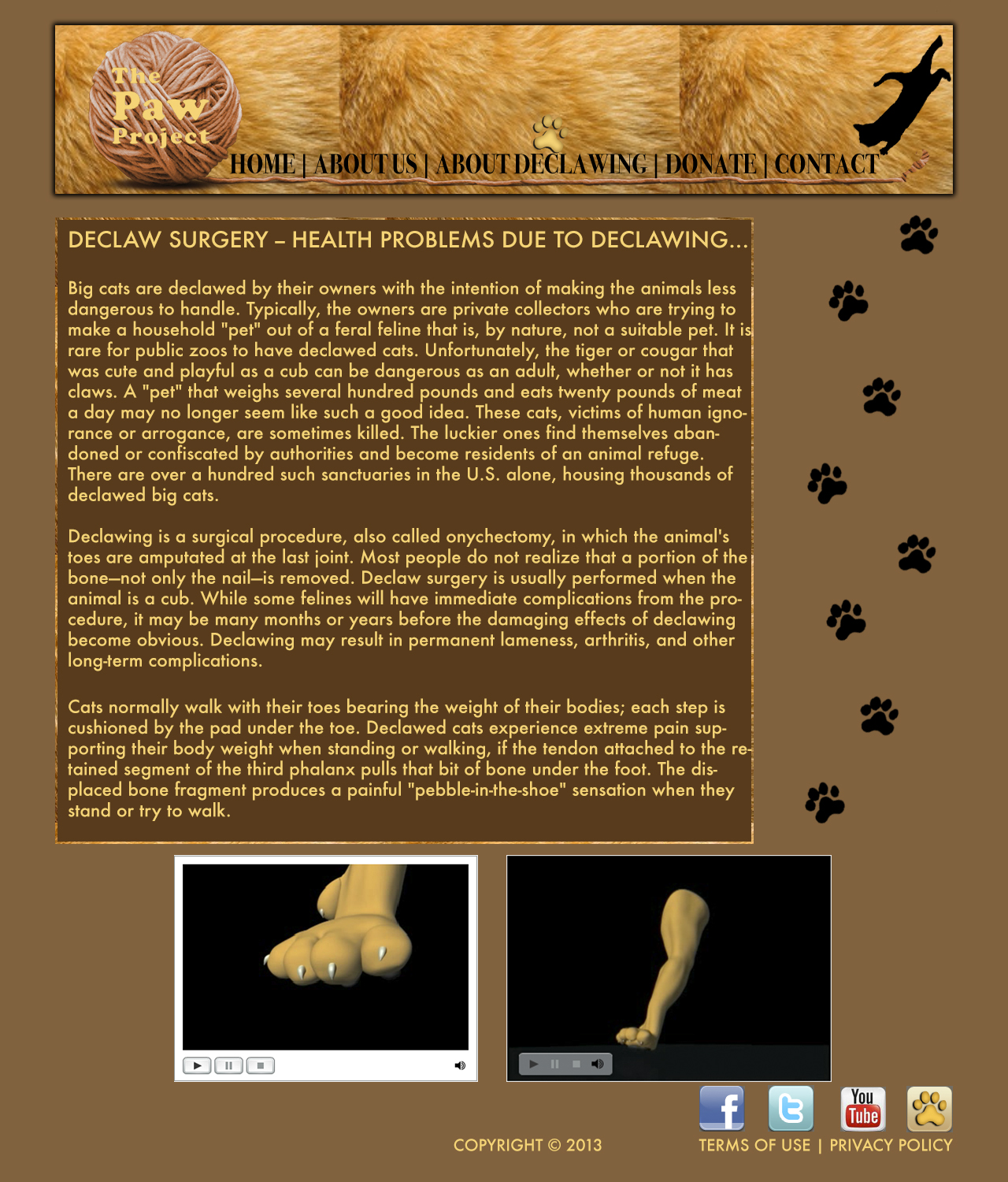