
Coming into Graphics 217 I knew quite a bit about Adobe software and how to use programs in photoshop, so I did not expect to learn too much more than what I had already known. However, I actually learned a lot more than expected. Certain functions in Illustrator were alien to me and programs such as InDesign were beyond my knowledge. Having completed the course, not only do I know how to use these programs but I now know how to use them to create an effective advertisement and image.
Author Archives: Michael Clavijo
iPad Mag Project


iPad Mag Cover
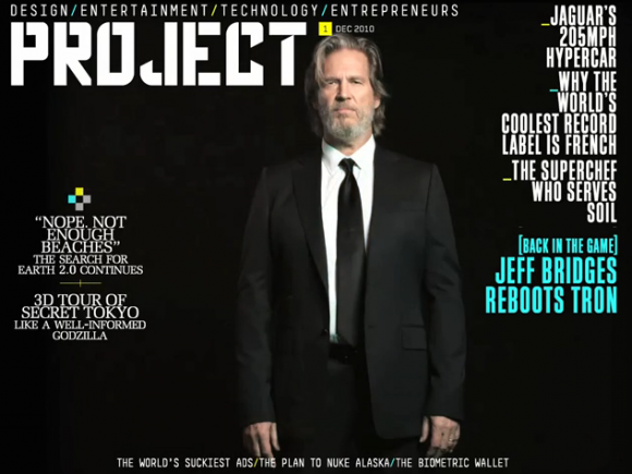
The greatest strategy put into use on this cover would have to be the use of empty space in the background; with all the black space to the designer’s advantage, the text at the front becomes that much more emphasized. The lightly colored text comes out vibrantly against the black background, and the lightly toned face of the subject at the front comes out a lot more against the dark background and the black suit.
Headline and Deck
HEADLINE: EMINEM’S CHILDHOOD HOME CAUGHT ON FIRE
DECK: Last night, Eminem’s boyhood home in Detroit was damaged by fire. The two-story…
I can appreciate the urgency behind the headline in the post; its simple, direct and catches the viewers attention, as well as their emotion with the term “childhood home.” The deck further does a good job of getting the reader to transition from the title to the story.
Favorite Magazine Layout

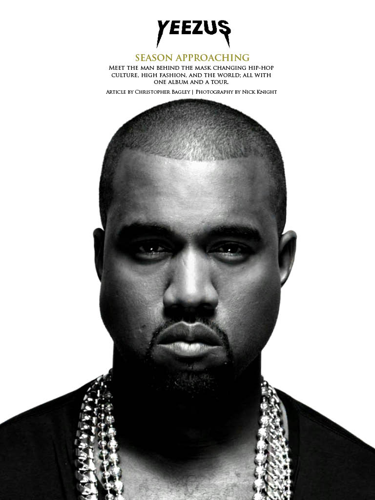
For my preferred magazine, I chose Complex Magazine’s 2009 Kanye West cover. Personally I am a huge fan of Kanye West not just as a musician, but as an individual and an icon of my generation. But what I felt Complex did that really helped attract the viewers eye was their use of visual hierarchy. They made KANYE WEST the biggest text after “COMPLEX” to help attract the attention of Kanye fans to the magazine, and used the term “MOST INFLUENTIAL BRAND” to further intrigue the reader. In addition, they did a good job of putting white text in front of Kanye’s polarized face, which is something difficult to do because they are both lightly toned.
Web Design Pages
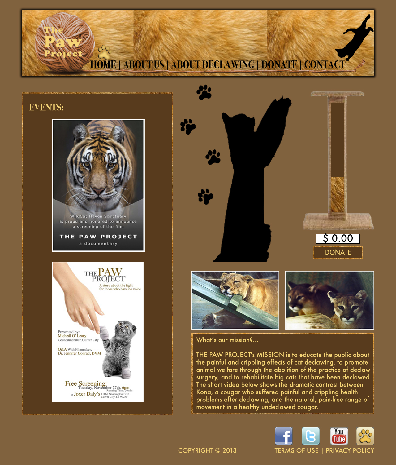
Home Pages
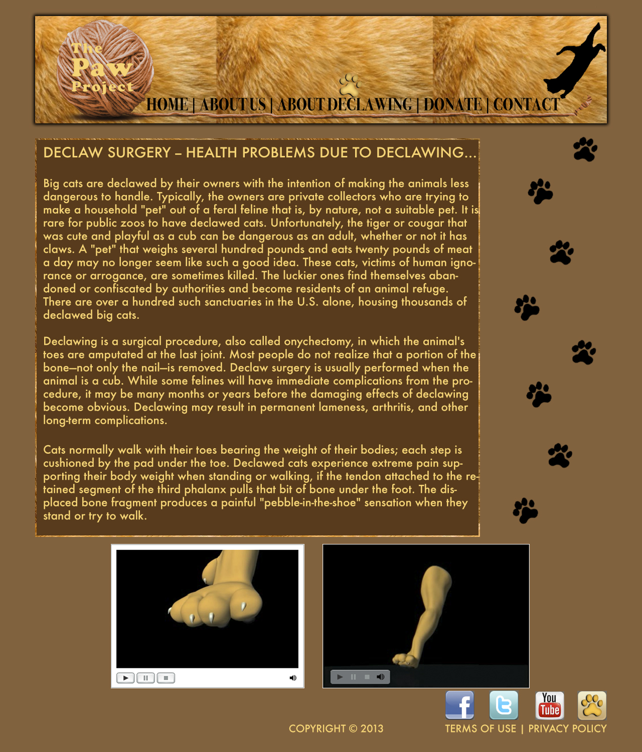
“About Declawing” Page
“About Us” Page

“Contact” Page
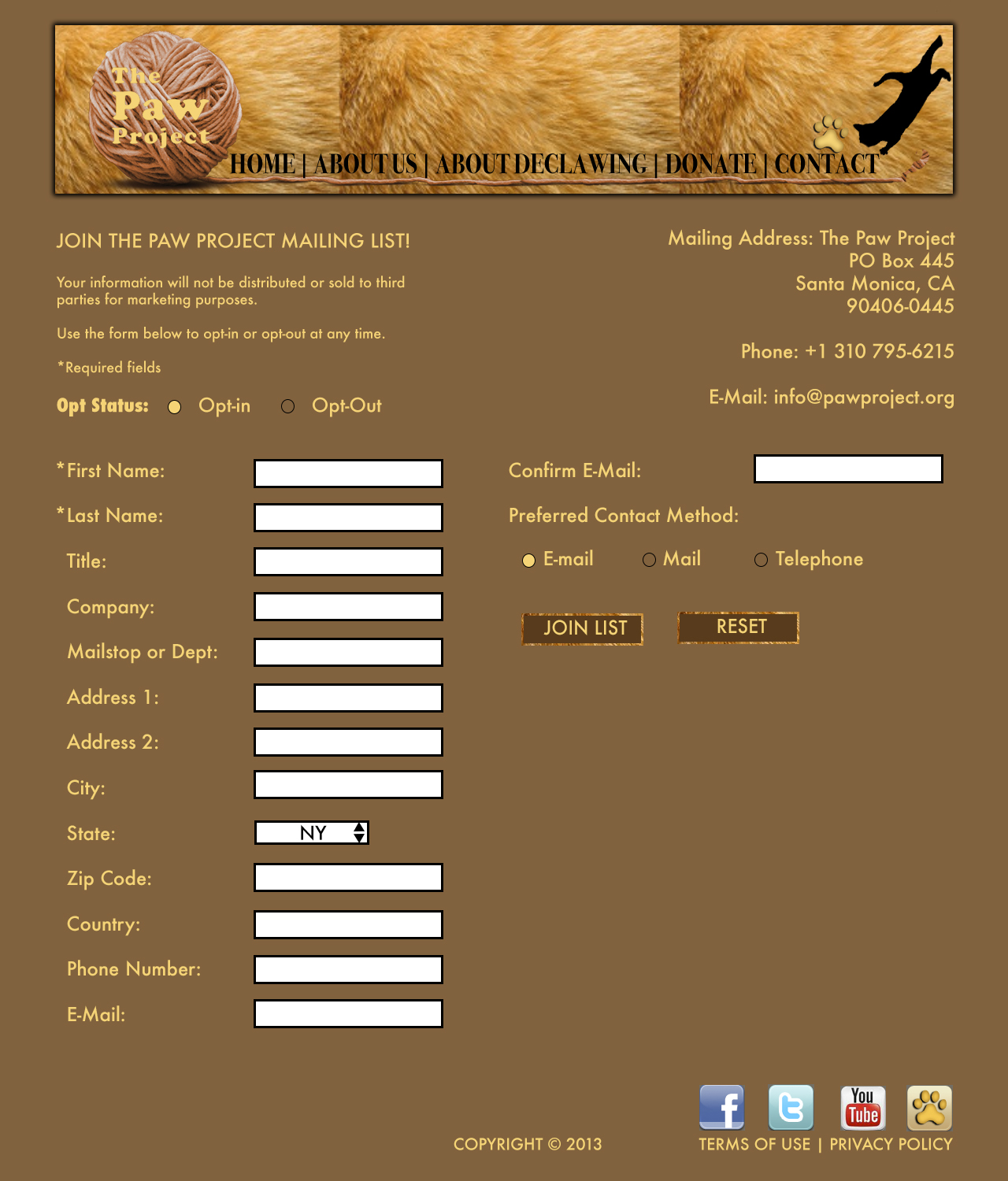
“Donate” Page

Personal Logo
![]()
What I enjoy about the logo I created is that it’s simple, yet different; I feel like the use of this text allows me to create a feeling of individuality and creativity in my logo, but convery a sense of professionalism.
Gestalt Site Post
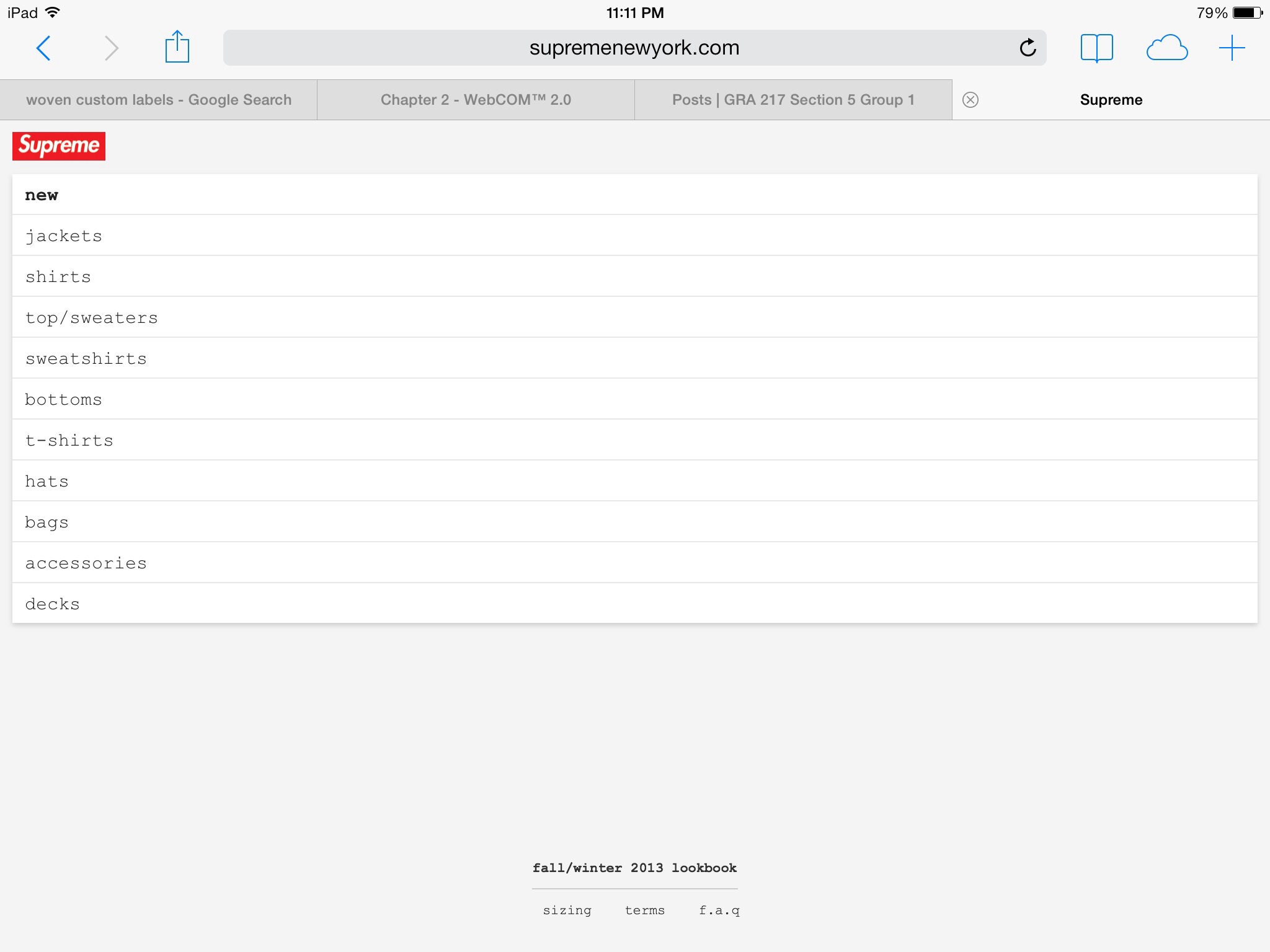
The Supreme online store uses a great deal of the gestalt strategy to attract the eye of the viewer; for instance the use of Visual Hierarchy is apparent in the placement of the brand over the main menu, as the brand is bolded and surrounded by red. The rest of the menu uses a plain black, san serif font indefinitely separating the menu from the brand logo. The use of figure (logo) to the white background also creates a sense of attraction from the viewers eye to the text.
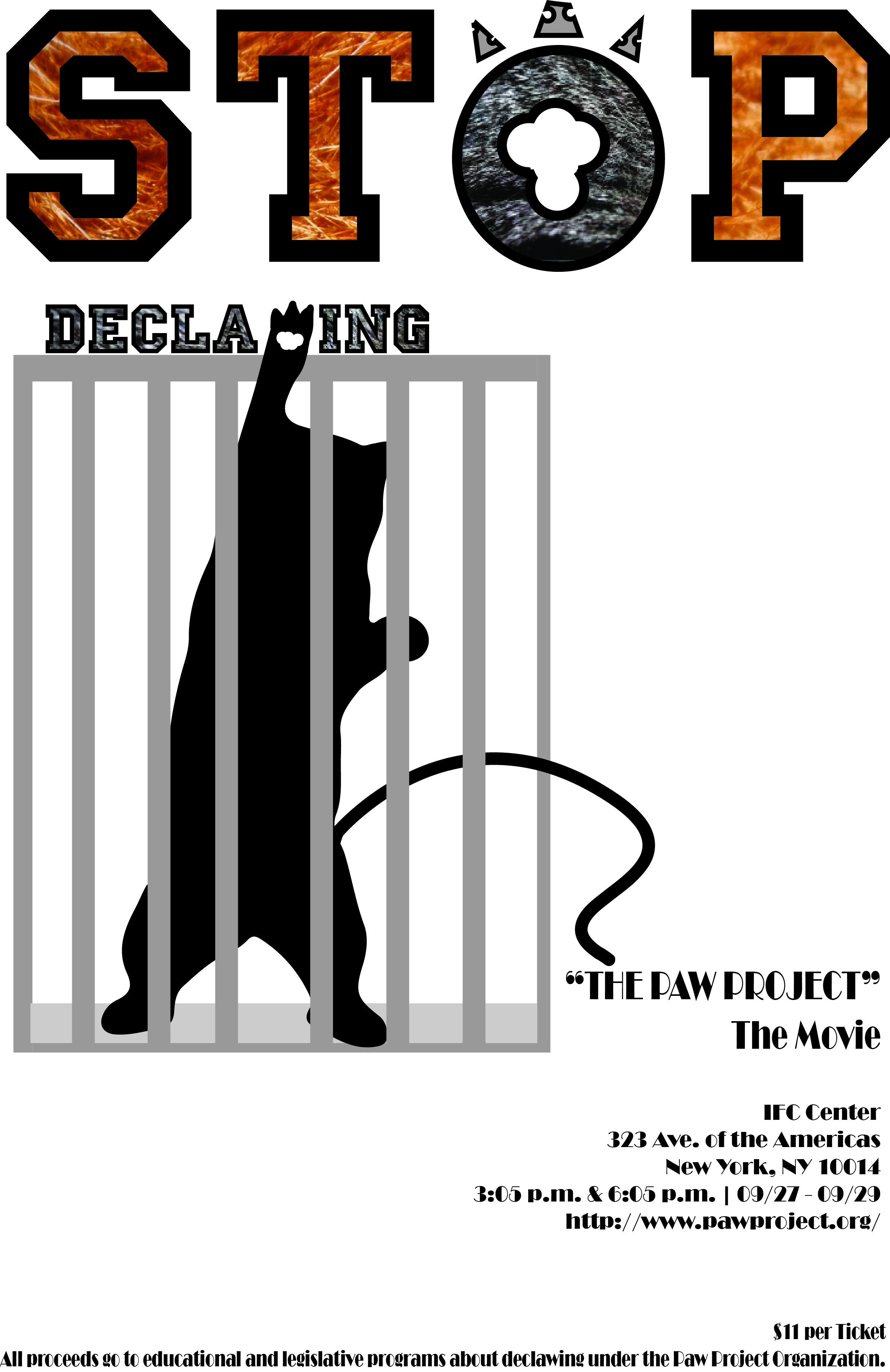
Poster Project
Blog Post: Website
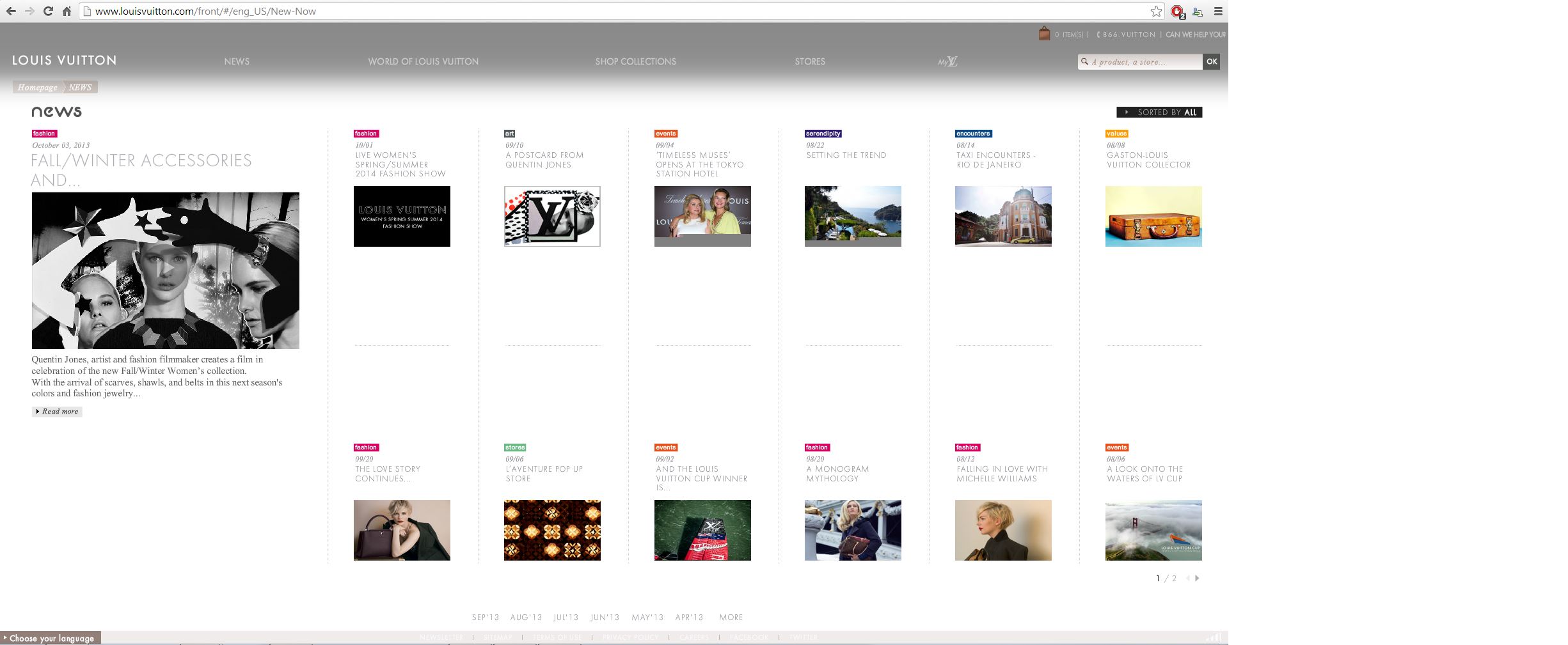
What I found interesting about Louis Vuitton’s webpage design was how convenient it was to the viewer’s eye. The designer uses white space to separate the different articles and objects on the page. In addition, they used a bold san-serif typeface to present an elegant impression of the website, alongside contrasting colors to catch the viewers attention and make it easier to read. I also liked how the rest of the page would fade out and the grey header would get more bold if you moused over a link at the top. Overall, the design works really well.