
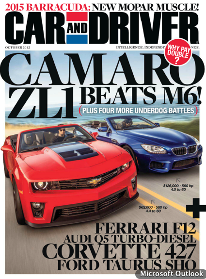
I like the way Car and Driver has had their layout for years because it tells you whats going to be featured in the main articles of the magazine before you read it. The bold headline of the magazine helps to draw in the reader for car enthusiasts with big company names and popular car brands. Every cover the magazine features vibrant cars dueling it out or in an action shot to further attract the reader.


Agreed. I’ve always loved Car and Driver myself, and their designs and photography are always top notch. As for their front layout, they often bleed and have the biggest possible images in fairly bright colors to catch one’s eye. The text is always large, bold, and situated appropriately so that it’s on a clean background and so it stands out more. Overall, great design!
I love this feature. The image if very powerful and dynamic, you can’t help but be attracted to it. As for the layout in general, I think it does a great job of catching the readers attention, especially with the bold typeface. Also i love how simple the headline is. Its short and straight to the point.