
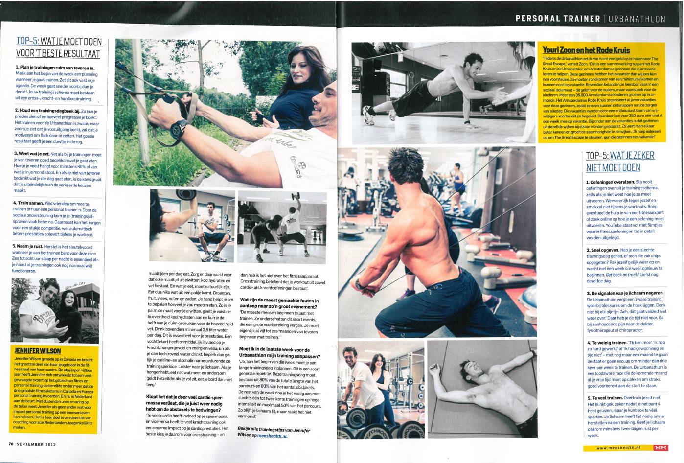
Above is Men’s Health’s article published every month on a specific workout. The layout of this two page article is what attracts my eye. Men’s Health not only utilizes the directions of how to properly perform each workout, but has pictures to give readers an accurate description. This simply layout and placement of text and pictures creates an easily navigable article that will entice readers to read all the way through.


I can really appreciate the color scheme of the layout. The consistency in the use of white and yellow makes it easier for the reader to skim the page and also emphasized the dark black text. In addition, the yellow on the page also works as a tool to highlight important content.