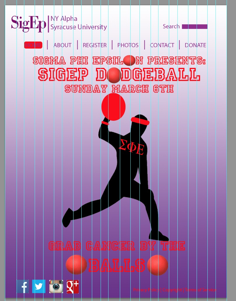
I really like the color scheme and how much contrast it brings to your website. I also like the repetition of dodge balls in the design of your site. They work well when used together to form both areas that contain text, and just to separate information on your pages.
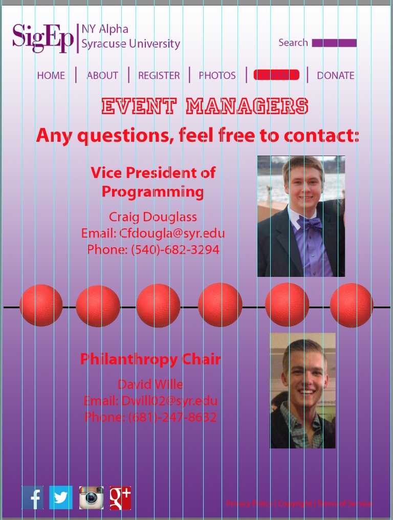
I think this website is extremely well designed. I think you incorporated the dodgeballs effectively into every page and the images bring the site to life. The red text also works because the dodgeballs are red, creating coherent coloring throughout each page. Additionally, the headers and titles are catchy and interesting.
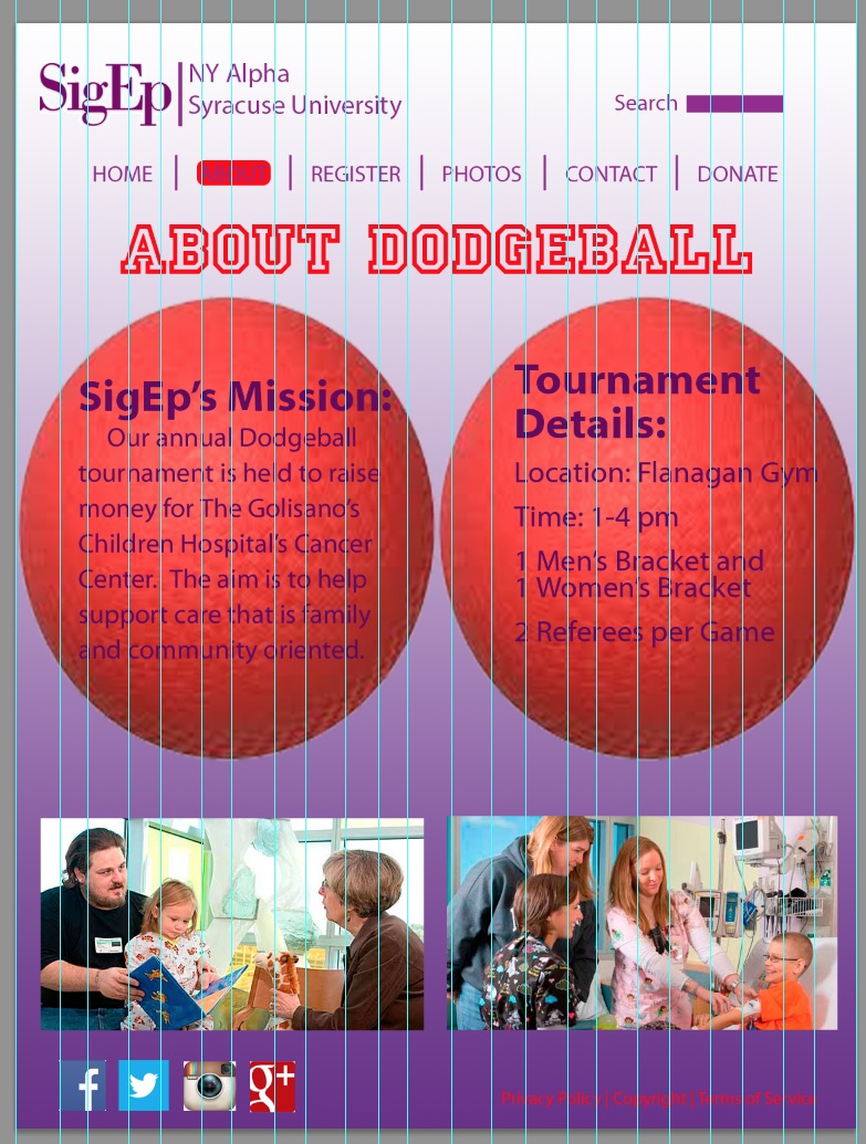
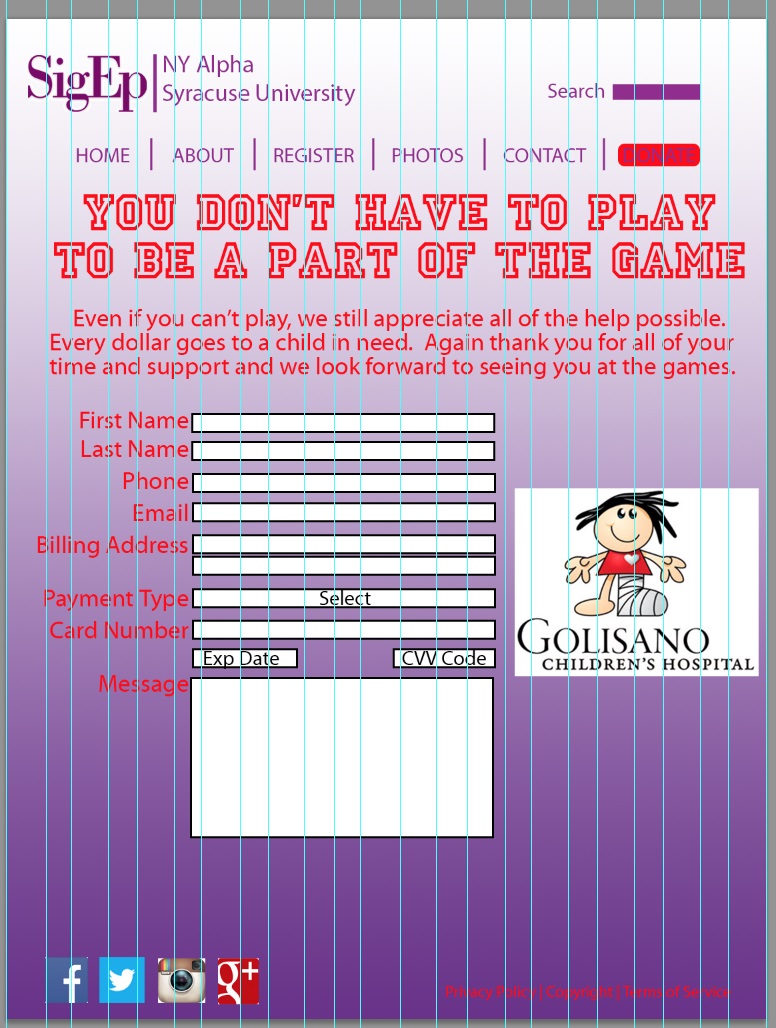


I really like the color scheme and how much contrast it brings to your website. I also like the repetition of dodge balls in the design of your site. They work well when used together to form both areas that contain text, and just to separate information on your pages.
I think this website is extremely well designed. I think you incorporated the dodgeballs effectively into every page and the images bring the site to life. The red text also works because the dodgeballs are red, creating coherent coloring throughout each page. Additionally, the headers and titles are catchy and interesting.