
1. 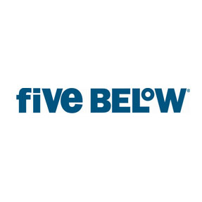
Lowercase and capital letters were used unconventionally in the wordmark above, which initially caught my eye. The mix of the lowercase and uppercase letters and the sans serif font gives the store a young vibe which is consistent with its target audience–young teenagers looking for cheap buys. The lowercase “o” in the raise position over the “L” gives the viewer a sense that it is the degree symbol, and -5 degrees is pretty “cool.” The store does not sell anything above $5, so the actual meaning of the wordmark is consistent with the store’s mission.
2. 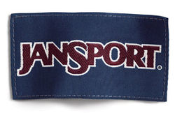
This second wordmark is a well-known company around campus. In terms of the kerning, because the letters are all connected and bold, it gives the name strength, which is an important attribute for backpacks that are often heavy. Dropping the “J” and “S” down further than the rest of the wordmark separates the words and makes it easier for the reader to recognize the name. JanSport’s mission states that they are interested in “the discovery of fun, freedom and adventure.” As their mission, including “sport” in their name is beneficial because it attracts sporty, athletic people that are also keen on discovering new things and going on adventures.
Sarah Graham


I think it is very interesting that you made the connection between the boldness of the Jansport letters and the idea that their products are in themselves strong. The brand would in fact take on a different meaning if the letters were more delicate looking. Who would want to buy a back pack that would not be able to hold all of their heavy possessions? Before you pointed out that the dropping of the J and the S were intentional to make the wordmark legible I thought it was just a simple design choice. However, you are right. If the J and S were on the same line as the rest of the letters the logo would be harder to read.