
![]()
This wordmark is effective in its simplicity. Orange and purple are very basic colors but when taken out of the Fedex context and shown together many people would identify them as Fedex colors just as if someone saw pink and orange together they would think Dunkin’ Donuts. The typeface is also simple and clear which I think aligns with their brand identity. It shows customers that they are a reliable and no-fuss shipping company which will get your package from point A to point B and nothing more, because that’s all they need to do. Also, by adjusting the tracking they created an arrow between the “E” and the “X.” Not only does this make the wordmark more fun and interesting but the arrow is also relevant to their business of shipping and mailing.
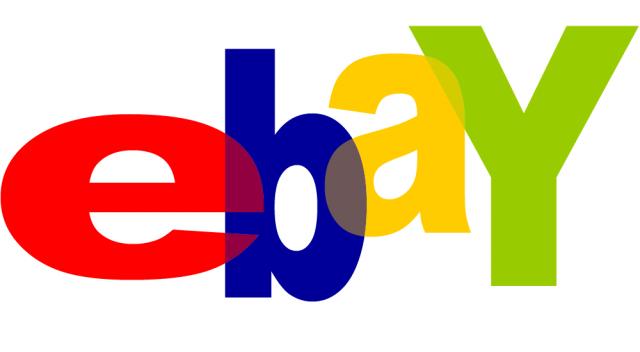
Ebay’s wordmark stands out to me because of their use of color. The colors they use are very basic, three of them being primary colors, but the order in which they are used are distinct to Ebay. Also, the variety of colors used in the wordmark reflect how large the variety of items is that they sell and resell. As far as the positioning of the letters, this could be reflective of how items are bought and shipped all over the world through Ebay everyday.


You make a good point when you talk about the color choice of the FedEx wordmark. Before you made the claim that the purple and orange together are in themselves a symbol of FedEx I unconsciously would associate these colors with the brand. It’s interesting that font is not the only factor that can make a brand’s wordmark standout from other brands. The same idea goes for the tracking between the E and the X. I remember the first time I noticed the arrow between these two letters. I was astounded that I had seen the wordmark so many times before and had never noticed it. I feel as if the tracking is one of the most identifiable characteristics of the FedEx logo. It not only identifies that the brand moves packages in a “forward” motion but it is also the characteristic that most individuals recognize the brand by.
I really like your point on the positioning of the letters. At first I was attracted the overlap because I found it aesthetically pleasing, but thinking about those overlaps as functional makes the logo even better.