
Last semester when I scheduled for GRA 216, I was definitely a little nervous. The only program that I really had any sort of grasp on was InDesign and I wasn’t sure if I would be able to dedicate the time that was necessary to finish the projects. Now that the course is done and all of the projects are turned in, I feel much more comfortable using the different Adobe Suite programs. There were so many details about graphic design that I learned. Terminology, color associations, typeface uses and plenty more. The most valuable tool that I learned that I’ll be leaving the semester with is definitely learning the interactivity for the iPad design. That’s a huge plus when it comes to resume building and impressing future bosses. It was also helpful to have my work critiqued by someone who really knew graphic design, and not just a friend telling me if it looked good or not. I have definitely learned a lot and I am sure I’ll be able to use the lessons I learned when I’m making posters in the future.
Author Archives: Sarah Graham
Shaffer Art Gallery Extra Credit
Yesterday I had the opportunity to visit the Shaffer Art Gallery and spend some time looking at the history of printmaking. It was very interesting to see the styles and sophistication evolve throughout the years. The images began with mono-color wood engravings. These images were very detail-oriented and the talent that was involved in creating those pieces was very clear. After the mono-color era of printmaking, there were two-color linocuts and lithograms. These images were more involved and it was clear that the artists began to experiment with the color and where to place the color in the image so it’d be most effective. Eventually, printmaking developed into tri-color and more detailed images. These images were more advanced. It was also clearer from these images to see the progression from the tri-color lithographs to today’s design principles.
iPad Design

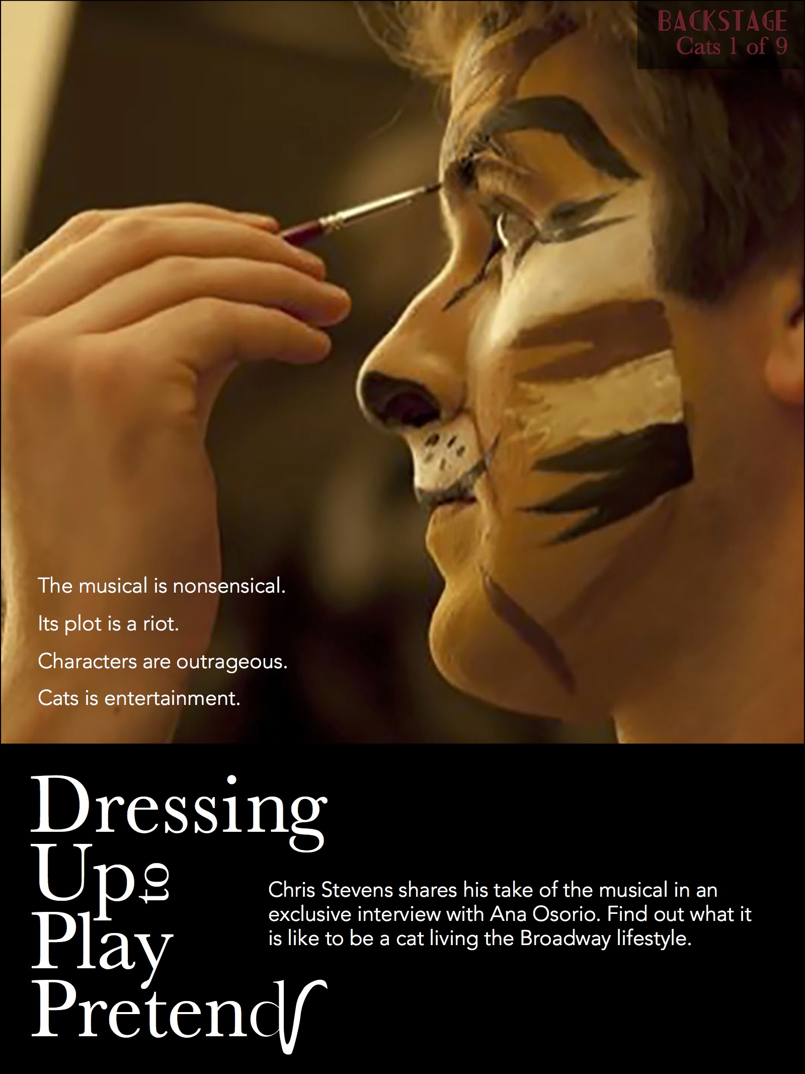
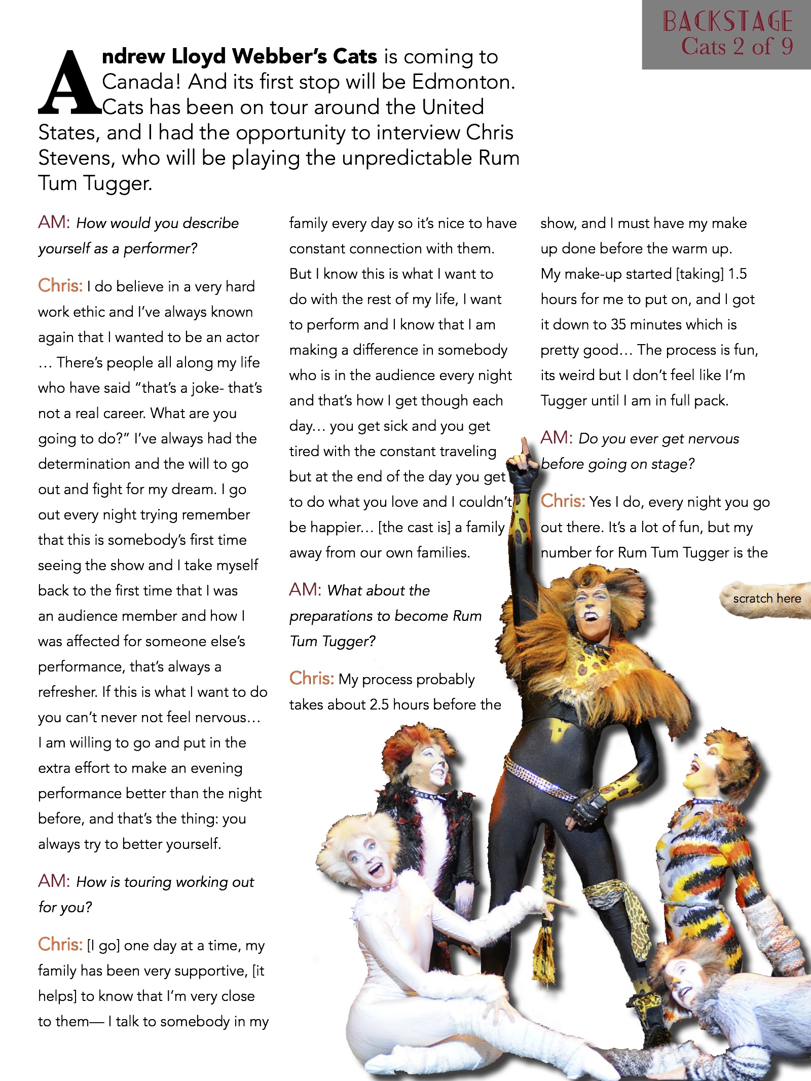
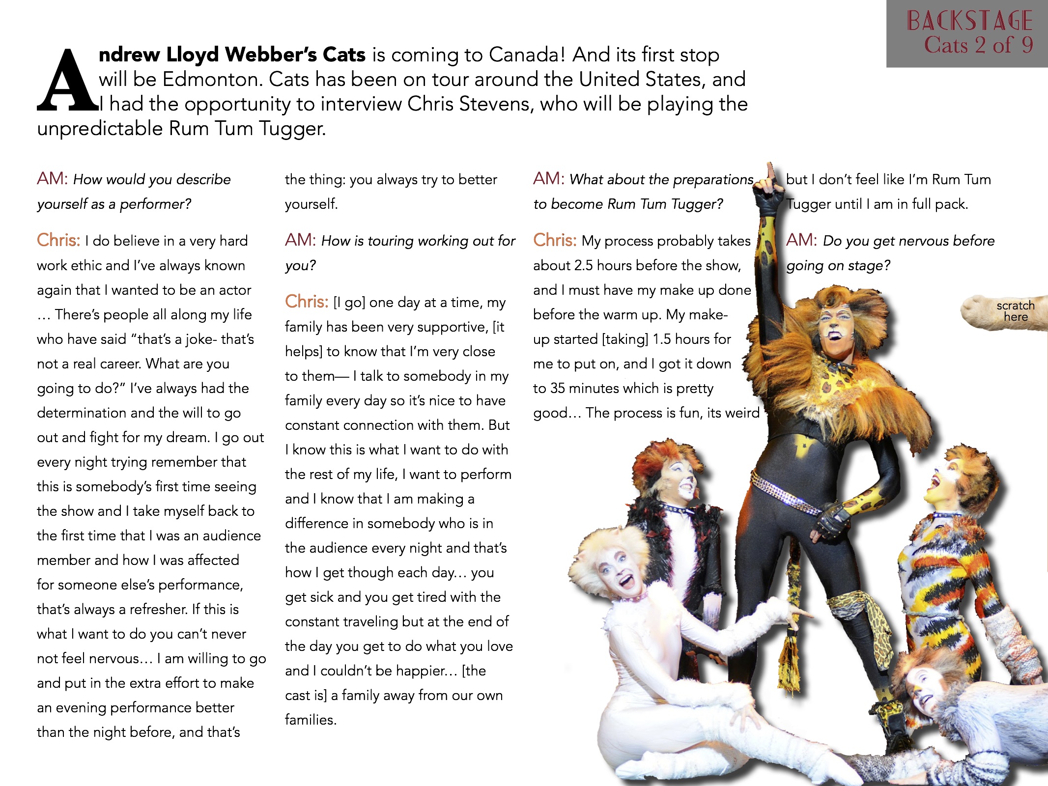


During this project, it was definitely good to learn about the interactivity feature of InDesign and know that those features are there. I also learned a lot more about InDesign and the tools that it has by doing the resume and this project in that program.
iPad Magazine Cover
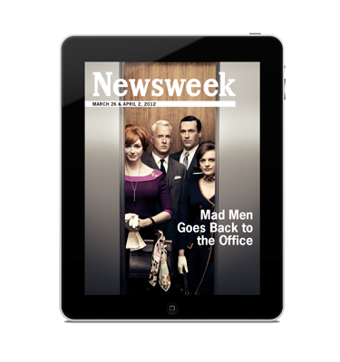
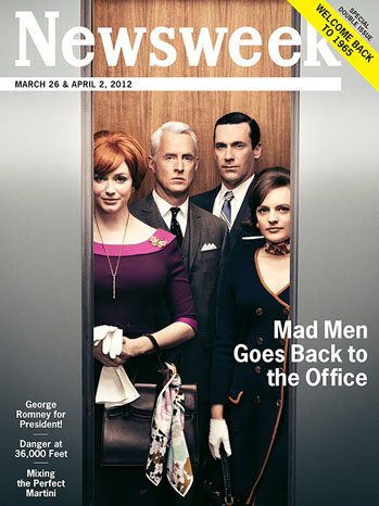
I chose this Newsweek cover because between the print and iPad version, there is very little change, but what does change is interesting. The text in the lower left is removed for the iPad and it makes a huge difference in the cover. For print, you have to show what is offered and intrigue people to buy the issue, but this isn’t true for the iPad version. Being able to remove that extra text keeps the cover clean and focused on the main story. The other change that is clearly apparent is that the print cover advertises that it’s a double issue in the upper right corner. Putting this banner in the upper right is a spot visible at a newsstand. It is important to advertise this in the print version to gain sales, but not necessary for the iPad version. Removing the sales points makes the iPad version more genuine and less like Newsweek is just selling you something.
Headline
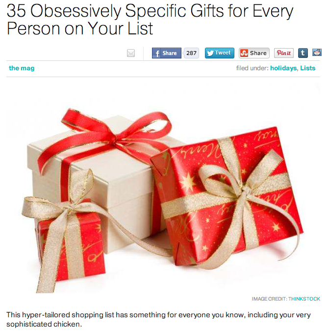
This headline and deck work very well together. The headline is creative and draws the reader in because it is unusual and is targeted to a specific audience. It is not broad, it is not confusing, it is clear and is successful in pulling in its designated audience.
The deck: “This hyper-tailored shopping list has something for everyone you know, including your very sophisticated chicken” works great with the headline and the fun language is consistent throughout.
Magazine Layout
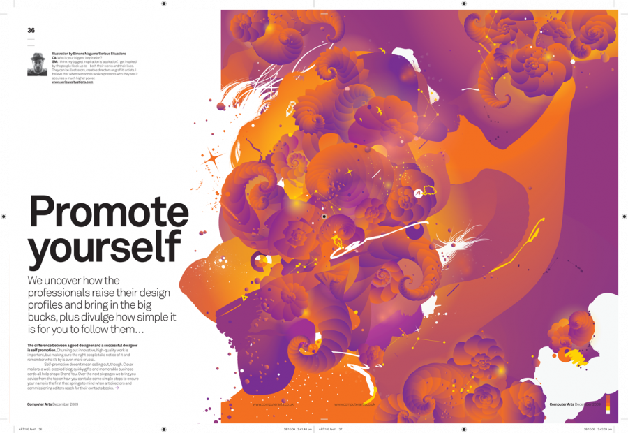
This layout stood out to me because the art direction was so on point. The headline, “Promote yourself” goes perfectly with the visual because the visual has so much life and personality to it. I also like how they didn’t conform to the gutter. They spread the illustration out over two-thirds of the spread rather than stopping at one page–it definitely works to their advantage. Their is very clear visual hierarchy and I really like how the color is integrated with the white background. Catchy and clear.


Personal Logo
![]()
My first thought when I was sketching out different ideas was wanting to do something with the “rah” since it was in both my first and last name. I added the color to my first name and made my last name thinner so it might help differentiate between the two. I used the same font and color as my resume because I assumed people I may be giving my resume to, I’ll also be giving a business card to, so it would be beneficial to have every piece of my paper identity coherent.
![]()
For this second idea, I wanted to incorporate something with the S and G in my names being similar curves and shapes. I think this one might be a little difficult to comprehend, and it might be because of the font. I think because the font is slightly unusual, it might get in the way of understanding it. However, on a business card with other information, it might make more sense. At first I had the G in the same maroon color as the first logo, but decided to change it so it would have more a contrast with the black S on top of it.
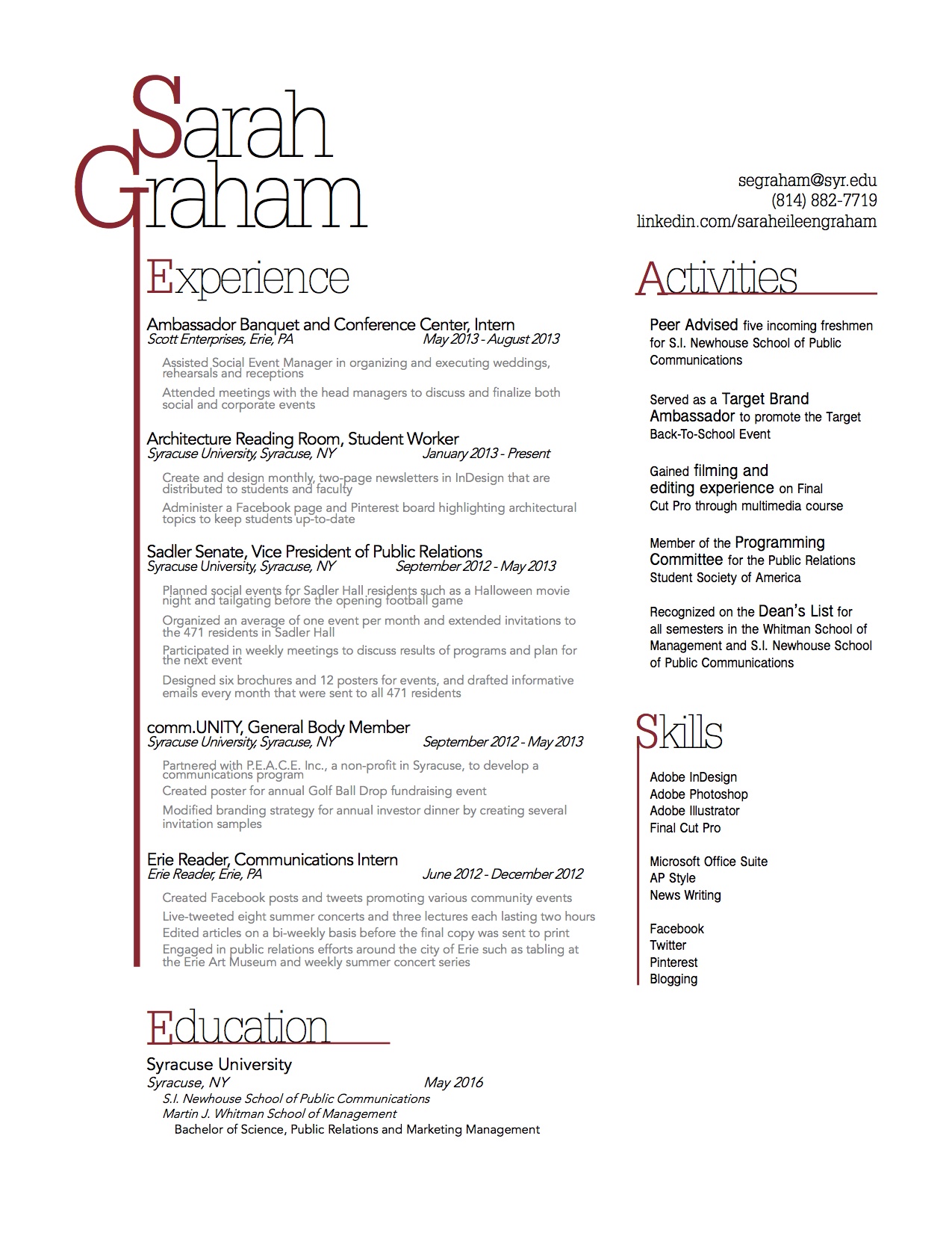
Resume 1B
Website Photography
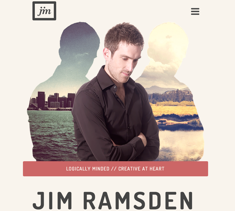
This screenshot is from a portfolio website of Jim Ramsden. His home page features this picture of himself, and then the silhouette of his picture with imposed pictures in the background. It works well as his home page picture. 1. His tagline is “logically minded, creative at heart.” Instead of just telling his audience this, he shows it through his picture and creatively adding the pictures in his silhouettes. 2. He positioned himself well with his eyes leading the audience down to his name. 3. It is clean cut and professional so any possible employers looking at his portfolio would be more apt to look further into this experience and talent. 4. The two images that he chose to fill his silhouettes seem to juxtapose east coast and west coast which gives a hint into his career, interests and personalities.