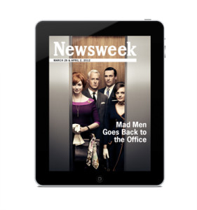
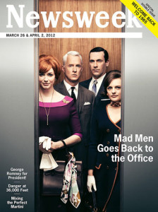
I chose this Newsweek cover because between the print and iPad version, there is very little change, but what does change is interesting. The text in the lower left is removed for the iPad and it makes a huge difference in the cover. For print, you have to show what is offered and intrigue people to buy the issue, but this isn’t true for the iPad version. Being able to remove that extra text keeps the cover clean and focused on the main story. The other change that is clearly apparent is that the print cover advertises that it’s a double issue in the upper right corner. Putting this banner in the upper right is a spot visible at a newsstand. It is important to advertise this in the print version to gain sales, but not necessary for the iPad version. Removing the sales points makes the iPad version more genuine and less like Newsweek is just selling you something.
GRA 217 Section 5 Group 1
The official blog for GRA 217 with Sherri Taylor


I think the point you brought up about the iPad version seeming “more genuine and less like Newsweek is just selling you something” is very interesting. I think this could be said for most of the iPad covers we’ve seen. This cover isn’t as dramatic of a change between print and digital, but somehow it seems less desperate or forced without all the flashy cover lines. I’m sure readers react more positively to mags with fewer ads as well, because personally, I don’t even look at them–it’s the same with a video ad online that automatically plays before the real video I’m trying to watch. It just frustrates me.
I totally agree your opinions on the different between print edition and ipad edition. Print edition needs to attract readers’ eyes therefore they are willing to buy the magazine, however, the ipad version needs to make people feel they are enjoying in the contents and pictures. I believe that’s why the designers of Newsweek magazine makes such a change. It’s very slight difference but it makes the ipad version looks what it should be.