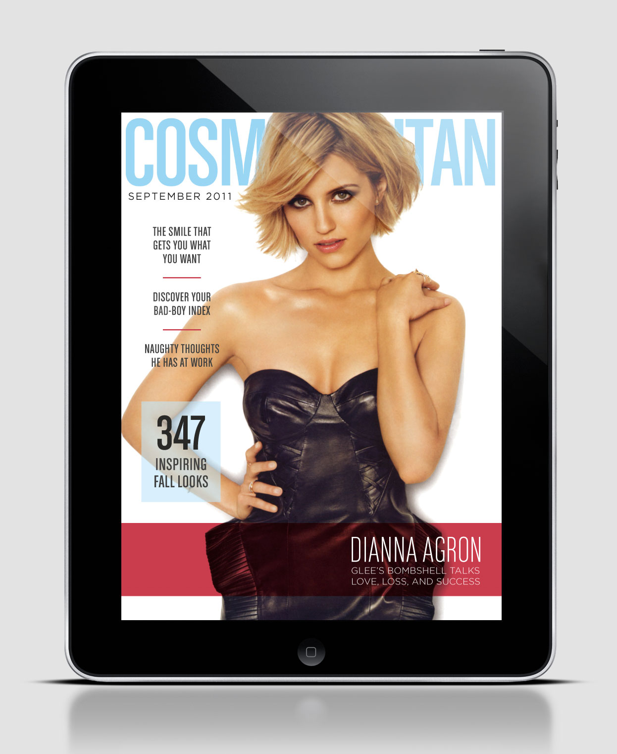
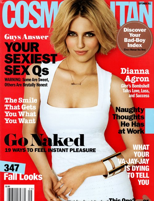
As you can see the digital and print cover for this particular issue are completely different. Although the color scheme stays consistent, where the color is placed is different as well as the picture itself. Another difference is the amount of white space from cover to cover. For the digital design 6 stories were picked to spotlight, whereas the print version has 8. On the digital version the only type that is in bold is the title of the magazine, but on the print version the majority of type is bold. I also thought it was interesting to see the difference in where the type was placed. The print version surrounded the picture with type, whereas the digital version clustered it all to the left except for the story that goes with the cover picture, which is located at the bottom left and highlighted. Although this example is of the same issue the design is so different it almost appears to be a different magazine. Do you think this is good or bad?


It’s definitely interesting how different these two covers are. The design choices for the iPad make sense because it makes it look more modern and sleek. However, the inconsistencies with the picture of Diana Agron that they use is, in my opinion, where the problem lies. The two pictures give off entirely different vibes. The white versus black dress, her expression, her hair, her posture. It all adds up to two very different ideas…but the content in the magazine and the feature story about her is the same. Although it’s nice to see different sides of Agron, I think it would be more of an impact to have a consistent image or at least vibe from the cover image.
Since Cosmo’s iPad cover isn’t looking to reel in readers from the newsstand, it seems that the only thing it’s concerned with is brand/identity consistency. The iPad version may have less cover lines, but it still portrays sexiness image that we’re used to seeing from Cosmo. They also still keep a consistent color scheme: the baby blue, red and white. But I do agree, without the nameplate, the iPad version could be any other women’s lifestyle or fashion mag.