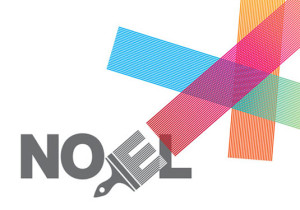
This first wordmark was designed for house painter, Noel Devereux. By rotating the E, part of his name transforms into a paintbrush with colorful strokes extending beyond the margins. Through this playful typographic design, Noel is able to brand himself not only as creative, but also professional. The use of a sans serif font, as well as the juxtapositions of color, give it a modern look.
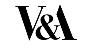
It’s only fitting that the Victorian and Albert art & design museum in London would have an attractive wordmark. I love their use of negative space and how the end of the ampersand fits as the crossbar of the A. It’s a great example of minimalist design, since the rest of the A doesn’t even need to be filled in. The exclusion of color gives the museum an elegant persona, acting as a symbol of status in the art world. I also think the serif font combined with the simple design shows that the museum is rooted in tradition but still understands contemporary art and design.


Its a brilliant idea to modify the “E” in the watermark to make it look like a paintbrush that is active in the watermark. It helps to really grab the viewers attention and really take in the entire workmark as a whole.
The VIctorian and Albert one helps to embody the idea of what design and art should look like in a word mark. The innovation and use of heavy black font with white space helps to attract the view and give a sense of fashion and appeal.
Another note on the Victorian and Albert wordmark–it makes sense to us, students learning about wordmarks, and it catches our eye because of the creative use of the letters, symbols, and space. However, to someone who is just skimming, they might have to take a few seconds more to understand the full scope of the wordmark. To help this type of viewer along, I like how when you’re sounding it out in your head, the A in ampersand also helps you subconsciously piece together that the second letter is an A because it flows into it.