
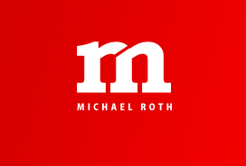
The wordmark above is representative of Michael Roth, an independent consultant. After scrolling through hundreds of wordmarks on a particular website that I came across, this one specifically stuck out to me. The color struck me right away. It was bold enough to stand out from other work marks, but not overpowering to the point where its design turned me off. I felt that the text led me in the way it was supposed to due to the kerning choices that were used. The kerning was slight enough that it allowed me to see the overall image (the letter m) first, then leading my eyes to the individual r that came after. Finally I understood the entire meaning of the wordmark by reading the full name printed underneath. I think I was so attracted to this wordmark initially because it was bold enough to grab my attention while still staying simple enough to the point where it looked professional.

When I first came across this wordmark for the company eight, I had to take a second glance. Immediately the number “8” jumped out at me because my eyes focused on the first two characters coming together as one image. However, after staring at the wordmark for a little I saw the bigger picture. The letters e, i, g, h, and t were all formed out of the numerical version of 8. While the letters are not the first thing my eyes were initially attracted to, I was able to understand the meaning immediately. I like how this wordmark made me think. The way in which the number 8 is cut to make the letters and the way each letter is positioned is what made this wordmark so interesting to me.


Immediately when I saw the Eight wordmark, I was interested in the inspiration. I looked up what it was representing and found out that it is for The Eight Group, which is a musical group. Beyond the fact that the wordmark works because it’s simply artsy, the emphasis on rounded letters and circles reminds me of CDs or records (although out of date, still a symbol of the music industry).
The Michael Roth wordmark is one that I really like too. The fact that it’s not overwhelming obvious is probably what I like most. A person isn’t likely to just glance at it, understand it and move on. Your eyes first go to the M and the R but you really only figure out that they two letters are there once you read the print below it. By forcing your viewer to sit with it for a moment and then figure it out causes it to have a more lasting impression on them.
Although I do feel that the Wordmark for “Eight” does not exactly communicate the message of a musical group, the way in which the designer played with the number eight to form the word “eight” was brilliant. He applied a sense of individuality in the Wordmark, because rarely does, or can, anyone form a word out of the actual thing it represents. I can appreciate the simplicity, and artistic nature to the Wordmark with the designer having done so.
I really like the cleverness of both of the wordmarks you chose. At first glance I didn’t understand the full extent of either of them. After looking at them for a couple of seconds I fully appreciated the creativity and inspiration that went into making both of these wordmarks and was able to see the bigger picture. I agree that the Michael Roth wordmark is both bold and simple. I really like the designer’s choice of the color red because it makes the wordmark come out at you rather than detracting. I also think it was wise to use white as the color of the actual letters, because it made the wordmark very clean and not too overwhelming.