
![]()
The first wordmark I chose was Pinkberry’s because its a logo that I’ve always been attracted to. The sans serif typeface makes it fun and easy to read. The colors and simple side logo add a refreshing look. This logo represents the company well because I would want to go get a nice froyo after looking at this.
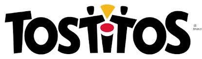
The second wordmark I chose was Tostitos. I’ve always liked this logo because at first glance it seems pretty typical- a sans serif typeface with a bit of novelty thrown in. However at second glance you realize that the T’s and I’s are actually people sharing chips and salsa. Hence, a total representation of the company.


I think Pinkberry decided with pink and green because those are bright colors, which I immediately associated with fruit. The pink swirl made to look like a berry also connects the idea of how frozen yogurt swirls when you dispense it. The sans serif font also gives it a modern look–communicating that Pinkberry is taking a modern approach to ice cream.
I’ve never noticed that the T’s and the I in the Tostitos wordmark are people sharing chips. This is very creative and clever while representing the product well. I also think that the varying sizes and tilts of the letters give off a “party” vibe, which is perfect since Tostitos are typically served at parties. Since both O’s are the same size, and since the first and last letters are bigger than the others, I think the wordmark has a sense of order and balance.
While I am not too familiar with the Pinkberry brand, from the fruity pink and green colors, it is obviously a fun place. I would want to eat at this froyo place due to the fact that the colors illuminate a healthy
I really enjoy the Tostitos word mark. The slightly slanted letters and the letters ‘t’ in the middle acting as individuals and the ‘i’ as a bowl of salsa distinguish this word mark from every other salsa chip brand. The warm colors of red and yellow attract the eyes attention from left to right across the word.
Before reading your post I had never noticed that the I and two T’s make a picture of two people sharing chips and salsa. I completely agree that this wordmark is a great representation of the company itself. I also really like that color’s that were used, I think it was a clever way of drawing the consumers eye to the picture while also depicting chips and salsa. By tilting the letters at different angles and mixing up the size it gives the logo a somewhat festive feel, which I also think represents the goal of the company.
The first wordmark is very interesting. Yep, I agree the typeface is fun and very easy to read. The color also makes people feels comfortable. The wordmark uses cold color may because the frogo is cold. However, the color is not that “cold” and still looks warm. It may because the company want to show that they are friendly.
I like the design between “t” and “i” in the wordmark. It not only looks like “sharing chips” but also looks like a smile face. The size of “Tostitos” varies. This matches its product, becuase Tostitos also varies in size. The color of the products let me feel relaxed. People always eat tositios with friends or watch TV. Thus, I think this wordmark perfectly matches its product image.
I’m usually not a huge fan of colored logos or word marks, but Pinkberry’s wordmark has always been one that appreciate. The light green and and pink create a fun, friendly, and relaxed environment that immediately draws in consumers. This is extremely important since Pinkberry is a froyo restaurant and froyo is perceived to be fun. The word mark definitely would not work if it were black and white. Also, the lower case lettering add to the friendliness of the logo.
I also like the pink berry logo. I think that the colors chosen appeal to the consumer (mostly young people) and I think that the modern typeface makes the company seem trendy. The image of the berry (although not technically part of the “wordmark” as it is not text) suggests a fresh product.
I really like the image of the people sharing the salsa, but I also think that the fun font helps demonstrate that tosititos are meant to be eaten at parties and other events.
The Pinkberry logo is successful at representing the product it sells. It is a very fresh logo that is light and uses a well fitting graphic that only adds to the overall look of the logo.