

Supreme is a leading brand in the street-wear industry and is popular among a varied range of demographics. Many would argue that this is a result of their use of simplicity in their designs, and this is perfectly exemplified in their primary Wordmark. What I like about the simplicity of the Wordmark is that it doesn’t just strive to be simple, it emphasizes the word “Supreme” by doing so. It’s saying, “instead of cluttering up the word with fancy blots and scripts, let’s just allow the word speak for itself,” and it does. I can also appreciate the fact they decided to not just write the word in a nice front, but almost cut the word out of the red square so that the red color makes the word more pronounced.
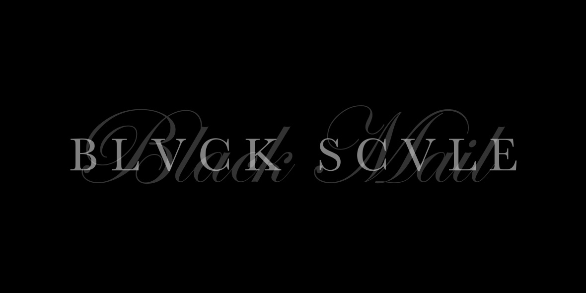
Black Scale is another well-known street-attire brand and has a very unique style. In their clothing, they make an effort to be dark and give their designs a kind of “classic” feel; this is also especially represented in their Wordmark. The plain, serif text accomplishes the “classic” feel to the brand and is further amplified by the script writing in the background. To add to the distinctiveness of the brand, turning the “A’s” into “V’s” was a clever decision and further contributed to the sharpness and feel of the Wordmark. Not to mention, they attempted to stay in a darker range of colors when making their design.


In regards to the ‘Supreme’ word mark, I agree that the simplicity of the font lets the title of the brand speak for itself. In addition, the red background grabs the attention of viewers that provides more publicity for the brand. The overall simplicity is what drives individuals to research further into the brand.
Black Scale’s word mark evinces a strong sense of class and sophistication. The cursive font in the background provides the high class feel, while the black and white colors provide a strong sense of simplicity that gives justice to the brand.
The first wordmark uses red color. Warm color makes it very attractive. The red color is very appropriate.It not like a bloody red. In fact, it is a warm red. Cool and friendly. Just like its brand image. Nowadays, I think the fashion trend is simple but special. “Supreme” logo is “simple” but let me feel warm and special.
Black Scale’ wordmark let me feel classic.I browsed their website. I think they using black and white color is very smart. Many of their clothes are black and white. I also like they trun “A”s into “V”s. This made two word matches each other, like a unit.