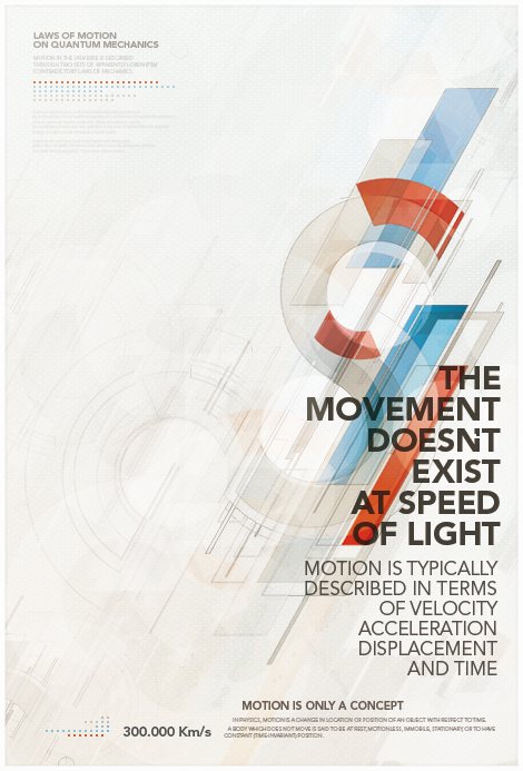
Designed by Metric72, a Spanish graphic designer. This poster is dedicated to the theory of quantum mechanics, which investigates physical phenomena at microscopic scales.
This week you are going to critique a poster. A strong poster should be not just visually attractive, but also communicative and understandable to the general audience. Research the Internet and choose a poster you like. Find out what design elements make the poster stand out. What is the major message the poster tries to convey? Why did the designer make such typography and visual choices (illustrations, photos, colors)? How did the words connect to the graphic elements? Did the poster fully achieve the its marketing goals? Is there any possible improvements?
- Post Deadline: September 13, 11:49 PM
- Comments Deadline: September 15, 11:49 PM


