
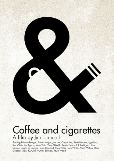
Out of all the different posters I looked through this is the one that stood out to me the most, both visually and conceptively.
The simplicity and cleverness of the poster is what makes it stand out. By visually representing both coffee and cigarettes in the & symbol, the poster conveys the essence of the film to the general audience, which according to IMDb is a “series of vignettes that all have coffee and cigarettes in common”.
I think the designer had two reasons for picking black and white for the color of the poster. One is that Coffee and Cigarettes is shot in black and white, so by choosing those colors he or she stayed true and inline with the film’s visuals. Another reason for reason is that the white resembles the color white walls will eventually turn if someone is constantly smoking near them.
The title Coffee and Cigarettes is perfectly matched up with the visual elements. The coffee cup is aligned with the word coffee, the & symbol with the word and, and the word cigarettes with the visual cigarette created by the large typography. The visual is clean and to the point. I would not change anything with this poster. The design makes it clear that it is a poster for a film. It also engrains the title of the film into the viewers mind while illustrating an important theme in the film at the same time.


I agree with the points made, and I do like the poster. The only critique I would have is concerning the type that the designer used. Maybe because the film is black and white and has a more vintage feel to it, it would’ve been more effective to use a serif instead of a sans serif typeface. But overall, the poster is effective, that is just one change that I would personally consider.
I think the color choice fits perfectly for this poster for obvious reasons: the b&w cinematography and that coffee and cigarettes are both neutral shades. This poster has certain spunk to it, and I think it has to do with the clever use of the ampersand and modern sans serif typeface. Since this film was made in 2003, I think it wants to give off a retro, yet still modern feel. The sans serif font with the vintage-esque design maintains that balance, in my opinion.