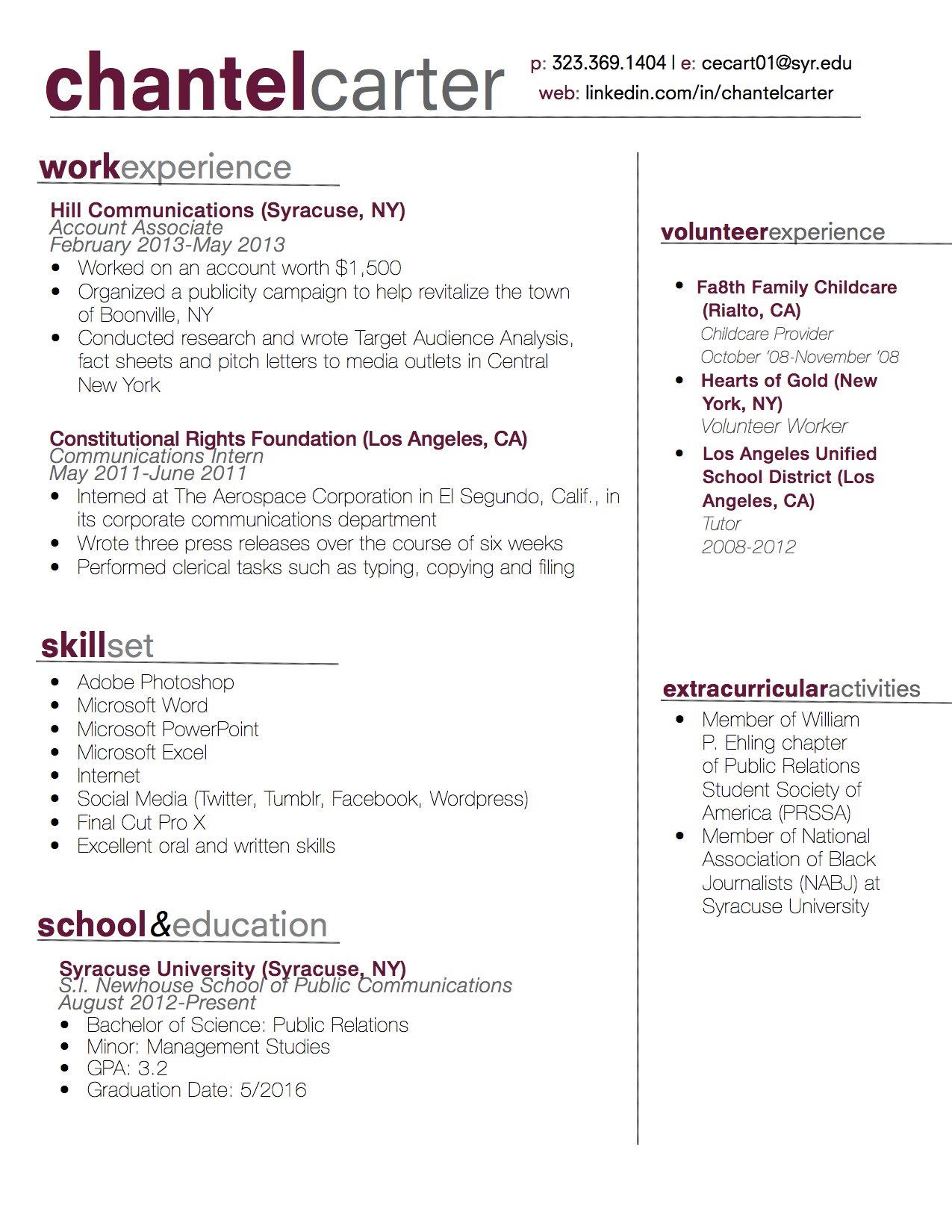
This resume really stands out to me. I like the clean, crisp colors and typeface. You did a good job utilizing white space- the information seems organized and not cluttered at all. Since the header for “work experience” is positioned above the header for “volunteer experience,” it creates a sense of hierarchy on the page. You also did a good job of matching your headers exactly with your wordmark. The only thing I’m concerned about is the headers. Since the words on the headers are two different weights and colors, the line that the headers sit on looks uneven and creates an imbalance on the page.
For starters, I love the sans serif font. It’s super clean, and very professional looking. Your wordmark is awesome, and I love that you utilized the lower case capabilities of your chosen typeface. Keeping the theme consistent with lower case headers and the re-use of color throughout the resume keeps it looking interesting without losing the aspect of professionalism. Your white space is used quite efficiently, and I am a fan of the contrast between the first parts of your headers and the second. Lastly, the use of your straight lines on resume really works to keep it neatly divided without sacrificing too much white space, and without negatively impacting the overall professionalism of your design.