
The most important thing I learned in this class was better use the Adobe programs. I’d already had some background in both Photoshop and InDesign, but I had been introduced to Illustrator with this class. It was definitely beneficial and I feel a lot more comfortable saying that I have experience with these programs on my resume. The class did need a lot of patience but in the end, I’m glad I took it. It enhances my portfolio and skill sets and puts me a step above a lot of other people in my field that don’t know how to use any of these programs.
Author Archives: Chantel Carter
The main thing I learned with this iPad design was to be patient with learning new Adobe software. I prefer Photoshop to any other program, but this project allowed me to be a lot more hands-on with InDesign than the resume project did. Though InDesign is still not my preferred program, but I am lot more comfortable with it now than I was back in September.
iPad Cover


These two covers are essentially the same, minus the iPad design excluding the barcode and date on the cover of the magazine. However, I don’t think that all of the headers look bad on both the print and iPad designs. All of the text surrounds the subject, and though it is mostly taking up white space, it makes the cover look very cluttered. The pop of color that her dress gives is the only thing that would make me want to pick up the magazine.
Headline
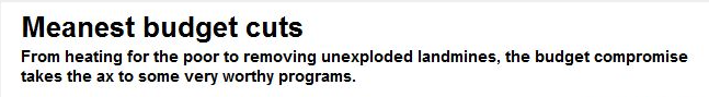
I think the headline relates very well to the deck, with the key word being “meanest”. The cuts that they describe just in the headline, such as cutting heating for the poor, etcetera, tie into the idea of of dastardly budget cuts, and it makes me want to read the article to see what other “worthy” government programs were cut.
Logo Design
![]()
The font used for this logo is “Segoe Script”. I personally think that my initials and my name is boring, so I wasn’t able to use any images or variations of my initials to be creative, so I instead decided to use one “C” for my first and last name while doing an outer glow (softer stroke) of a different color to differentiate my middle initial from my first and last name. I hope that this handwritten font would give off the impression that I’m personable and maybe even flexible, rather than using a computer generated serif. I used the drop shadow feature in Photoshop to give the entire logo dimensionality.
Poster
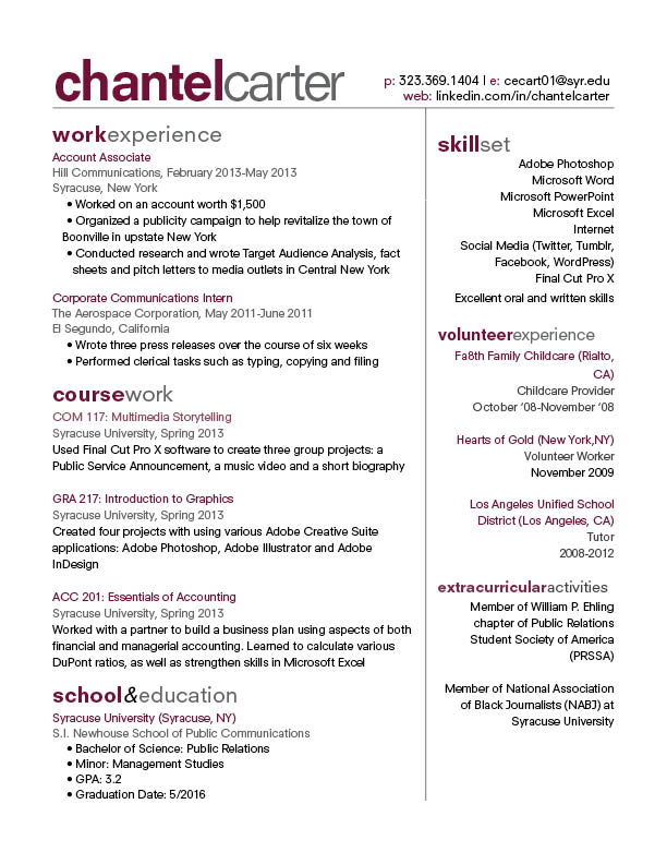
Resume Re-Do
Week 8 Post
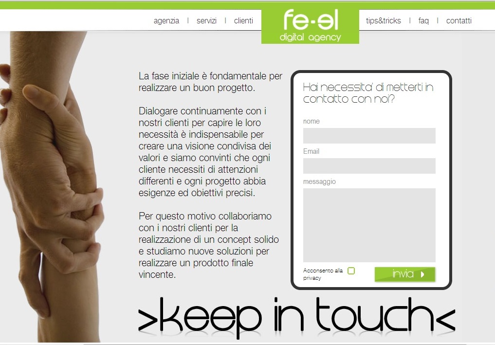 www.fe-el.com
fe-el.com is a web design agency that focuses mostly on highly interactive webpages that focuses strongly on interaction and communication with customers. Their website does not focus much on photography, but it is relying very heavily on elements of graphic design to bring their website together. It’s a very deep website with the user having to continue to scroll which might be a turn off to some viewers. The one photo that they do have on their website is under the “Keep in Touch” option, which shows an image of two people literally “keeping in touch”. I think it works well because it conveys the message fe-el thinks that their partnership with customers is important in order to achieve success.
Web Design
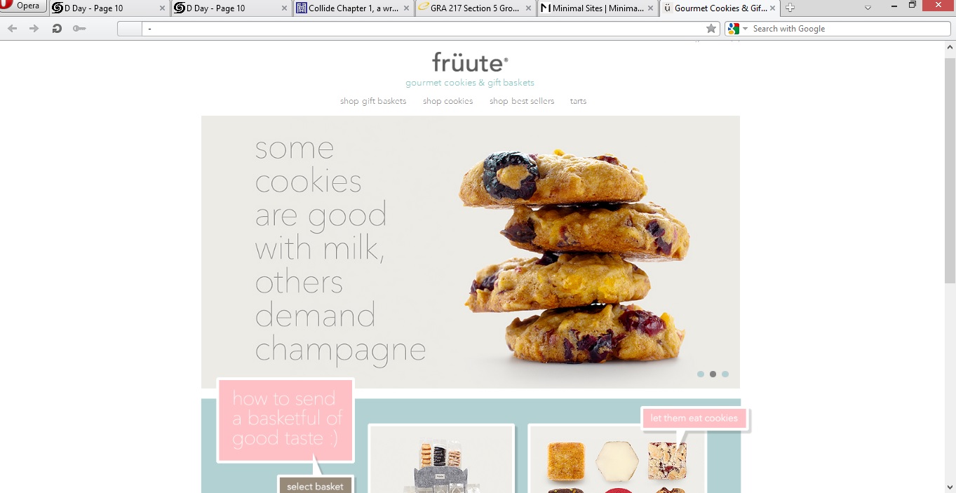
https://www.fruute.com/
I think the deisgner of this website did a great job of utilizing white space in order to make the viewer pay attention to the main content in the center of the page. They utilized great images of their deserts to be sure to show great details in the foods. Because of the use of the white background, the designer was able to use pops of pastel colors without being overwhelming or annoying (as most pastels can be, in my opinion). I feel that the use of simple fonts allows our attention to once again be able to drift to the photos of the deserts and makes us more inclined to click on them.
Week 5 Illustrator
 This image looks like it used both the pen and circle tools to create this flower, with a lot of gradient coloring used to fill it in. the color swatch palette might have been used in the center of the flower. The leaves and flower petals look to have a yellow stroke around them to to separate the flower from the white space. The image can be completed in illustrator, But coloring looks lIke it can be done in Photoshop as well.