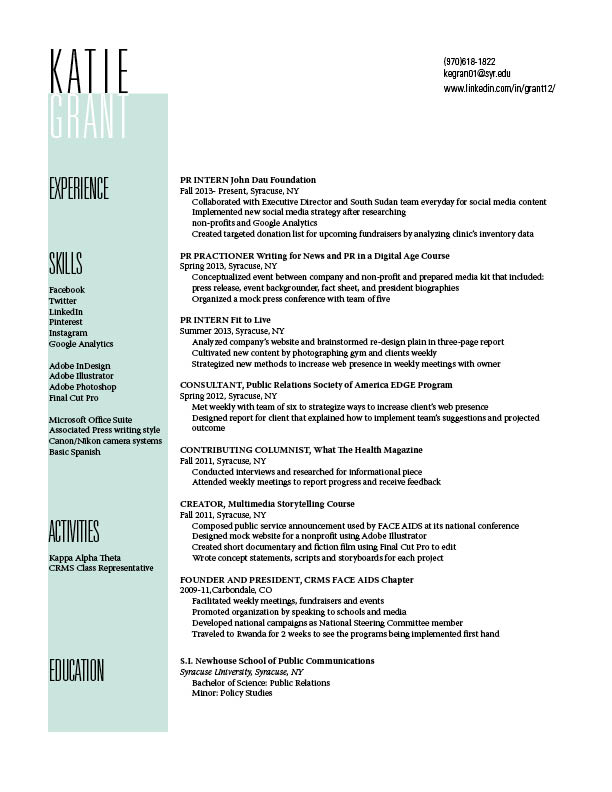
Your wordmark really stands out on the page. I like how you played with the fact that both your first and last name have 5 letters. By lining them up like you did you were able to make your name very clear and readable, however still fun and engaging. I also really love the green-ish color you chose for the box along the left side. It is a more subdued color but still jumps out at the reader. I think that the way you formatted your experience section was a good choice also. By separating the date and place you worked from the job title, you’ve allowed the job and the place of employment to stand out more. For a second though, I thought that your “Experience” and “Education” sections didn’t have labels. That is the only part of your resume that I think a person might get slightly stuck on.
When scrolling through the list of resumes, yours definitely stood out. I really like the way you used color to separate the colums. It brings my eyes all the way down the page and creates somewhat of a frame around your information. I like the fact that you didn’t also attempt to integrate the color into the type as well. I feel like it would have been too overwhemling if you did, so good job on balance! The idea to inverse the colors of you wordmark is so simple but effective. It definitely makes your name stand out. Overall I would say you have a very strong resume!
The spacing and use of color, as well as your wordmark all stood out to me right away. You can tell you put a significant amount of hard work and effort into this resume. My only comment would be to move the header of Experience over its content and move the content of Education under its title. This way, the reader avoids any confusion of what information belongs in what section. Overall, a very strong and professional resume.