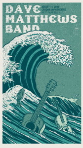
For my poster critiques I chose the concert info posters for Dave Matthews Band. What draws me to these posters is that illustrations are changed to fit the concert venue. For example, the poster to the left has racehorses because the concert was to be held in Saratoga, which is known for its racetrack. The poster to the right has wave because it was to be held in Palm Beach. These posters do their jobs well. Immediately you’re attracted to the picture. Next, the giant Dave Matthews Band at the top. If you’re interested in the concert its very easy to look next to the date and venue written right next to the title. Both posters use a serif typeface that’s easy to read and draws the eye. They both have a very relaxed tone to them, which is consistent with the relaxed feel of the artist’s music.


I am immediately drawn to the poster on the right with the Japanese print of the tsunami looking wave. Among the waves are three guitars managing to stay afloat in the strong current. The varying shades of blue and the foamy white of the waves crashing all works to bring the design together. However, I do like the intensity in the left poster with the horses and their jockey’s in the heat of the moment fighting to get to the finish line first. Both are powerful and interesting posters.
The poster designs definitely characterized the area where the concerts were going to be held, but I feel like they didn’t do a very adequate job in showing that Dave Matthews Band was to be playing in the area. Besides for the designs that largely represent WHERE the location of the show would be, there is hardly anything besides a few instruments to indicate the nature of the show: Dave Matthews Band was to be playing! There needs to be something that signifies this in a stronger manner in order for the poster to be used at its maximum efficiency. I can appreciate the typeface, and it is definitely clear and easy to read, but I still feel the poster failed to deliver its message effectively, and including more content pertaining to the performance of Dave Matthews Band itself would be far more effective than brushing by it and focusing on the location of the concert itself.
As you pointed out I think it is very clever that the illustration of each poster matches the audience of the different venues. I also really like the color that was used for both of these posters, they both give off a very cool vibe. The only thing that I might have done differently had I been the designer is make all the font bigger for the poster on the left so that the attention was on the band and the details of the concert, more so than the illustration. For the poster on the right I would have enlarged the concert details as well as changed the font color. Dave Matthews Band stands out, but the details of the concert are really hard to see, so someone might mistake it as as just a poster rather than a advertisement for a concert.