
 {Save Water…Save Life}
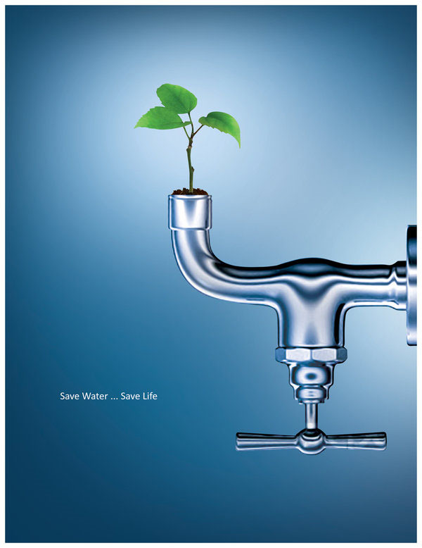
In this poster, the eco-friendly message is conveyed through its simple and clear design. Combining the natural element of the growing life of the budding seedling coming out of the faucet represents the need for the seed’s need for water and our need to conserve Earth’s limited fresh water supply in order to create a more sustainable future. The chrome of the faucet against the blue and white background is shiny, clean and even reflective–possibly of a more sustainable future? Portraying the give and take relationship between nature and modern technology, the poster’s design effectively raises awareness to remain conscious of our water usage and cognizant of our environmental impact. I like the way that the reader’s eyes are drawn first to the vibrant green leaves growing from the faucet which is turned upside down so as to not let any water escape which continues the theme of the poster.


This poster is very creative. It is very simple and could easily let viewer to get designer’s idea. The background color is blue and it matches the theme,”save water,save life”. I am totally agree with you that the chrome of the faucet is very shiny and draw people’s attention, so as the vibrant green. It raises people’s awareness to save water and that small behavior could save life. Overall, the poster gives me a strong impact and because of its simple design I could easily remember it.
The poster itself does a superb job of getting a message across. I’m absolutely fascinated by how simple the poster is, yet so powerful. The idea of bringing the plants and the faucet together was a good choice in terms of intertwining the elements of water and nature; but the biggest impression made on me was made by the text. The isolation of the text brings the reader’s eye to it, and the small font symbolizes the “lack of water” for the plants.
I really like this poster too. I think that the choice of image, color, and text work harmoniously to make the image extremely clean and fresh. My only issue with the poster is that perhaps the words are a little too small. I like how the designer used the faucet as the plant pot to demonstrate that the two are connected to one another.