
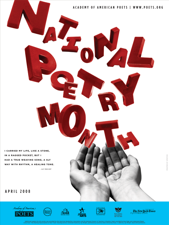
The poster promoting National Poetry Month is creative and unique. The eye is immediately drawn to the large red type displayed across most of the poster, which stands out against the plain white background. The letters look “messy” in a variety of sizes and angles, but this design works effectively for the poster because poetry is supposed to be creative, unique and individual. The letters seem to be floating out of the image of the hands, which connects to how poetry is supposed to flow. The designer probably chose a sans-serif font since the letters would look messy, chaotic and hard to read with added serifs. The sans-serif font also keeps the poster from looking too formal. I like how the rest of the poster is simple – minimal black text in an attention-drawing font with a white background. The black text matches the black-and-white image of the hand nicely, so the hand doesn’t look out of place. Also, the blue box on the bottom of the page provides separation and serves as a nice contrast to the red “National Poetry Month” type. I think the poster does a good job at promoting National Poetry Month and capturing the essence of the event.


This is a pretty cool poster. The sharp red and blue colors set on a black and white background is striking and exciting. This is also a good example of the power of white space. It is quite effective making the images in the poster that much more emphasized. The hands are placed in the bottom right corner, the last place our eyes will look. The hands, in turn, direct our eyes right back to the top of the poster where the letters are understood to have emerged from the hands. The font is quirky and fun but tough to identify because of all the drastically different sizes of the letters.