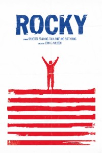
My infatuation with this poster comes from it’s creative use of white space to attract the viewer’s eye to the important information and imagery on poster. Firstly, the text is one color which makes it easier for the audience to read and understand what the poster is about. Secondly, the artist plays with two colors (red and white) to create the actual picture within, and makes a symbolic image of “Rocky” the boxer at the top of a set of steps; reminiscent of a critical moment in Rocky’s training in the film. And finally, the artist specifically used the color combination of red, white, and blue to convey the message that the movie is about an “all-american” boxer fighting to win something.


I definitely agree that the white space in this poster is used in a creative way and makes the important information stand out. The eye is first drawn to the blue “Rocky” since the cool color jumps out of the page. The eye then moves to the image, since the red color recedes more than the blue. I like how the image in this poster is created with only one color. The white space ensures that the image doesn’t look like an overwhelming amount of red. The color choices, as well as the red and white stripes, highlight the fact that Rocky is American. Finally, the wordmark is easy to read and looks rugged and tough, just like Rocky.