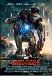
While I am a huge fan of the Iron Man series, the posters are what originally got me to see the movies. The layout of the design attracts your eye to the warm color and the largest figure. In addition, the eye is attracted to all the commotion in the background. The color of the type fades in from top to bottom and truly illustrates the tone of the movie. Furthermore, the type at the bottom is the perfect size so it leaves enough room for the picture and it is still legible.
Being from Philadelphia, I am already a huge Rocky fan. The type is very simple and casual, just like a man from Philly. The poster utilizes the white space, while making enough room for the iconic main character. The reason this poster is so powerful is because a person does not need to have seen the movie to understand; he or she can look directly into the main character’s eyes and feel the emotion. This is the epitome of graphic and type combination.


