
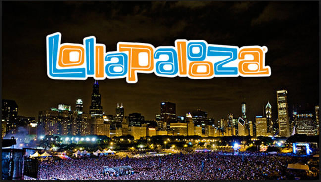
The Lollapalooza logo for the United States version of the popular music festival event is loud and fun. The clashing orange and blue colors make the letters pop and the stacked double “o” toward the end of the word force our eyes to take the extra split second to appreciate the artwork. The wordmark represents a good time, a party. Setting it in the visual center over the Chicago Skyline adds to this effect. Studying this poster close almost makes you want to nod your head as if you were in the festival. The warm whites and yellows of the skyline illuminates and contrasts the deep blue and purples of the crowd below drawing further emphasis to the wordmark on top. Everything about the poster screams crazy wonderful fun.


I am totally agree with that you said of the wordmark. I like the design and the color is very attractive! It seems that the blue demonstrate the lake&the night. The white demonstrate the daytime and the orange is for enthusiasm and summer. I also like the space in “o” ,”p”and “a”. It’s like people sing songs together and loudly. The skyline of Chicago let people feel excited. The lights from the concert also show that the music festival is exciting and popular.
I really like the colors on that. The interesting contrast really goes well with the white stroke and makes readability of the word easier (for me at least). I think the stacked “O”s were an interesting way to conserve space.