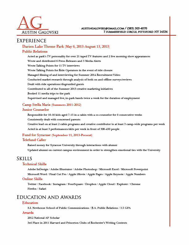
I like that you didn’t try to me terribly elaborate with your design. I think trying to do the most with the design can be a hassle for the reader. It’s very straightforward and to the point without being boring (to me, at least). I think the font that you used went perfectly with the design, and I like the white space that you have to the left of the page. It makes the resume look a lot more open even though you have a lot information in your resume.
I really like the choice of color. The subtle but happy shade of orange is used very nice in the wordmark and as borders for the page. This resume is one of the most professional I have seen. It is simple, you didn’t try to overdo it. But it all works extremely well together. I especially like the typeface used for the headers. I am a fan of all-caps. Even though it is difficult to use you find a nie contrast with the body text. It works very well.