I really like your word mark. It looks professional while still standing out as a way to personally represent you. While only sticking with black and white you were able to make a resume that stands out. All of your entries in the experience section were very relevant to your career path so I think that will help you stand out a lot.
I love the initial mark. It’s a great way to brand yourself and be able to use as a signature mark on business cards, etc. One picky observation–it looks like the graphic might flow a little better if the bottom of the D actually connects to the N and if the top of the D is refined through a touch of editing. The information is great and the visual hierarchy through the different weights in the titles helps lead someone through the information. Very effective use of black and white.
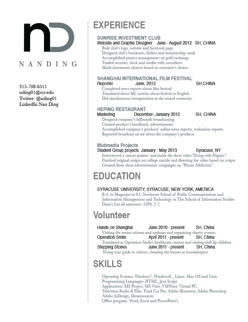