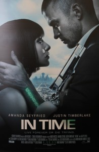
“In time” is a science fiction movie. The whole color in this poster it kinds of dark. The watch in green words is very attractive and it matches with the name of the movie. The special gun and the unique watch could let me easily to tell that this is a science fiction movie. From the poster, I could easily tell that the story is also a love story.
Even though the poster is 2D, it seems that the actor is in the very front and the city is at very far away. I think this is a very good design. It could let me imagine the relationship between the actors and the city and motivate my imagination of the story of the movie.The wordmark of the movie title is very cool and matches the style of the movie.


The main colors of black and white give this poster a sense of high class. Furthermore, the light green color on Justin Timberlake’s hand is the only color besides black and white, which in turn attracts the viewer’s attention to the main story point of the movie.
I completely agree in regard to the dark nature of the poster; having seen the movie “In Time,” the poster does a good job of conveying the message to the viewer of what the film is going to be about. Using darker elements, making the poster black and white, and emphasizing the “time watch” on Justin Timberlake’s wrist with color were good qualities to the poster, contributing to the success of both the marketing and the film itself.
I do like the overall color scheme of the poster and I feel like it plays into the theme of the movie. It seems as if the cool colors are implying that the movie has some deeper meaning than a traditional action moive. The green that is presented on the male actor’s wrist is vibrant enough where it is noticed and stands out from the rest of the poster. The only thing that presents a problem for me is the overall lighting of the shot. It may just be because the poster is a small size on the blog, but the lighting makes it a little difficult to make out all of the details that I would like to see.